LogoArchive Issue 6
Opinion by Richard Baird Posted 23 April 2020
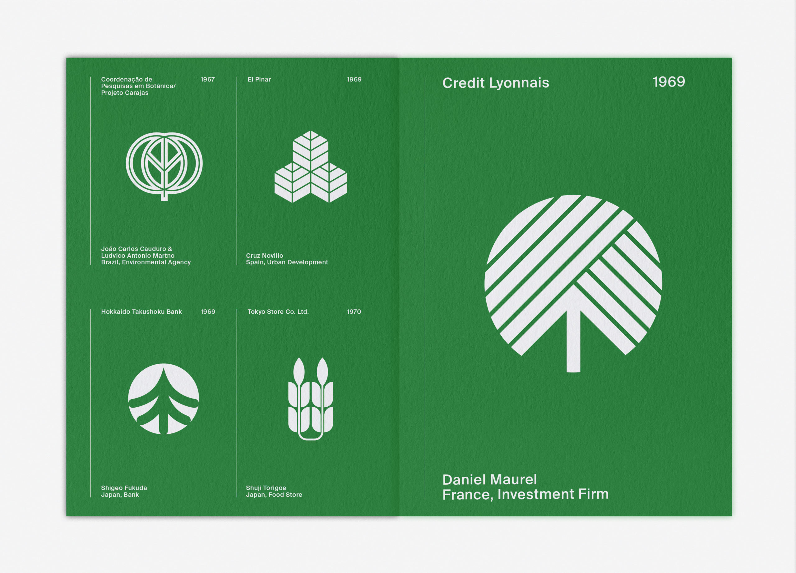
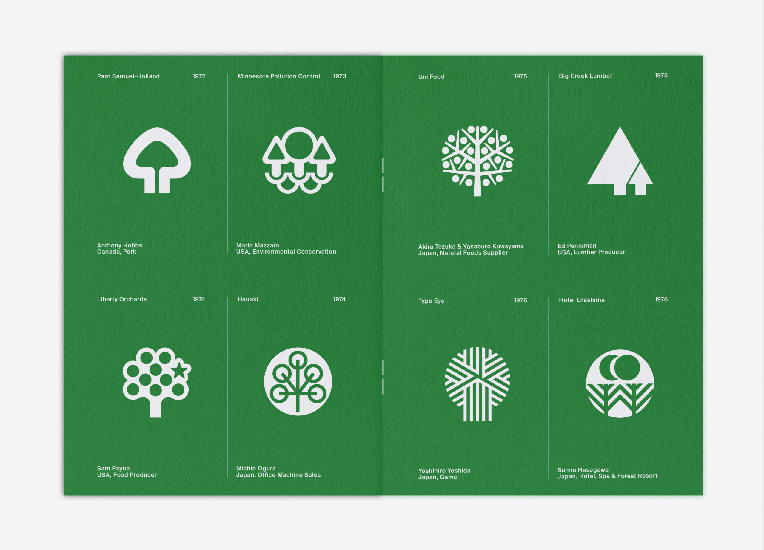
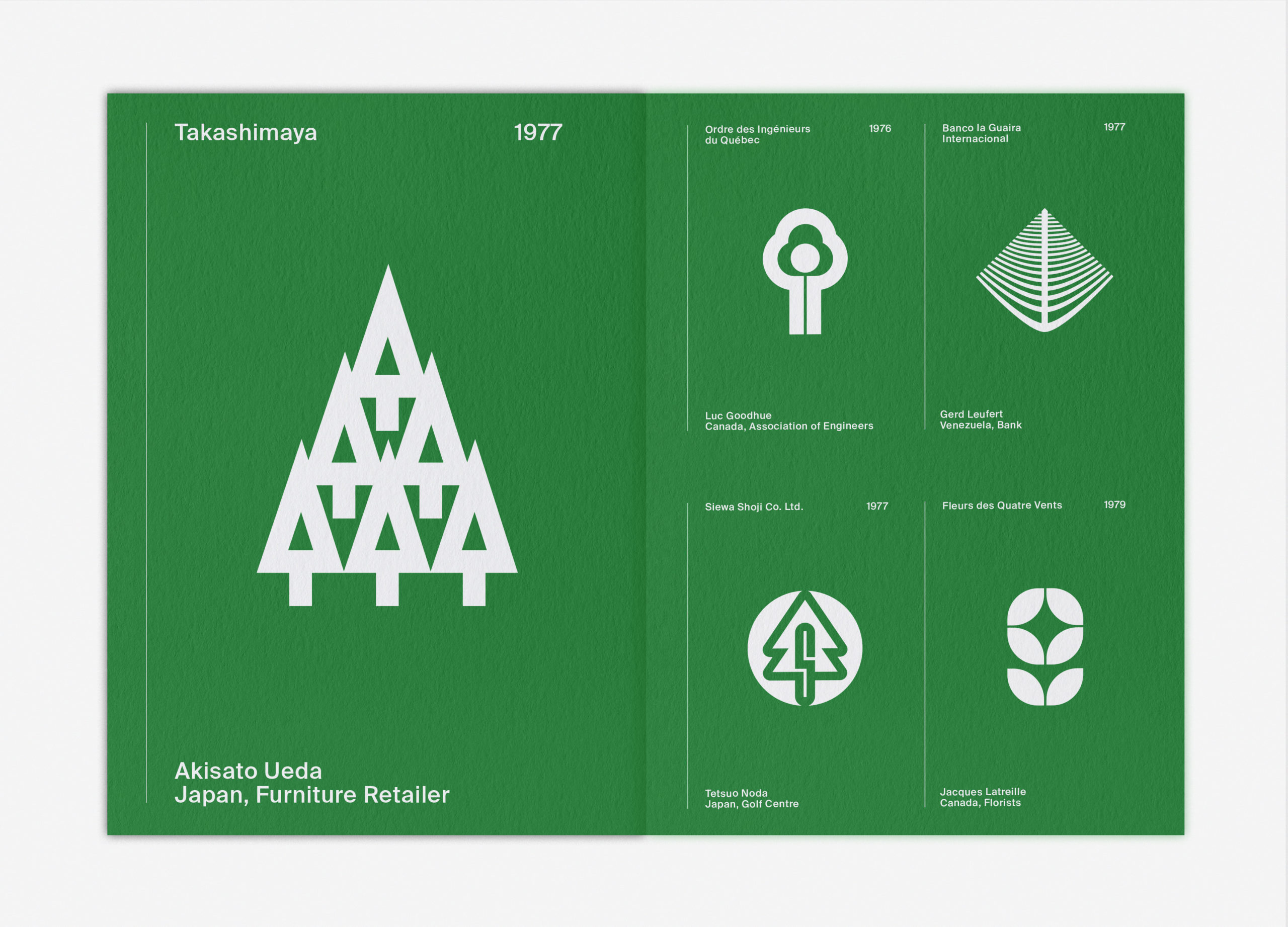
LogoArchive was conceived, designed and sent to print in a day. It was inspired by a panel discussion at Somerset House as part of the exhibition Print! Now on to its sixth numbered release, LogoArchive continues to reconfigure itself with each new issue with the intention of surprising and delighting, particularly at a moment of intentional difficulty. This issue, launched in time for Earth Day, celebrates the symbols that draw on nature for their inspiration.![]()
Order LogoArchive zines here.
And subscribe to Logo Histories here.
The book is an artefact shaped by the conditions of its time. These can be visible—intentional and apparent on the surface—and invisible, only revealed in the passage of time. LogoArchive is acutely aware of this temporality. So, alongside the documentation of the symbols of the past, the zine has always sought to introduce an element of the present into its content and materiality. This issue leans further into this, allowing the context of an unprecedented pandemic of our times to impose itself and give new meaning and form to old things.

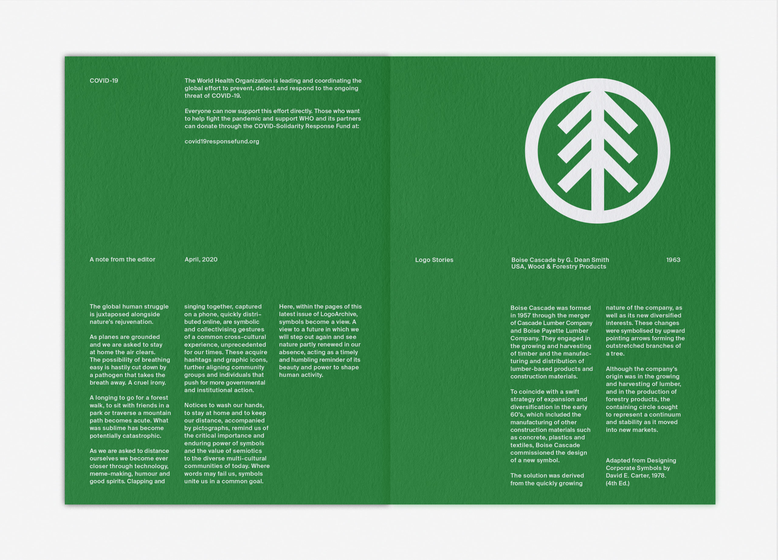
New financial pressures and the limited economic means of the editor due to the pandemic sees this new issue downsized and its numbers reduced. However, this imposition sees two new elements introduced, alongside more logos. Firstly, a new feature called Logo Stories, brought over from the Instagram account. And secondly, a participatory role, offering donations on the sale of each issue to The World Health Organisation who are leading and coordinating the global effort to prevent, detect and respond to the ongoing threat of COVID-19.
LogoArchive reconfigures the familiar format of a logo book into an ongoing series of zines. Its intention was to acknowledge and further the relationship designers have with the symbols of the past, offering an alternative that moves away from a book-form, project-based and inspirational utility towards technique and design craft. Fewer logos, a high-quality and unexpected materiality and an ongoing and recurring release schedule is central to this intention, and further, is in opposition to the passivity fostered by social media platforms, as well as seeking a more involved relationship with the symbols featured.![]()
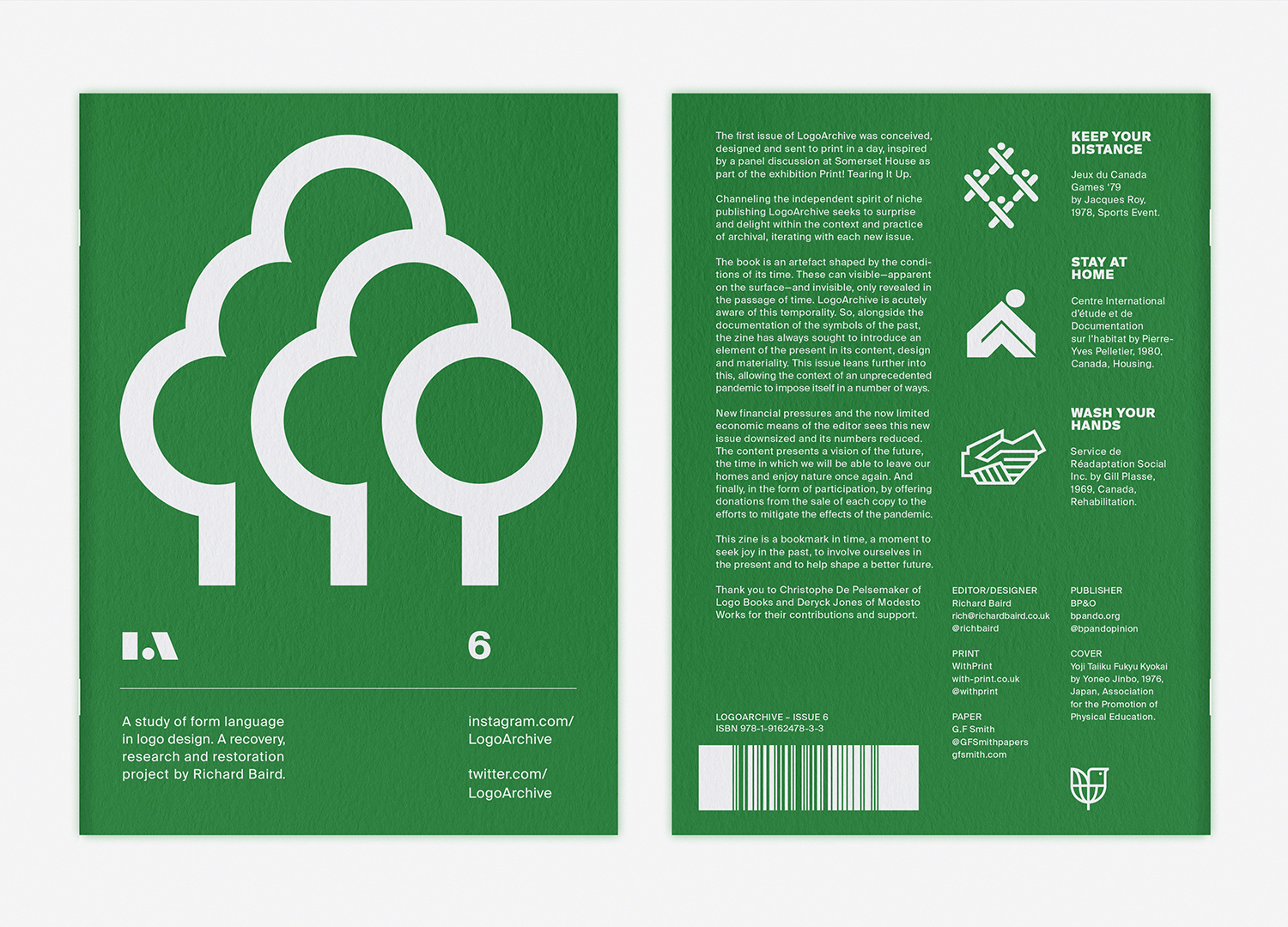
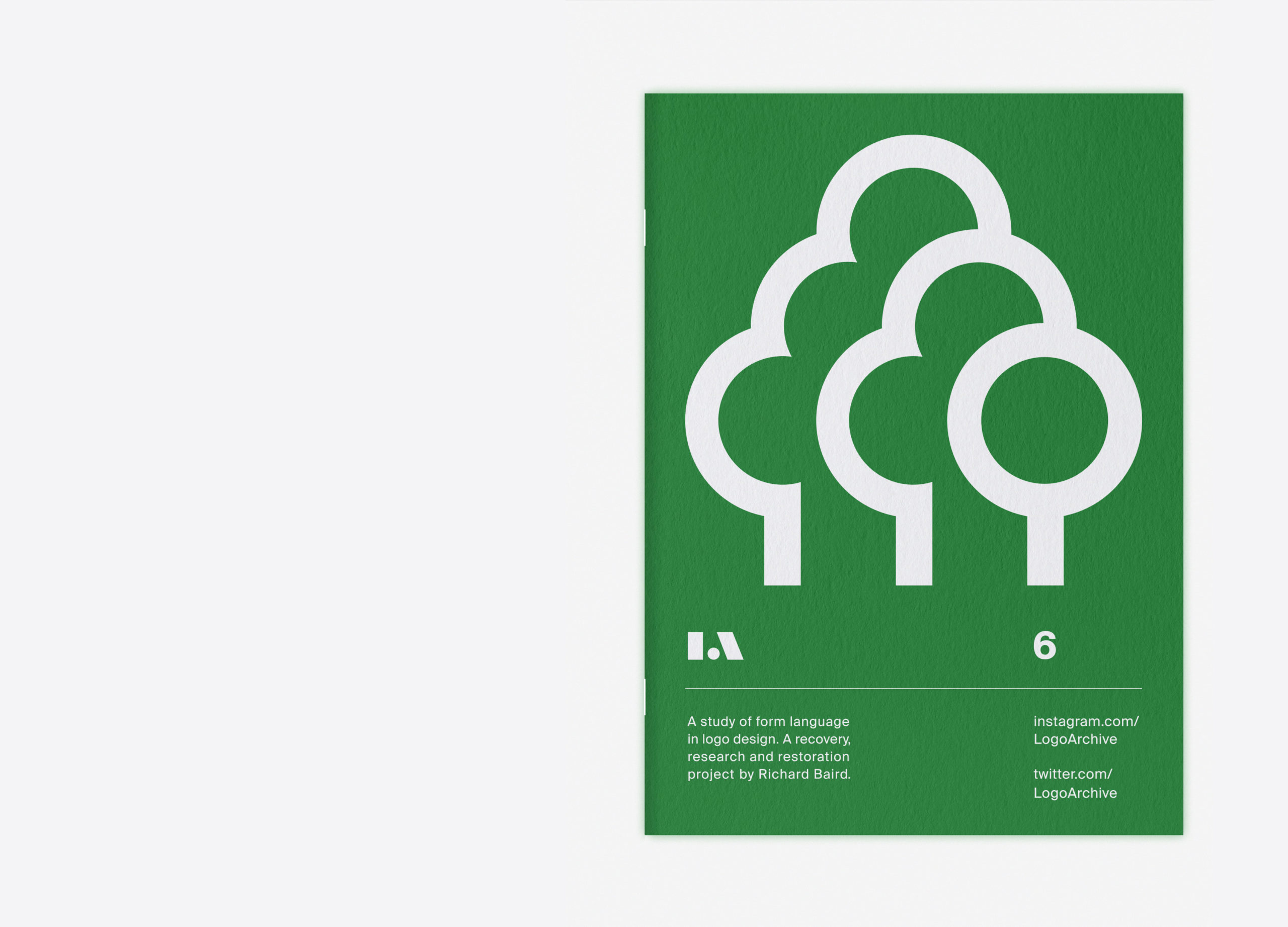
In a break from format, which usually sees the numbered issues printed on Colorplan Ebony, Issue 6 is printed on Colorplan Lockwood and bound with white staples. This augments the theme of trees and leaves and avoids the potentially somber qualities of black. Nature’s rejuvenation in our absence, and the desire to return to nature after a prolonged lock-down becomes the subtext of this issue. It offers a hopeful outlook and metaphorical view to the future whilst also reminding us of the precarious balance between nature and human activity.
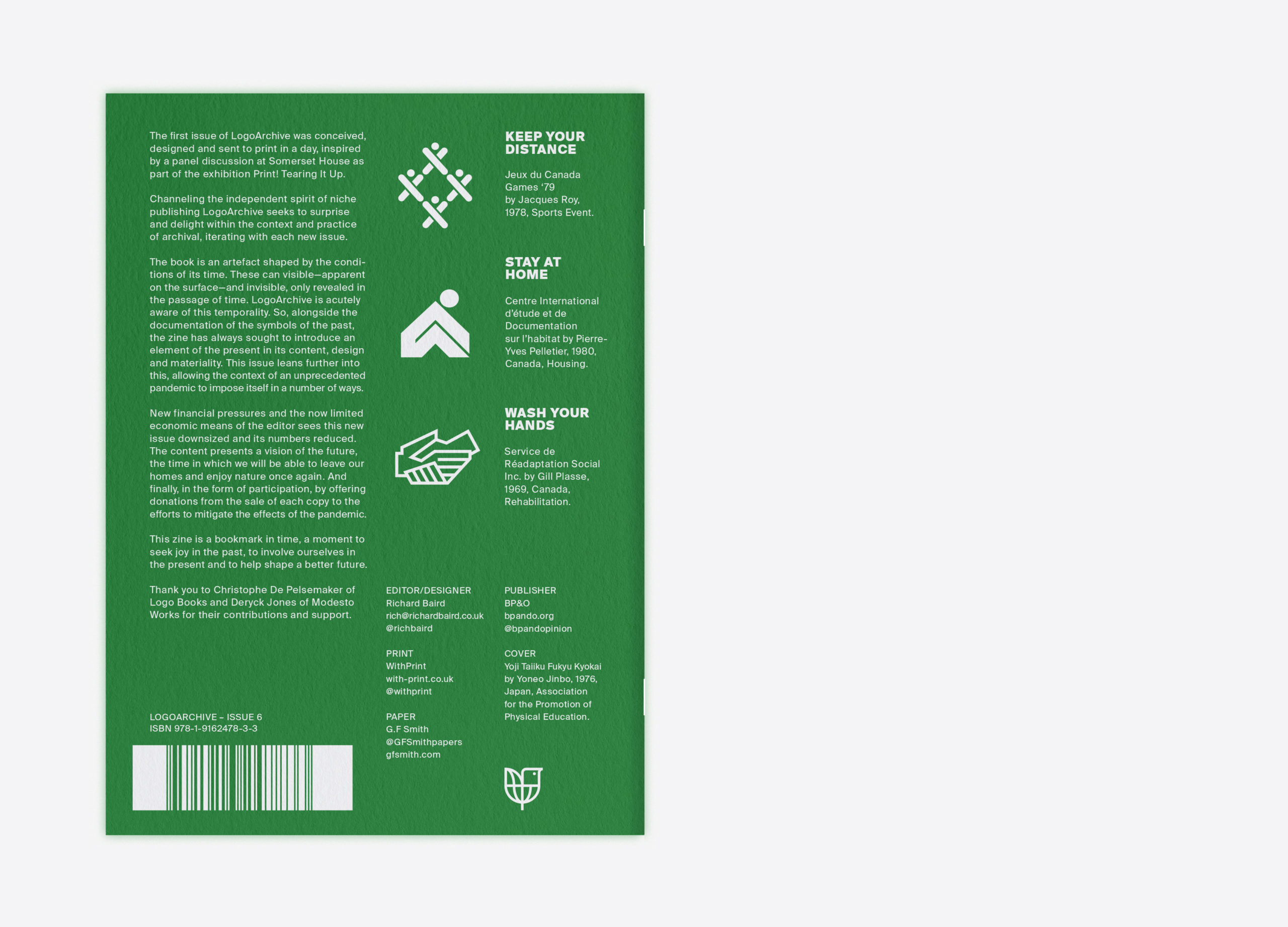
Notices to wash our hands, to stay at home and to keep our distance, accompanied by pictographs, remind us of the critical importance and enduring power of symbols and the value of semiotics to the diverse multi-cultural communities of today. Where words may fail us, symbols and the commonality of the human form unite us in common actions to reach a shared goal. With this in mind, and again allowing current conditions to shape the design of the issue, symbols of the past are given new meaning, the zine becomes a surface to remind us of our civic responsibilities, and perhaps offer a bit of joy in tough times.
LogoArchive Issue 6 is a 12pp booklet printed by With Print using five passes of a digital white on Colorplan Lockwood bound with white staples. This issue is available as a limited release of 300. Discover more about logo design at LogoArchive’s Logo Histories.