
Landscape’s “optimistic” rebrand of COVID testing and vaccine start-up Curative
The studio has crafted an Americana-inspired identity for Curative, which has administered almost two million vaccines in the past year.
San Francisco-based design studio Landscape has rebranded Curative with an ambition to position the U.S heathcare start-up as an on-the-go and “essential” service.
The studio has designed a new logo for the company, as well as a wider identity which rolls out over physical and digital touchpoints.

Curative was established in 2020 by Fred Turner with the aim of improving sepsis testing. In light of the pandemic, it pivoted to COVID testing – designing a PCR test that was approved by the U.S Food and Drug Association (FDA).
It also administers vaccines at over 500 vaccination sites across America. According to Curative, it processes around 35,000 vaccines every week and has administered more than 1.9 million in total over the past year.
Designing during a “turbulent societal moment”

The new visual identity had to “evolve the brand’s narrative beyond lab sciences”, says Landscape founder Adam Weiss.
“Based on research, we crafted a new narrative, positioning Curative’s offering as on-the-go, essential health services designed to keep people and their communities safe, healthy, and informed,” he adds.

One of the biggest design challenges was the project’s scope, Weiss explains. The brand had to have “nationwide appeal” and also communicate “complex information during a turbulent societal moment”, he adds.
It also needed to instill confidence, stand out visually, and resonate not only with diverse individuals but also public health authorities at different levels, according to the designer.
Weiss adds: “Centering on the design principles of universal accessibility, radical ambition, and collective power, we explored an evolved identity backed by a flexible design system that can support an ever-expanding array of brand touchpoints.”

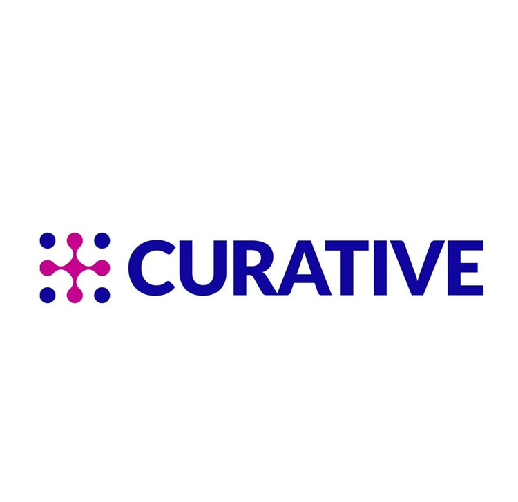
The new logo, which combines a star and arrow icon, hopes to “signal the organisation’s sense of urgency, clarity, and optimism”, Weiss says.
An updated wordmark is based on the typeface Söhne from New Zealand’s Klim Type Foundry which has been slightly adjusted.
Meanwhile the shift to lowercase hopes to convey a “warmer and more approachable dimension to the organisation’s community engagement efforts”, says Weiss.
“Americana-inspired sense of familiarity”

The “highly functional” wider identity “brings information forward, helps to orient, and feels much like a civic utility”, Weiss explains.
It comprises geometric shapes that are based on the 45- and 90-degree angles contained in the logo. These have been used on vehicle livery and at kiosks at test and vaccine sites.
The patterns support “a sense of energy and directionality without feeling decorative, superfluous, or unnecessarily premium”, he adds.

A colour palette of red-orange, white and blue hopes to reinforces the identity’s “optimistic energy” and also brings in an “Americana-inspired sense of familiarity”, Weiss says. This was important to build trust and confidence in the brand, he explains.
“Trendy cues” were avoided in the hopes of creating a long-lasting brand identity which could flex across applications, the designer says.
He adds: “The system is required to perform across digital touchpoints as well as physical ones, such as kiosks, vans, signage, and is designed to help regional operations teams implement the brand rapidly and consistently.”
“Communicating concepts with as few elements as possible”

Landscape has crafted a set of icons which are used primarily at testing and vaccine sites to communicate processes and instructions. The COVID tests are self-administered, for example.
There were especially important for a diverse audience which had to understand what was going on “regardless of their native language”, Weiss says.
These have been designed from simple, geometric shapes in mind in the hopes of “communicating concepts with as few elements as possible”, he adds.

The studio has also redesigned Curative’s website and scheduling app, again with a view to accessibility. On the website, photography of “real, relatable people” has been used as well as “iconography of processes” as a way to present Curative’s services “clearly and credibly”.
Elements like colour and typography have been used to give the digital platforms a “cohesive experience”, Weiss adds.
What do you think of Curative’s rebrand? Let us know in the comments below.

-
Post a comment


