
Call for Entries: Finding Forte
A global crowdsourcing campaign is looking for in-use examples of the ubiquitous yet overlooked script typeface

The call for entries is now open! Forte in use for a shop sign, spotted by Tom Koch in Siem Reap, Cambodia.

Trial No. 2 for Monotype Forte, as sent to and approved by John Dreyfus and Stanley Morison in May 1960.
It saw the light of day exactly sixty years ago and is arguably Austria’s most successful contribution to type design. We are of course talking about Forte, a bold brush script by graphic artist Karl Reißberger (1915–1983). Literally designed at a kitchen table in post-war Vienna, Forte was produced as a typeface for machine typesetting by the Monotype Corporation in England, and officially released in May 1962.
When metal type was all but dead, Forte got a new, larger lease on life. Microsoft licensed the digitized version and bundled the font with their Office software, starting with Publisher 97. This meant instant ubiquity: Forte was suddenly available on millions of computers across the globe. Reißberger’s typeface consequently appeared on shop signs in Mumbai, food packaging from Singapore, and manhole covers in Palermo. It also meant putting the font in the hands of people who weren’t always trained designers, and who happily squeezed, slanted, stacked, or tracked out its chubby letterforms. Like Mistral, it’s a brilliant design that has fallen into disregard after years of amateur use.
Viennese graphic designer Tom Koch wants to remedy that and shine a new light on Forte. Together with Reißberger’s daughter Mara, Koch exhaustively researched its history. Coinciding with the typeface’s sixtieth anniversary and the twenty-fifth anniversary of its adoption by Microsoft, Koch is putting together an exhibition that will be shown at the Designforum Wien in October 2022, as well as a book that will be produced with the cooperation of Slanted Publishers. The project as a whole is accompanied by a crowdsourcing campaign titled Finding Forte, and a dedicated website has been set up to gather in-use examples from around the world.
If you’ve spotted Forte in the wild, submit your finds and help document Forte’s global spread. Every image included in the book will be credited by name as a gesture of thanks. A selection of the most interesting in-use examples will be published on Fonts In Use. Happy Forte spotting!

Detail of the growing gallery on the Finding Forte website, with some of the first finds of Forte in use.
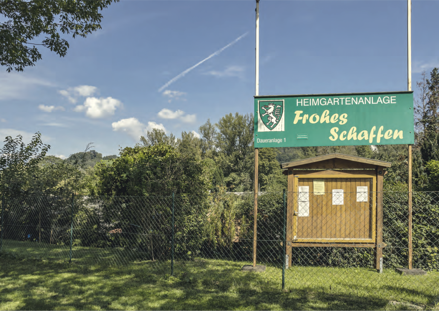
Frohes Schaffen – have fun finding Forte!

")

</cite>")


 identity")


