
Pentagram gives cancer charity a “passionate but considered” rebrand
Blood Cancer UK has a new name, logo as well as guidelines for tone of voice and photography, designed by Pentagram’s Marina Willer.
Blood Cancer UK has a new visual identity – including logo as well as guidelines for visuals and tone of voice – designed by Pentagram partner and graphic designer Marina Willer.
The charity has also been re-named; it used to be called Bloodwise. It is the second time the charity has been renamed in five years. Before Bloodwise, it was known as Leukaemia and Lymphoma Research.
The charity supports those affected by blood cancer – including patients’ families, friends and carers – as well as funding into cancer research. It is the only UK charity that supports those affected by all types of blood cancer. While there are over 100 types of blood cancer, the three most common types are leukaemia, lymphoma and myeloma.
The charity was founded in 1960 by David and Hilda Eastwood after their daughter Susan died of leukaemia. At the time, the mortality rate from the cancer was higher and so the Eastwoods started fundraising to find a cure. Over its 60-year history, the charity has spent over £500m on blood cancer research.
Seeking clarity

However, in recent years the charity has faced a funding problem. In a blog post, the charity’s CEO Gemma Peters, writes that since she joined in 2017, its income had been “declining at a time when other charities’ income was going up”.
Among other structural issues, she says that a part of this owed to a lack of brand recognition. “It became increasingly clear that the name Bloodwise wasn’t just failing to communicate what we did. It was giving people the impression we did something else,” Peters adds.
Of the timing for the new launch, Peters says that coronavirus has added a greater degree of urgency: “People with blood cancer are at a much higher risk of becoming seriously ill if they get the coronavirus, and so we’ve seen demand for our services dramatically increase.”
“Caring and scientific, passionate and considered”

The new brand identity aims to bring together the charity’s wide scope – from research to emotional and practical support – as well as drawing on its “emotional connection” of its backstory. Pentagram’s Willer tells Design Week: “We needed a name and a language that was both caring and scientific, passionate and considered.”
The design team came up with the idea of using ‘Because’ as a central theme for the identity, which draws the many themes together. “We proposed the language around ‘Because’ to link back to their cause: to beat blood cancer and to help those affected by it,” Willer adds.

This appears prominently on campaign posters. One poster reads “Because of Laura” while another highlights fundraising opportunities with the line: “We cycle because of Rob”. It aims to retain an emotional resonance. In one poster depicting a woman and a newborn baby, it reads: “Because Alex only has a 1 in 3 chance of surviving.”
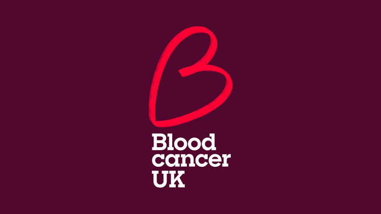
A multi-purpose logo
As well as setting a tone of voice for the brand, ‘Because’ dovetails into the charity’s new logo which is a hand-drawn B. The B links to ‘Because’ and also resembles a love heart, which is a “simply symbol that embodies passion, conviction and kindness,” according to Pentagram.
In keeping with the rest of the identity, the logo is red which “expresses its passion”. The typeface Sharp Slab has been used for the logo and headlines, while Roboto has been used for body copy and digital.

Moving away from typical charity imagery

Pentagram has also created a new “simply and straightforward” photography style for Blood Cancer UK. It focuses on people and mostly when they are together, Willer tells Design Week. As well as conveying “genuine moments of human strength”, this has a practical benefit for the charity.
“A charity of this scale that needs constant imagery would not be able to invest in photoshoot productions,” Willer says. “We’ve tried to show how photography can become ownable even when produced without too much preparation.” It’s also an attempt to “move away from the typical imagery used in the charity sector”.
Pentagram also created animations for the charity, and the identity appears on physical material such as tote bags and T-shirts.

-
Post a comment


