
A refreshing new identity for wine connoisseurs SommSelect
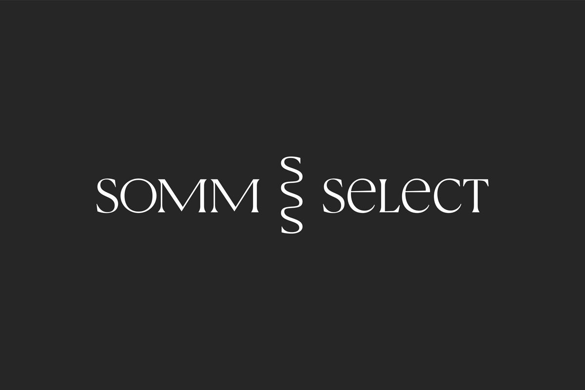
A corkscrew-inspired ‘S’ logomark is at the heart of the wine subscription service’s new look, which was led by designer Deva Pardue
SommSelect was founded in 2014 by master sommelier Ian Cauble as a way of bringing the sommelier experience home for curious wine drinkers.
While the world of wine, and particular sommeliers, has traditionally been characterised by stuffiness and exclusivity, SommSelect is making it more accessible via its subscription service and an ever-evolving online wine shop.
Following the appointment of its first marketing and creative director, Melissa Saks, the company decided its visual identity also needed a refresh.
The rebrand comes off the back of huge growth amid the pandemic and the forced closure of bars and restaurants, with SommSelect’s wine club subscriptions up by 300% in the last six months alone.

Saks brought in Deva Pardue, formerly of Pentagram and The Wing, to lead the rebrand and draw in a new generation of more adventurous wine drinkers.
The refreshed visual identity nods to the sophistication of the sommelier experience, while also looking to elevate it to a more modern and approachable place.

A new logomark leverages the prominence of the letter ‘S’ in the company’s name to create an elegant, corkscrew-like letterform.
The wordmark is based on a customised version of the primary brand typeface, Canela by Commercial Type.

Pardue worked with type designer Jesse Ragan of XYZ Type to perfect the custom lettering and logo mark, and brought in Phil DiBello and Devin Washburn of No Ideas for the accompanying website redesign.
New lifestyle and product photography based on the refreshed identity has also been introduced, which was shot by Greg Golko and prop styled by Natalie Papova.

Latest from CR


