
Echo designs Kleenex’s new product range to avoid “moments of distress”
The Proactive Care range will feature face masks, hand sanitisers and wipes and aims to reassure consumers amid the anxiety of the pandemic.
London-based studio Echo has designed the packaging for Kleenex’s new line of personal hygiene products.
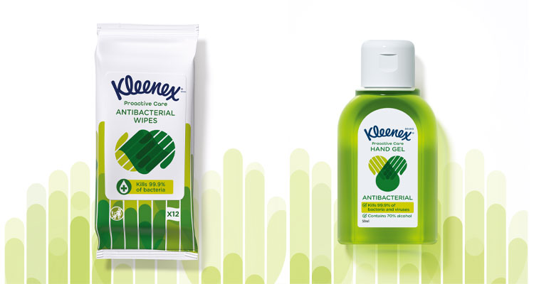
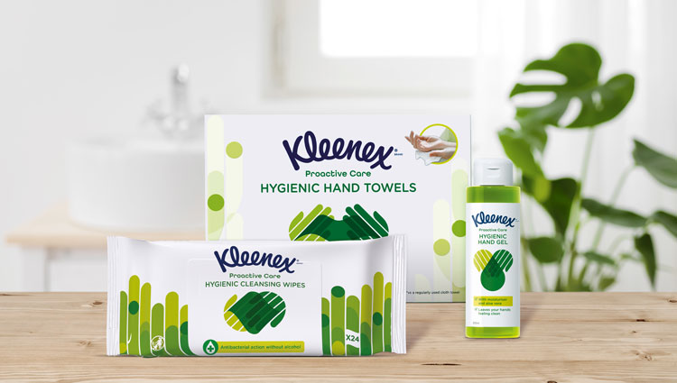
The Proactive Care range will feature products like face masks, hand sanitisers, antibacterial wipes and hand towels. It comes to the market at a time of heightened awareness of personal hygiene because of the coronavirus pandemic.
The aim for the new line is to help consumers adopt “progressive yet simple” hygiene rituals, while not contributing to the climate of anxiety around germ transmission. Echo was chosen for the quick turnaround role and delivered the project in three months – a record time for the studio.
“We wanted to encourage people to feel comfortable”
Echo was tasked to design packaging that could help Kleenex “meet consumers’ changing daily needs”, according to studio innovation director Tashi van der Waerden.
The intention was to get away from the idea these products would be brought in “moments of distress”, but instead form part of a healthy everyday hygiene routine, she says.
“We wanted to encourage people to feel comfortable and motivated to use products like hand sanitiser and masks in their daily routine so that they can feel better prepared for the cold and flu season, this year especially,” van der Waerden adds.
“Consciously departing from clinical blues”
The studio team has opted for a green colour palette across the range. This was a deliberate choice to position the products away from “clinical blues”, Echo creative director Nigel Ritchie says.
“We chose a vital green palette to inspire feelings of resilience and optimism,” he says. “By consciously departing from clinical blues we were able to shift perceptions from distress purchase to a proactive wellbeing choice.”
Also present across the line is a series of illustrations showing depicting interlocking hands. The intention here to show how Kleenex understands the important of human touch, and that these products can facilitate this safely. This also helps to unify the range, which is by its nature features eclectic packaging shapes and materials.
“We wanted a simple, clean and iconic visual identity that married the family values of the Kleenex Masterbrand with the necessary re-assurance of anti-bacterial codes,” Ritchie adds. “The hand motifs were a simple way of combining the functionality of the products with a human touch encouraging usage and adoption.”

“Streamline what could otherwise be an anxious process”
To further provide accessibility, the team has also designed the packaging with a clear typeface and “open, approachable and helpful” descriptions. For a new range coming to market, this is essential, the team adds.
“Supplemented by simple icons, the illustrations and descriptions aim to simplify and streamline what could otherwise be an anxious process for some consumers,” the studio says.
Additionally, the packaging has been created to be readable from a two-metre distance. This is a new consideration for the design process, but one the studio says is incredibly important. Being able to read the type from a distance means potential customers do not have to touch the products on the shelf before deciding if it’s right for them.

-
Post a comment


