Email marketing can be extremely effective when it’s done correctly. Through your email list, you’ll be able to bring your customers back to your brand to increase sales or readership
When it comes to designing a highly effective email, there are a few different ways you can improve your chances of getting great results. Here are three specific tips you can implement right away.
1. Design With One Action In Mind
The most effective emails will direct readers toward one specific goal or action. Giving readers lots of different options will only dilute the results.
In many cases, the goal of your email will be to get the visitor to click on a link and visit a specific page on your website. It could be a blog post that you want people to read, a sales page, or some other type of page.
While it’s possible to include lots of different links in an email, a more effective approach is to design with just one action in mind and push readers to that one specific goal.
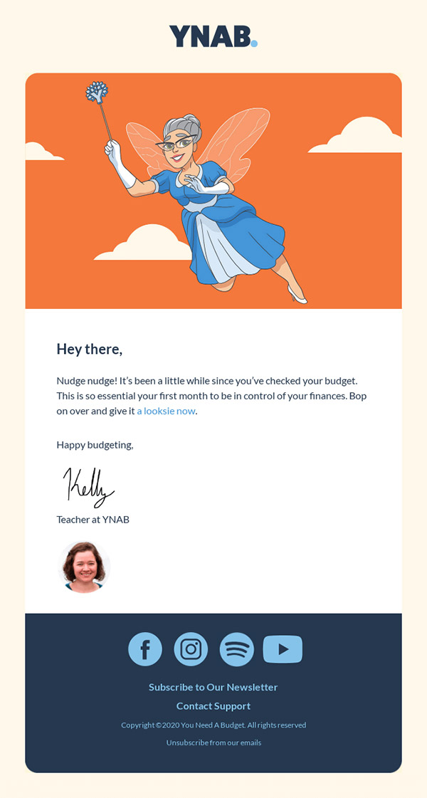
The email shown below is used by You Need a Budget to re-engage users that haven’t been active. There is one clear purpose of this email: encourage the user to click and open the app or website.
2. Less Is More
About half of all emails are opened on a mobile device (source), and that percentage seems almost certain to increase over the next few years. When you’re designing an email, you need to consider the context or situation of the people who’ll be reading that email. Most people are in a rush and they don’t want to dedicate a lot of time to read a long email. The longer your email is, the less likely it will be read, and this is especially true with people who are checking email on a mobile device.
Get millions of stock images and videos at the best price
Unlimited access. No attribution required. Starts at just $9/month.

Including too many images will also make your email take longer to load on a mobile device, which increases the chance that the recipient will lose interest and navigate away.
The most effective email designs are simple. With many emails, there is no need for long text or for lots of different images and photos. Your email should include enough to get the point across, and nothing more.
As designers, we love to see beautiful visual creations. However, effective emails don’t need to be complex in order to look good. There’s no need to include three images when just one will do.
Avoiding unnecessary bloat in your emails will also help with the first point of designing with one action in mind. Adding too much to an email can create distractions that take away from the message. Instead, keep it simple and direct readers toward the one action that you want them to take.
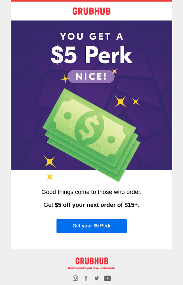
The email below from Grubhub includes only an image, a headline, two additional sentences of text, and a button. The message is short and to-the-point.
3. Choose a Button Color That Stands Out
Color is obviously a big part of graphic design, and the colors that you use in your email design can also have a real impact on the results. If you’re designing to direct readers to a specific action, your emails will include a call to action (CTA) that leads readers to the desired action. With many emails, the CTA will be a button.
If you want to direct email subscribers to a specific page, you’ll need to be sure that the buttons in your emails stand out. Using a clutter-free design will help, but you also want to use a button color that stands out. Be sure to choose a button color that contrasts with the rest of your email in a way that makes it extremely clear what a user should click.
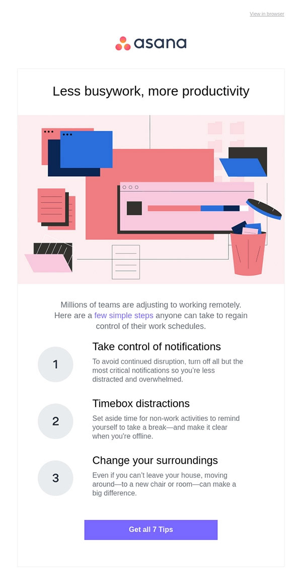
This email from Asana uses a nice purple button that stands out.
Final Thoughts
Keeping these tips in mind when you’re designing emails will help you to get the action that you want from your subscribers. If you’ve been struggling to get results with your email marketing, put these tips into action right away.
Lead image by inuyasha.tp837217.