
Pentagram creates homely and positive identity for Maggie’s cancer charity
The agency has created a new identity and website based around the concept of home, representing the charity’s focus on providing comfortable and homely environments for cancer patients and their families
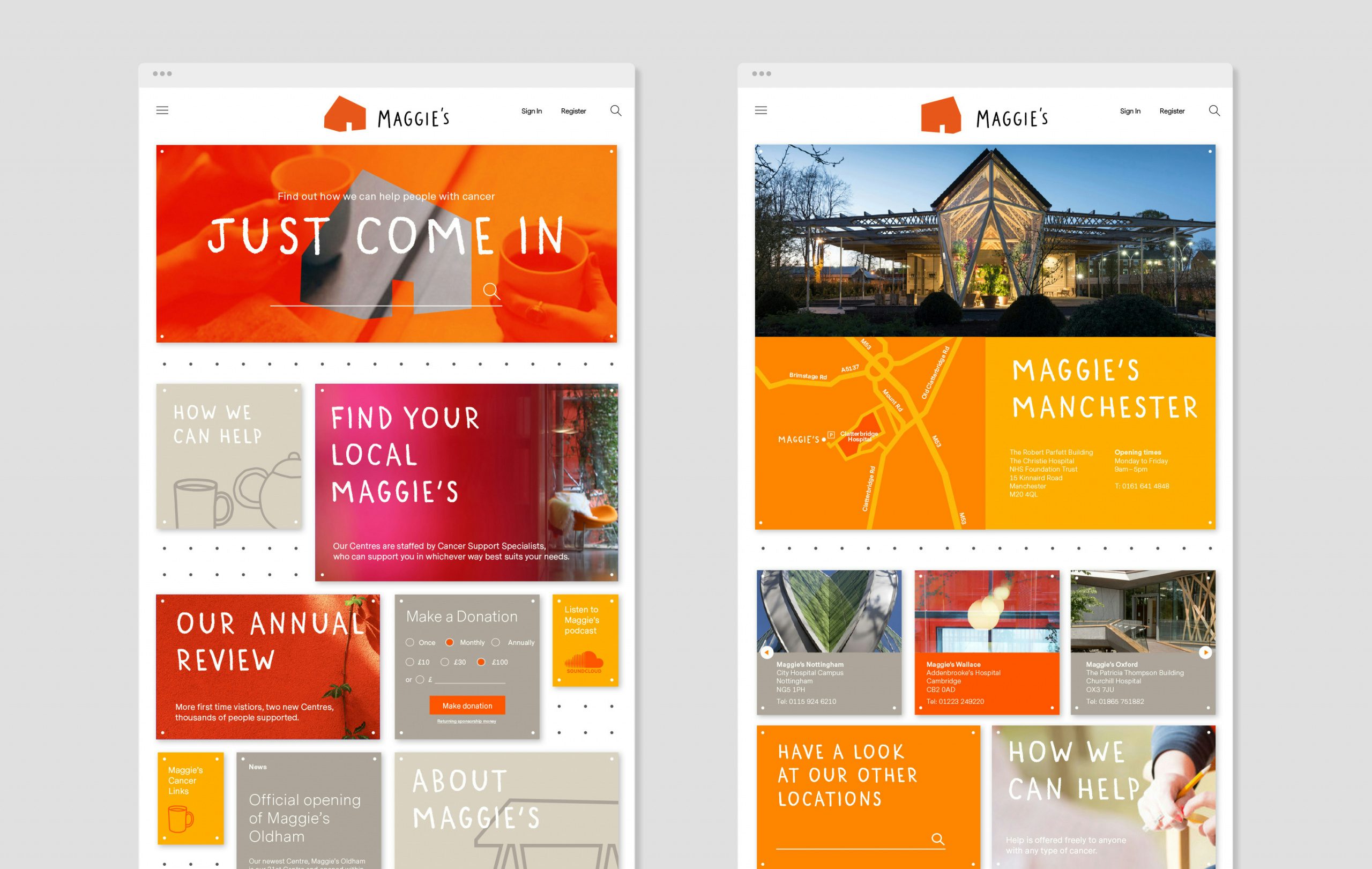
Marina Willer and her team at Pentagram London have created a new brand identity for cancer care charity Maggie’s, having worked with it for the past two years to gradually roll out the new look, which has now culminated in a new website.
The organisation provides free cancer support and information for people with cancer and their family and friends from support specialists, psychologists, nutritionists, therapists and benefits advisors in centres across the UK and online.
“Maggie’s was looking for a brand identity that was more visible than before, and would help them stretch from just campaigning to caring and supporting,” says Willer. “They needed to express their point of difference more clearly from lots of other voices in the charity world.”
The team started the identity project by “helping define or articulate the unique perspective a client brings to the world” – in Maggie’s case, being the “everyone’s home of cancer care”, says Willer. It then helped Maggie’s to create a new website (which is still in development )and explored how the brand could work across multiple platforms – from print to social media and internal touch points.
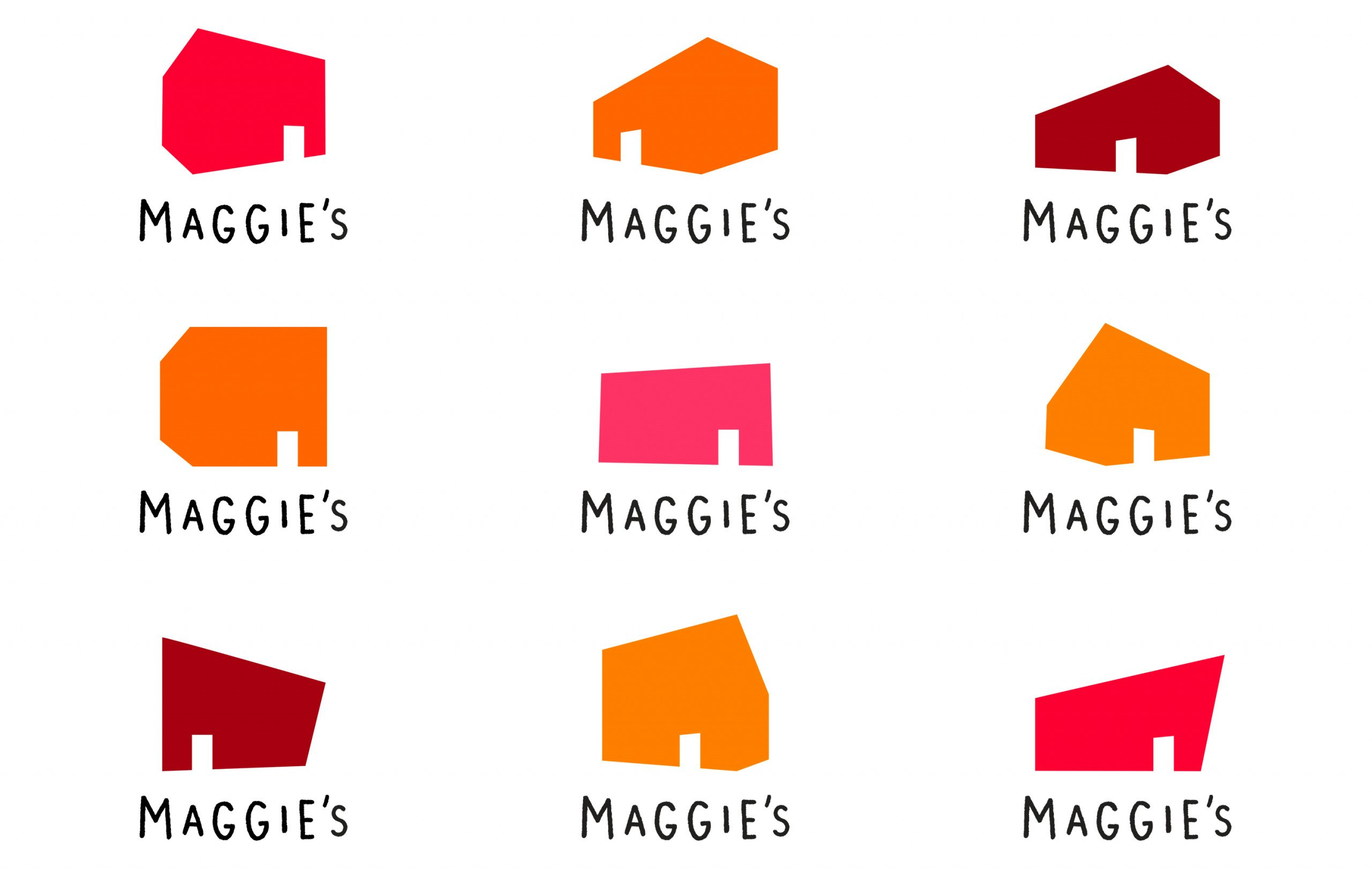
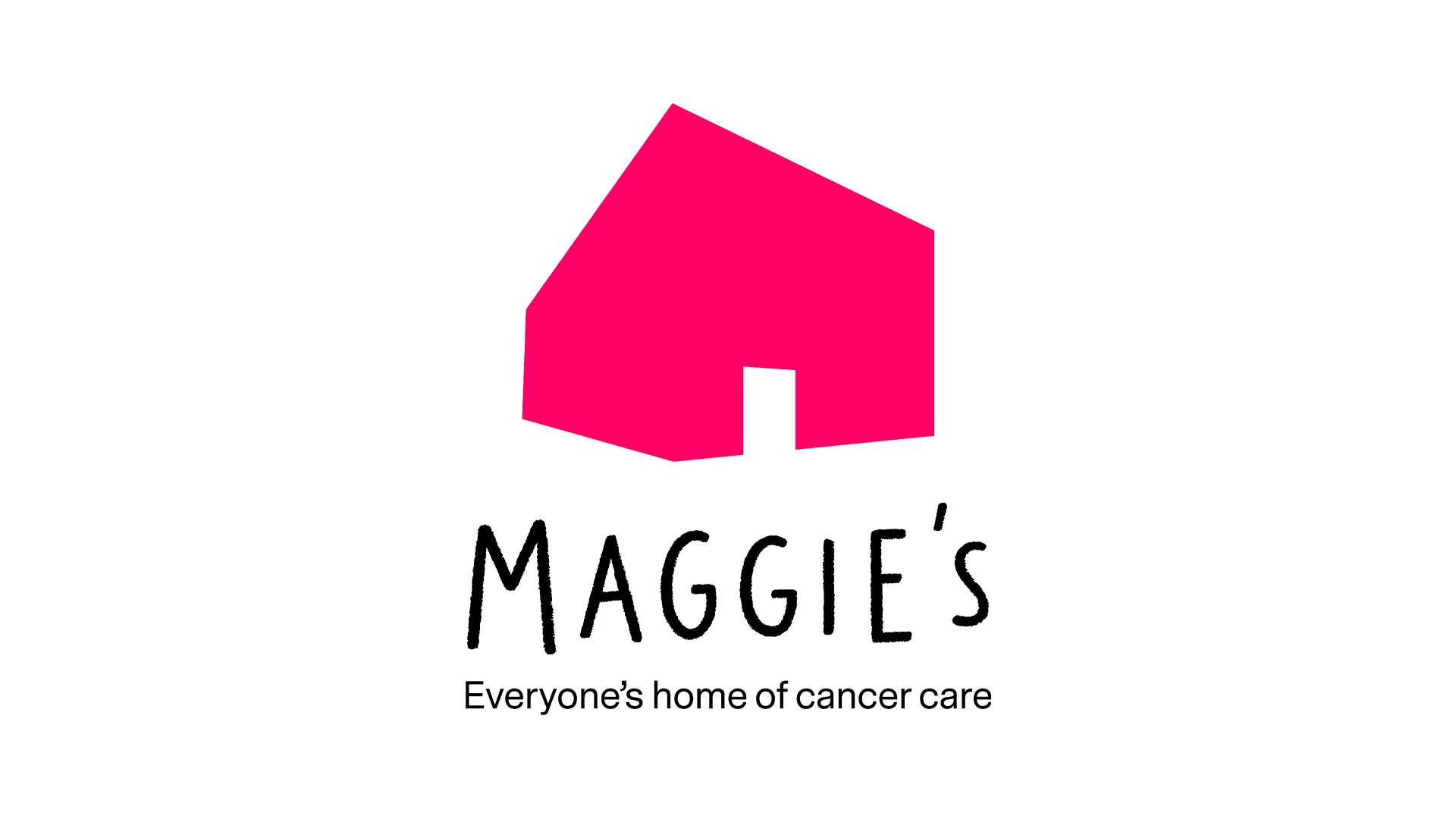
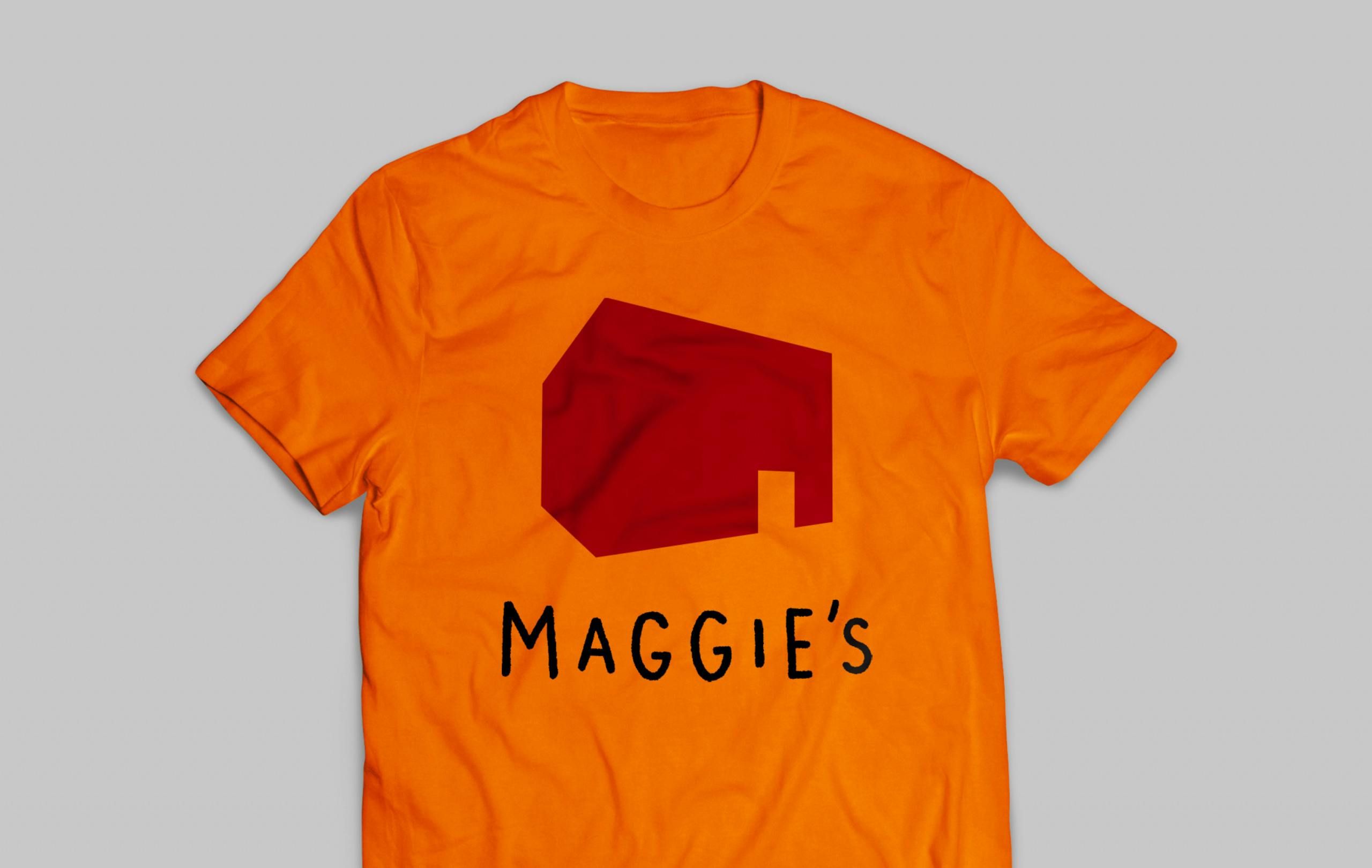
The identity is based on the idea of home – reflecting the idea that Maggie’s centres provide a homeliness and comfort to many of their users. With this in mind, Pentagram set out create a look that was vibrant and uplifting, combining a bright colour palette of red, pink, yellow and orange with a house graphic that comes in various shapes.
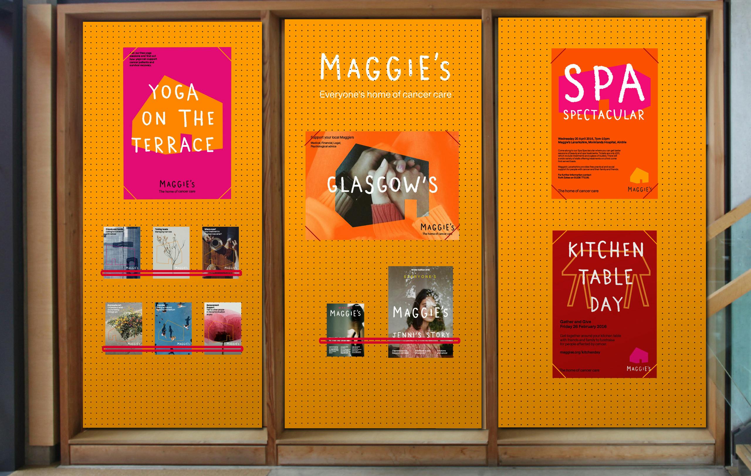
The house symbol is used as part of a logo family across different applications. It can also be used as a standalone graphic, background image and holding device on posters, flyers, online applications and more.

“The colours are inspired by the spaces themselves,” says Willer. “Instead of the clinical lighting or materials that are often found in a clinical environment, the centres have very warm natural colours, tending towards tones of orange. In the same way that the new house logo has multiple shapes, we felt that a range of warm colours was more suitable to represent a family of spaces than just one. Each centre is quite individual, but all are extremely welcoming and ‘home-like.’”
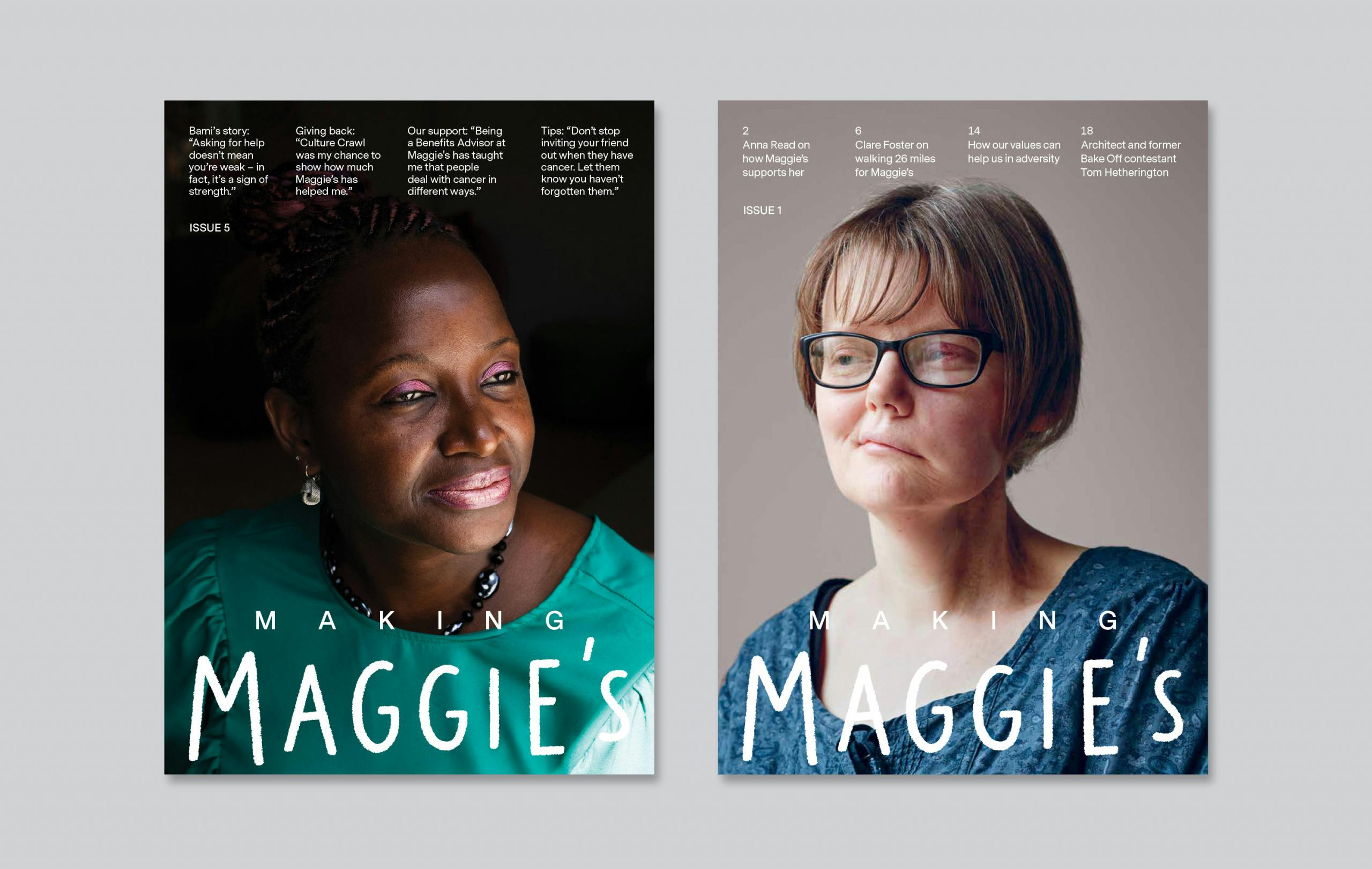
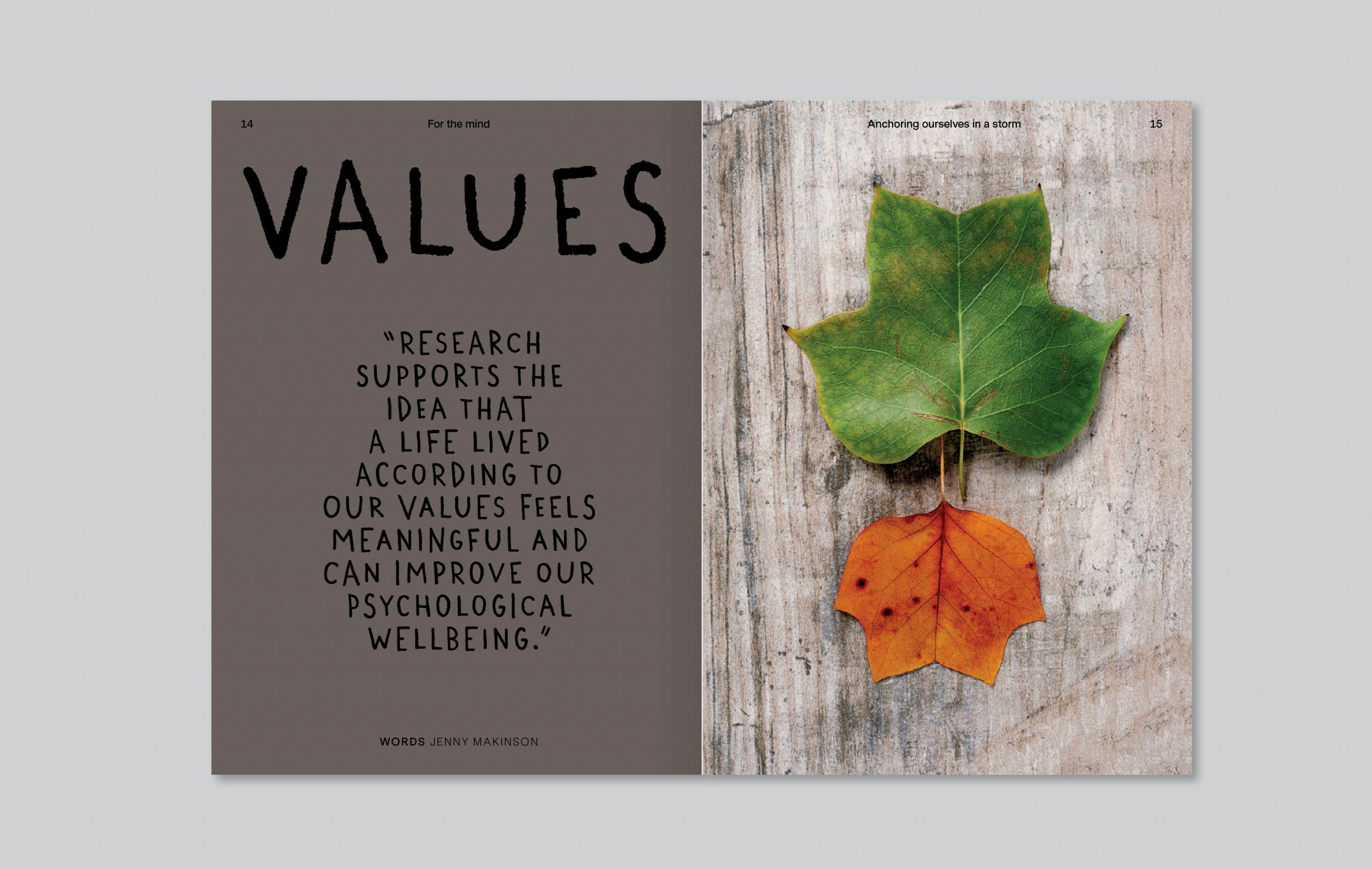
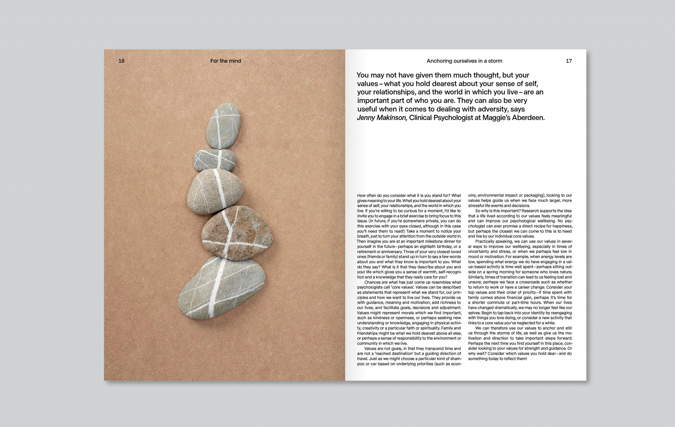
A bespoke typeface was created, along with a “human and practical wordmark” set in entirely in upper case to resemble an architect’s handwriting (and avoid any possible confusion with the charity’s founder’s personal signature). Pentagram also redesigned Maggie’s magazine to give it a more lifestyle-like feel – and avoid the “institutional and unappealing” feel of many charity publications. The redesign extended to communications for hospital noticeboards and Maggie’s centres, which are again designed to feel human – rather than cold, clinical or impersonal.
As Pentagram points out, the bold, friendly designs align with the ideas of Maggie’s founder Maggie Keswick Jencks, who has promoted the progressive idea that its spaces should offer an “antidote to the institutional and unwelcoming environments that people living with cancer often have to spend time in”.
Centres are deliberately informal, with a domestic rather than clinical feel: staff don’t wear badges, for instance, and kitchen tables are used instead of reception desks to help visitors feel at home – popping in, perhaps, to have a cup of tea with others in a similar situation, or take a quiet break from treatment or caring responsibilities. Each of its 22 centres in the grounds of NHS hospitals are designed by leading architecture practices, including Zaha Hadid, Rem Koolhaas and Richard Rogers, and each one is unique.


“Having these amazing physical spaces (which gave them the framework to look after and support people affected by cancer) is the main way in which they differ from other organisations,” explains Willer, who was recommended for the identity work by Ab Rogers, who she has collaborated a number of previous projects with. “The fact that Maggie’s centres are open to everyone and designed by ground-breaking architects to create the best possible outcome is remarkable.”
The new Maggie’s website launched last week on 12 February – the same day that the organisation’s CEO Laura Lee was named became a Dame as part of the queen’s Special Honours list.
Latest from CR


