Visa launches new brand identity system
The new system capitalises on Visa’s recognisable colours, and aims to show that it’s “more than just a credit card company” with a new focus on brand purpose
Branding agency Mucho revealed the early stages of Visa’s brand evolution last summer, and the financial services company has now launched the full update to its brand identity system. The agency highlighted that “to most people, Visa has been synonymous with credit and debit cards”, and one of the key aims of the new branding was to “ensure it is seen as more than a credit card company”.
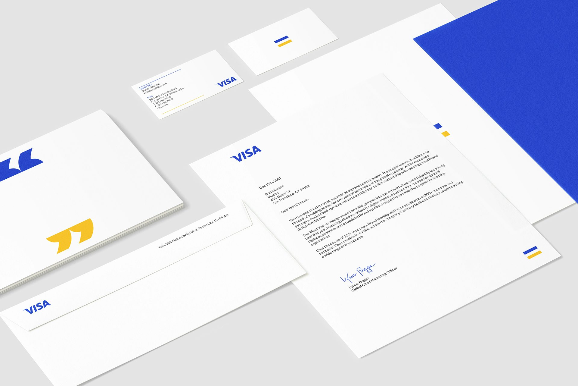
Based on 200 hours of stakeholder conversations, the agency also developed a new mission statement for Visa that leans into brand purpose: “We believe that economies that include everyone everywhere, uplift everyone everywhere.” This philosophy is tied into the brand symbol, an equals sign, which has been extracted from the recognisable bars that were historically used in the Visa logo lock up prior to 2005. “The symbol has always been there – we just dialed into the opportunity to use it in a creative way,” said Mucho creative director Rob Duncan.

Key to the new branding system was establishing consistency worldwide while helping the existing design elements – such as the Visa wordmark – work harmoniously in digital environments, adjusting colour palettes to work better on digital touchpoints (namely small mobile screens) as part of this.
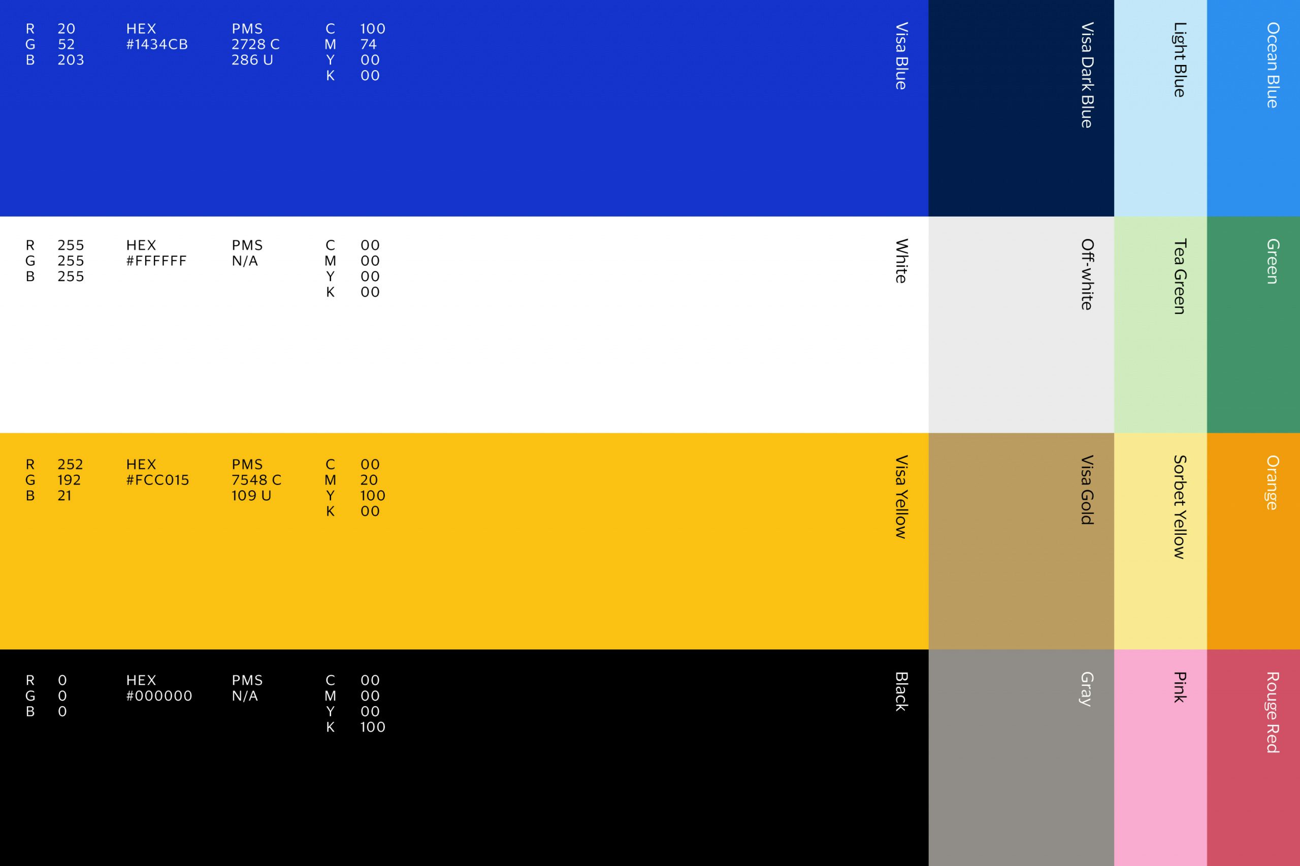
The agency developed an iconography and illustration system, brought together by the Visa colours (shown below), and worked with Commercial Type on a new typeface, Visa Dialect, which was designed with legibility in digital executions in mind. Mucho also focused on enhancing Visa’s B2B standing with a sleek range of assets using motion design, made with the help of creative studio Field.io.


