
The identity for second-hand search platform SrchPop resists “fusty preloved clichés”
Supple Studio has designed the visual identity for the American second-hand search site, finding inspiration in the search bar icon.
Bath-based design consultancy Supple Studio has created the new identity for second-hand retail platform Srchpop, which centres on the search bar icon.
The work comprises a new logo, web redesign and tone of voice. It rolls out across the SrchPop’s website, phone app and campaign visuals.
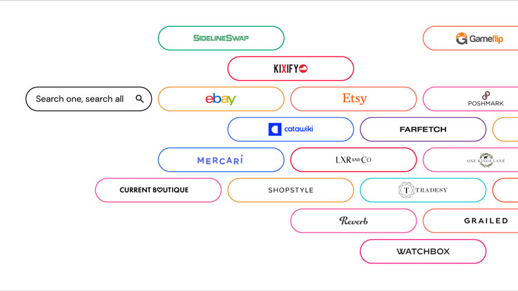
Established for the American market, SrchPop lets people search multiple online marketplaces like eBay, Amazon Warehouse and Etsy for second-hand products at the same time.
“We wanted the brand identity to be a mixture of old and new,” Supple creative director Jamie Ellul says. “You’re using new technology to find the best vintage and pre-loved stuff.”
“Clean and understated”
Ellul says that the redesign focused on the platform’s unusual offer. “Shopping search engines have proliferated over the years, with Google Shopping being the go-to for most people,” he says. SrchPop’s identity had to make the focus on “preloved products” and its benefits immediate to people, Ellul adds.
The design team aimed to create a “clean and understated” identity to accommodate the range of third party photography, Ellul says. While that was important for the user experience on the app, the visual components can be “dialled up with colour and energy when needed”, according to the designer.
The centre of the new identity is the search bar icon, arranged in a rainbow-coloured circle for the logo. “It uses the universal language of search bars but gives it a rainbow twist,” Ellul says.
The logo was born out of the perceived primary benefits of Srchpop – “the ability to carry out multiple searches at once,” he says. “It also doubles up nicely as a visual mnemonic for the brand name, being a search and a ‘pop’.”
The search bar symbol can be used at all sizes, according to Ellul. It appears in the Chrome extension and app icon, for example, and they can also be used to showcase any products on the site.
They can also break out of the lockup and create colourful graphic illustrations that “carry on the idea of plenty, energy and joy”, Ellul says.
Avoiding “any fusty clichés”
The typeface Doyle from Sharp Type foundry has been used for the logotype and body font. Ellul explains that this is a modern interpretation of Cooper Black and ITC American Typewriter which “gives it an instantly and iconic American retro feel”. It also ties in with SrchPop’s American audience, according to the designer.
These choices were an attempt to “avoid any fusty clichés around the world of preloved”, Ellul adds. “Second-hand is increasingly seen as a cool and more conscientious way to shop,” he says, and the typefaces seek to embrace that while also nodding to the world of vintage.

Tone of voice has been created in collaboration with totalcontent. “We wanted the copy to feel friendly and inviting,” Ellul says. “But it also needed to be practical and explain the offer – which for some users could be unchartered territory.”
The identity aims to “reflect the gratification and joy that can be found in a second-hand treasure hunt”, he adds.
What do you think of SrchPop’s identity? Let us know in the comments below.

-
Post a comment


