Climate crisis campaign Zero Hour!’s identity designed for cross-party appeal
London studio Among Equals has crafted the campaign, which takes inspiration from 1940s propaganda and reframes Churchillian language.
Among Equals has created the identity for Zero Hour!, a climate crisis campaign which hopes to gather support for the Climate and Ecological Emergency Bill (CEE Bill).
The London-based studio has created a bee-inspired logo, visual identity and strategy guidelines for the environmental campaign.
The CEE Bill is a potential law that seeks to ensure that the government would fulfill obligations set out by the Paris Agreement and work to protect ecosystems, among other measures.
Among Equals worked with a cross-party alliance on the campaign. “To date, the alliance has had a lot of success in engaging MPs on the left but they had reached the limit of where they can get to without a different brand that could help them reach a broader political spectrum,” studio co-founder Emily Jeffrey-Barrett says.
“A real sense of urgency”

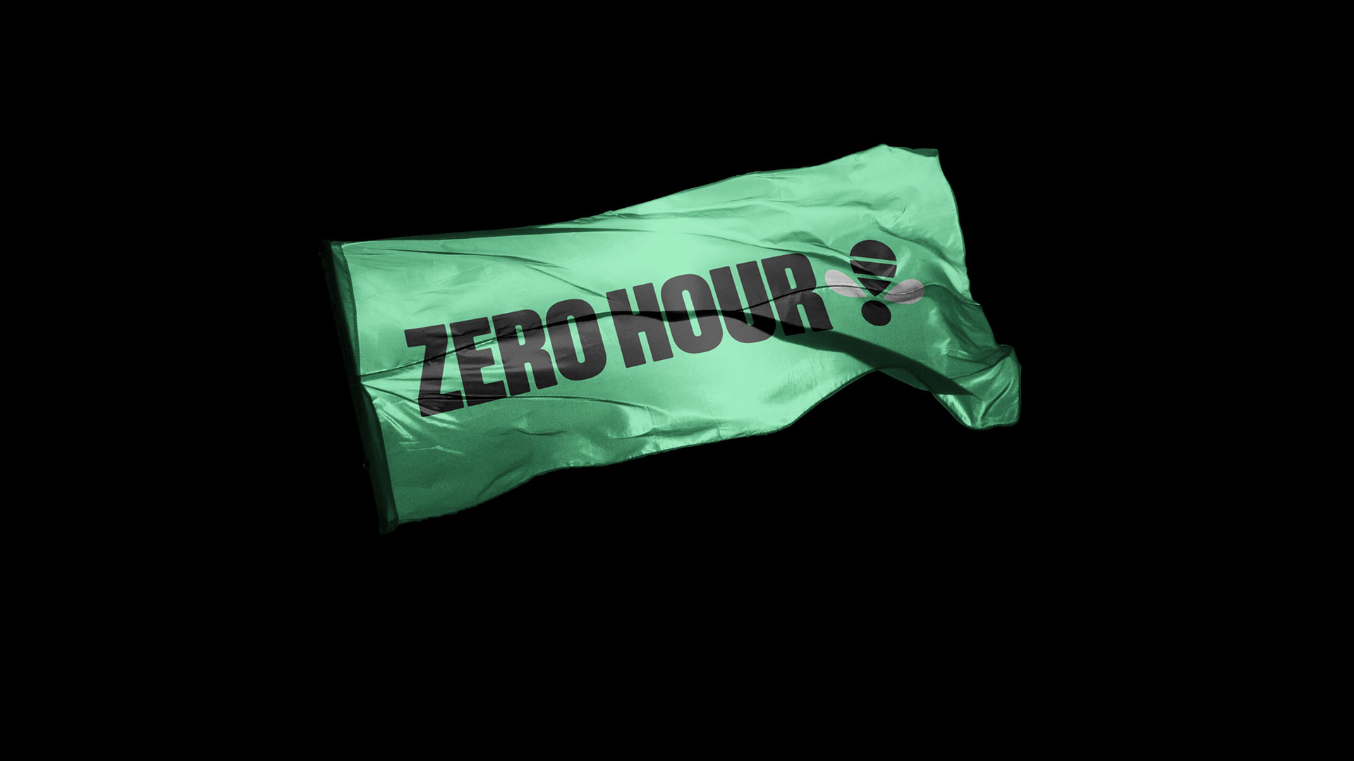
The logo combines a bee symbol as a reference to the threat to nature and also an exclamation mark to highlight the urgency of action, according to Among Equals creative director Nick May.
Because of its dual-meaning, the symbol can be used flexibly, he explains, in combination with typography, for example. “It adds a real sense of urgency to that,” the designer says.
The symbol also had to be easy to replicate, Jeffrey-Barrett explains. This serves the professional arm of the campaign run by alliance, as well as campaigners all over the country to create material. “They wanted something that campaigners would be able to draw themselves, from icing cakes to spray painting,” she adds.
From the studio’s research into sustainable communications, the team knew that a “classic hippy” aesthetic would be off-putting to people, she adds. Instead Among Equals has tapped into themes that are unifying across the political spectrum.

“We knew we needed something that would engage people who would typically be quite turned off by climate communications,” Jeffrey-Barrett says.
One of those themes is nature. “It doesn’t matter if you’re hard left or hard right, people like British nature,” she explains. The second theme is World War II – “as a huge moment of challenge on one hand, but on the other as a time for nostalgic national pride, particularly for the centre and the right.”

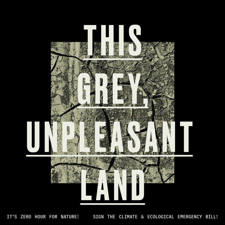
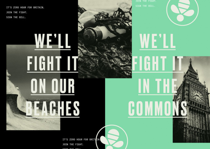
Work has been inspired by World War II campaign material, explains May. Poster layouts and typography make reference to these recognisable designs. A “vintage, postcard-esque” filter has been applied to the imagery, he adds.
The tone of voice ties into this theme as well, with lines such as ‘We’ll fight it on our beaches’ and ‘The Battle for Britain’.
These reframe classic wartime phrases and Churchillian language for contemporary audiences, according to Jeffrey-Barrett. “It was an easy way to galvanize people,” she says. “Even now those speeches stand the test of time and we hear them in political debate today.”

The typeface Druk has been used for the branding while the updated colour palette is also an attempt to appeal to a wide audience, according to Jeffrey-Barrett.
Keen to avoid an “eco-green”, Among Equals decided on a shade that would “signal nature but not feel off-putting”, she adds.

“Younger audiences felt that it was modern and vibrant and cool, while older audiences felt it was friendly and familiar,” Jeffrey-Barrett says. “It was appealing, in very different ways, to everyone we wanted to talk to.”
The coral shade has been retained from the previous brand identity, which further adds a sense of urgency to the campaign, the team explains.
What do you think of the campaign’s identity? Let us know in the comments below.
-
Post a comment


