
Facebook debuts a fresh look for its app
The social media giant introduced the new brand identity for the Facebook app amid speculation around its new focus on the metaverse and a possible change of the company name
It’s been been a rocky few months for Facebook. Earlier in October, a former employee turned whistleblower, Frances Haugen, leaked a series of damning internal documents and testified about the company before Congress. In addition, anti-trust regulators in the US and elsewhere are trying to break the company up.
The social media giant has been known to look inwards when addressing falling trust in its business in recent years. In 2019, after coming under increasing pressure to review its policy regarding political ads, it unveiled a new brand identity to make Facebook’s ownership of other apps and products – including Instagram, WhatsApp, Oculus and Portal – more transparent to users.
In the wake of its latest scandal, rumours have been swirling about a planned change to the company name in order to reflect its new focus on building the metaverse, according to the Verge. But a new name could also serve to further separate the company’s futuristic ambitions from the intense scrutiny it comes under as a social media platform.
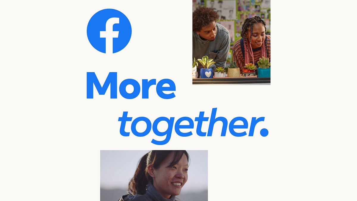
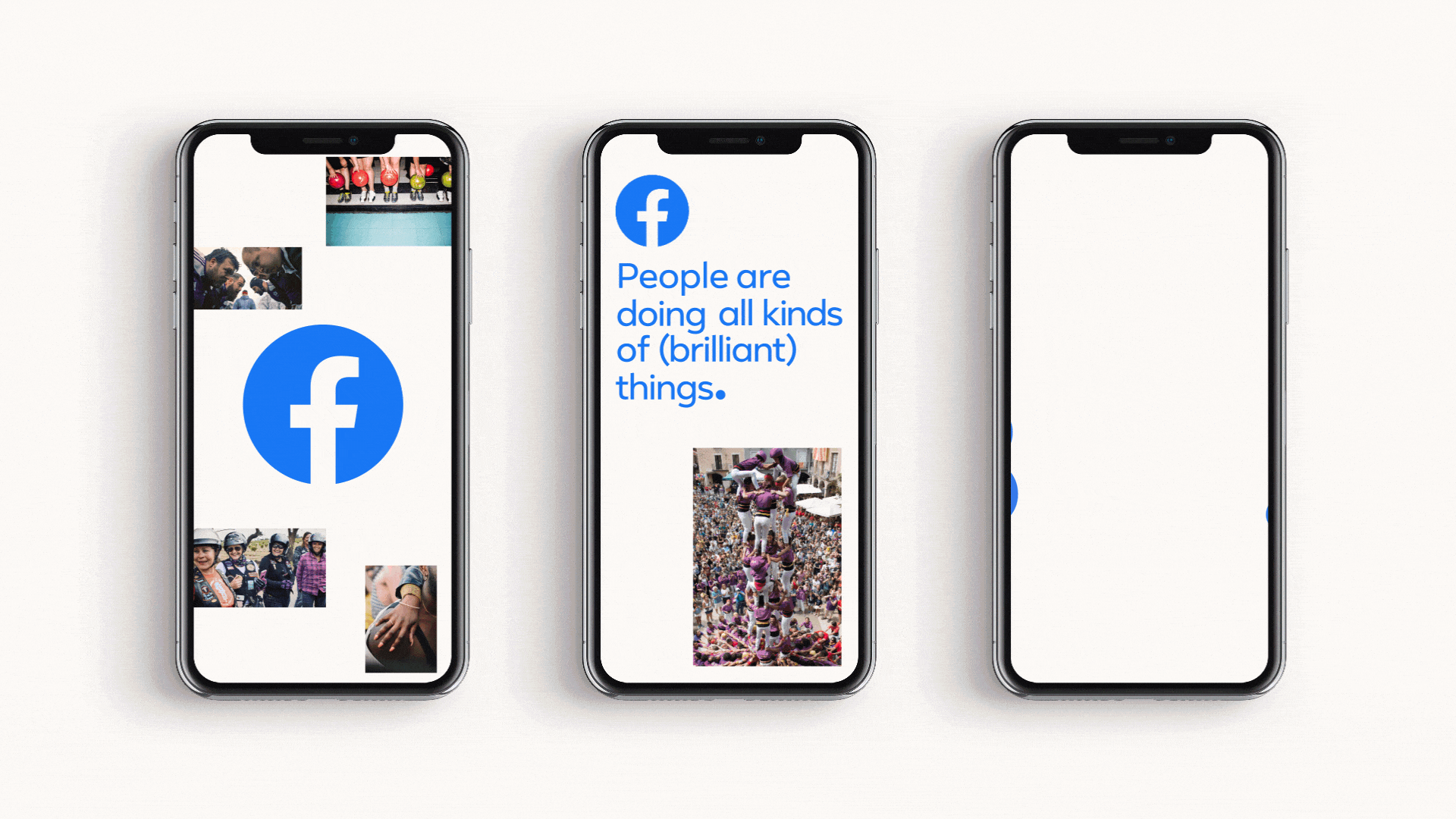
Amid the speculation, the company has quietly unveiled a new look for one of its core products, the Facebook app, which is regularly used by nearly three billion people. Writing about the new brand identity in a medium post, Facebook App’s brand creative director John Slater writes: “Although the Facebook app’s logo and signature colour are recognised around the world, we needed more tools to consistently visualise our strategy and help us better connect with people.”
Developed by Facebook’s in-house creative agency, Creative X, the new brand design system aims to be the foundation for the app’s global marketing communications and is based on the brand strategy ‘More Together’.
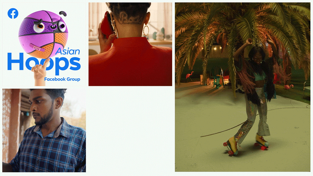
“We landed on the notion of Facebook as humanity’s shared canvas – a place where people can come together and create unlimited possibilities,” writes Slater. “The ‘shared canvas’ concept manifests as a base layer of structured brand elements such as colour, layout and typography mixing with a more varied expression layer containing the stories of the people who use our platform.”
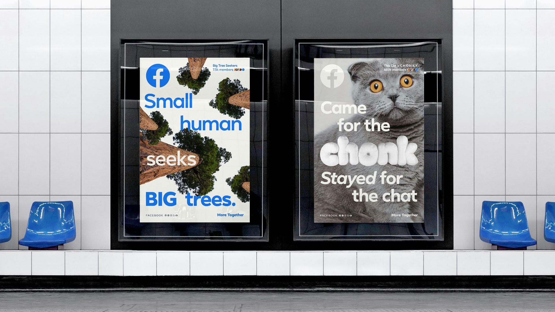
Given the scale of the app, the new identity needed to communicate about everything from entertainment to commerce to dating. The layered approach allows the app to flex its designs to support these needs while remaining consistent in style, along with staying in sync with the company’s marketing needs and the ever-changing interface design.
While the Facebook logo remains unchanged, it is now used more prominently as a masthead rather than a “quiet sign-off” or “secondary design element”, writes Slater. The brand’s distinctive blue colour also stays the same, but with the addition of a paperwhite colour to add warmth to the overall palette.
First introduced in 2017, the company’s custom geometric sans serif font, Facebook Sans, has been updated to encompass a broad spectrum of alignment and font style shifts. Motion also plays a big role in the new identity, with the aim of reflecting the interaction between the human hand and digital content.
Sub-brands such as Facebook Watch, Facebook Dating and Facebook Marketplace also needed to retain a clear connection to the Facebook app. The team’s solution was to build on the ‘shared canvas’ concept, with each sub-brand using the same base and expression layers as the Facebook app. This allows the sub-brand to then add a unique third layer, including additional colours, graphic elements and art direction, so that it can stand on its own.

Reflecting on what the team learned during the rebrand process, Slater writes: “Most importantly, making sure every step of the process was deeply rooted in our core strategy was absolutely necessary to developing a design system that could support such a large and complex brand. Without a unifying idea to hold it all together it would have been impossible to keep so many different projects pointed in the same direction.”
Latest from CR


