
Egg yolk, pancake batter, tomato and Marmite: behind The Breakfast Club’s rebrand
New York design studio ThoughtMatter is behind the updated look, with creative director Ben Greengrass having devised the original identity back in 2005.
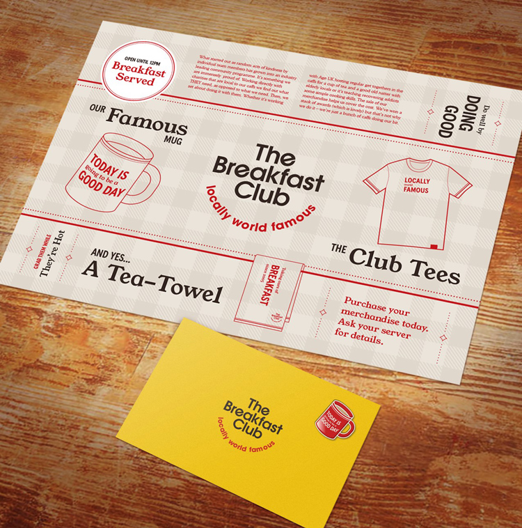
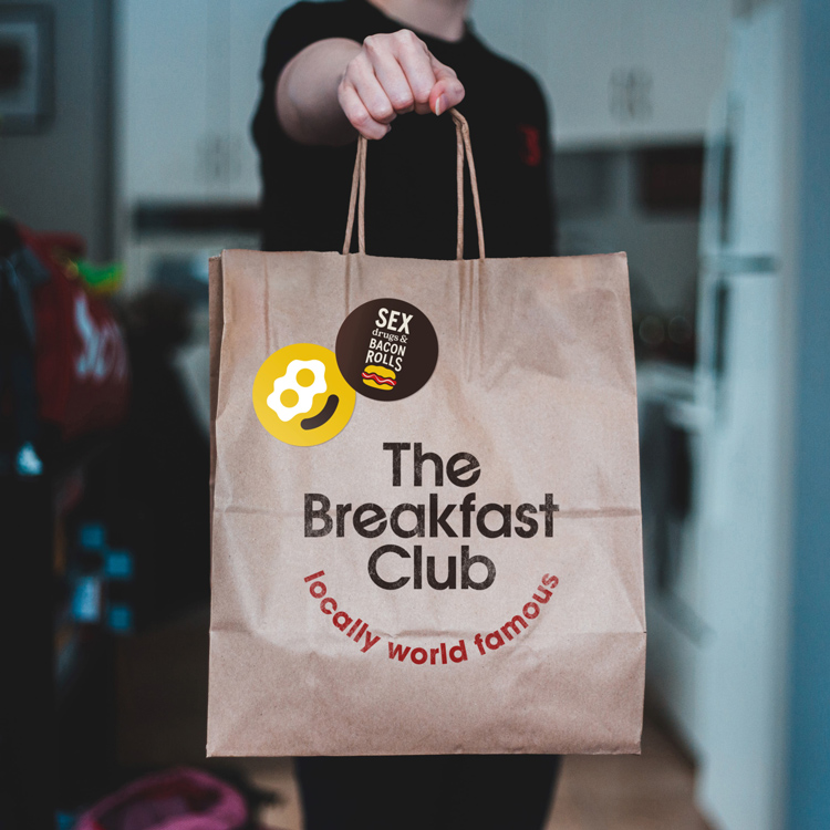
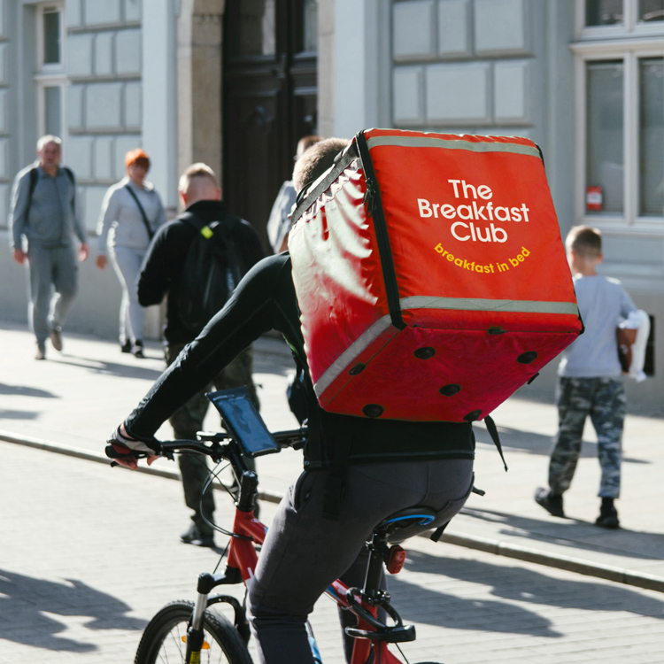
London-based restaurant chain The Breakfast Club has been rebranded in a bid to unify its look and messaging. The new identity has been applied across all touchpoints, and includes a redrawn logo, new menus and merchandise, a refined colour palette, typography and illustrations and updated brand communications.
Since 2005 The Breakfast Club has opened and operated in 12 locations across the capital and is well-known for its 80s-themed décor and charitable endeavours. New York-based design studio ThoughtMatter is behind the new look for the chain, with creative director Ben Greengrass having created the original branding for the company some 15 years ago.
“Future-proofing” and reducing “visual noise”
With the restaurant having developed considerably over the past decade and a half, the branding system developed by Greengrass had “begun to feel a bit stretched”. From the start of the project, the team were tasked with taking a critical look at the brand as it then appeared, he tells Design Week.
“[We had to] find a way to de-clutter and let a stronger, more considered visual and verbal identity shine through,” he says.
The first step in the process was to address the logo. Greengrass explains the team has “freed” the logotype from The Breakfast Club badge device, which will help to “future-proof” the system.

Beyond the logo, three typefaces have been introduced to work across all communications and branding – these were decided on for their “clear, modern and characterful” qualities.
Though new elements have been introduced in some places, other areas have been “tidied up” significantly. The menus, for example, have been rethought to reduce “visual noise”.
Coincidentally, this more pared back approach proved useful for the brand in the wake of the coronavirus crisis. As The Breakfast Club pivoted toward delivery over eat-in dining because of lockdown, the studio explains the new brand assets helps to “mobilise” the effort.
Gingham and tea towels
But while The Breakfast Club was looking for something more streamlined, Greengrass stresses that under no circumstances was it to lose its “cafness”.
Such “cafness” is at the core of the new look. It has in particular inspired the updated colour palette, with the studio saying the four main colours have been chosen to represent egg yolk, pancake batter, tomato and Marmite, since these are “ingredients close to The Breakfast Club’s heart”.

“The yellow and red were the important, iconic colours from the previous brand so we elevated those and added two more considered partner colours,” adds Greengrass.
Alongside the colour scheme, an “ownable” illustration style has been developed, which takes many of its design cues from the aesthetics of a traditional English café.
“Using a gingham pattern or tea towel stripes made sure all the above was grounded in The Breakfast Club’s roots and its most important asset – the food,” he says.
Understanding the traditional British café
With the New York studio needing to understand the nuances of traditional British cafes, Greengrass explains a “boots on the ground” approach was necessary.
“Being English myself and having an intimate knowledge of the English mindset was certainly an advantage but a lot has changed in the 8 years I have lived in NYC,” he says.
As a result, a week-long audit of the restaurant chain was conducted by the team in London.
“Defining the authentic tone of voice without losing all the qualities that makes The Breakfast Club what it is today needed careful consideration,” he says, before ending: “Spending six solid days eating two or three English breakfasts a day was a challenge but it was definitely, as we say at ThoughtMatter, Work Worth Doing.”

-
Post a comment


