
How Javier Jaén plays with everyday objects in his “symbolic” editorial work
The Barcelona-born graphic designer and his “playful” editorial portfolio is the subject of a new Counter-Print book.
“I have an interest in making things as immediate and easy to understand as possible,” says graphic designer Javier Jaén. “It’s not always about how things look technically, but about what they say.”
Jaén was born in Barcelona in 1983. He studied graphic design and fine art in Barcelona, New York and Budapest, and since graduating has worked on pieces for the likes of The New Yorker, The Washington Post, National Geographic and Greenpeace.
His career has spanned “environment, technology, love, sex, diversity, art, literature, religion, science, gastronomy, health, sport, wild capitalism, social movements, economy, terrorism, war, politics, justice, archaeology, virus, music, theatre, fashion, wine…”, all elucidated simply with “some graphic design,” Jaén says.
A new book from independent publisher Counter-Print invites readers into Jaén’s illustrative world. Greetings from Javier Jaén is a monograph in which the designer reviews his own portfolio and explores how he got to where he is today.

“Style has never been much of a worry”
Jaén tells Design Week part of the motivation of compiling his new book was to make sense of his own career. He was, after all, not “your typical art kid”. At 16 years-old, Jaén was working in a radio station and considering a life in journalism; in another stage of his life, he was a wedding DJ.
“It wasn’t a typical route into art and design, but actually all my previous experiences came together to form my career,” he says. “My work has always been about communication – I wanted to learn how to say things then, and that is still a huge focus of what I do.”
Jaén’s style is a tricky one to identify, and it’s not something he cares too much to pin down. Style “just happens”, he says, in the same way one develops a way of telling jokes or speaking.
“Style has never been much of a worry,” he says. “For me, immediacy in communication has always been the most important thing.”

“I think we as designers have to be open to inspiration coming from anywhere”
Jaén’s style is often callage-based and is rooted heavily in everyday life, which seems to be where his ideas come from. “Of course, big names, big books, big artists and big movies are a source of inspiration,” he says. “But in addition to all of that I like to add in my everyday experiences – sometimes even the silly things I get sent by my friends can end up being a part of what I produce.”
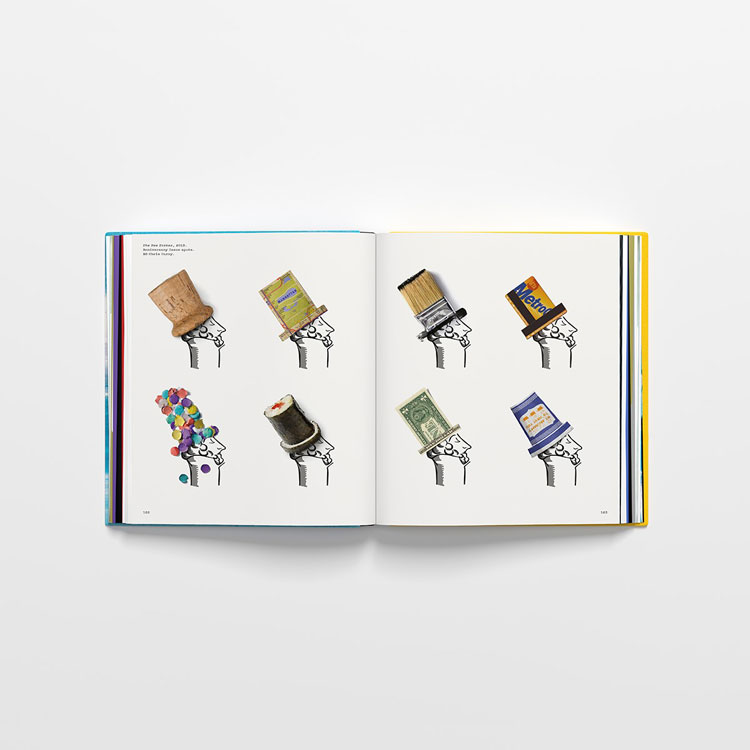
Jaén’s work is very often home to the likes of balloons, coffee pots, paintbrushes and dominoes, which become a vehicle for a bigger idea.
“I think we as designers have to be open to inspiration coming from anywhere,” he says. “Sometimes you walk down the street and see a tree casting a shadow in the shape of a dog. You take a picture of it and maybe you’ll never look at it again, but maybe you do, and it inspires your next move.”

“Trying to explain the concept of something in another language”
It’s the message which is always key though and Jaén says he often thinks of his role as being like a translator.
“My work is about trying to explain the concept of something in another language,” he says. If he is tasked with a theatre poster, he tells an audience what to expect without necessarily using pictures of the actors or actresses within a play. The “language” could be typography, colour and even paper texture, he says.
He gives as an example his earliest memory of graphic design: seeing the album cover of Pink Floyd’s 1975 album Wish You Were Here, designed by Hipgnosis The cover features two businessmen, one of whom is on fire.
“I was always a little scared by the image, but found it very magnetic,” Jaén says. “And for me, this image sounds like the music on the album – put it this way, you know from looking at that album cover that what you’re about to listen to isn’t going to be salsa music.”
Sometimes, he says, the best way to get an idea across is to create contrasts between medium and message.
“I always try to approach things with contrast,” he says. “If I have to talk about evil, I try to show it with something really nice; if I’m talking about something fast, I might use imagery of a tortoise; when I have to address technology, sometimes it’s fun to approach it with imagery of sticks and stones.”

“Most of our industry suffers with anxiety”
Greetings for Javier Jaén Studio has given the designer a chance to reflect and review his career’s work up until this point. It is a celebration of what he has achieved, but as Jaén is keen to point out, it doesn’t paint everything in a good light.
“It’s very important to me to share the dark parts and mistakes as well as the success,” he says. For this reason, alongside the commentary in of his work, in English and Spanish, there are also a series of lessons and tips too.
It is not a pedagogical book, he says. Rather, “it’s showing the way I do things, not necessarily how I believe they should always be done”. He takes readers through the common steps he hits from brief to final product, making sure to highlight the hours of thinking and unusable ideas that often happen along the way.
“Most of our industry suffers with anxiety over their work and impostor syndrome,” he says. “I like to share where I can, so hopefully this honest account of things can help someone.”
Greetings from Javier Jaén Studio will be published by Counter-Print on 27 October. It is available for pre-order now from www.counter-print.co.uk.


-
Post a comment


