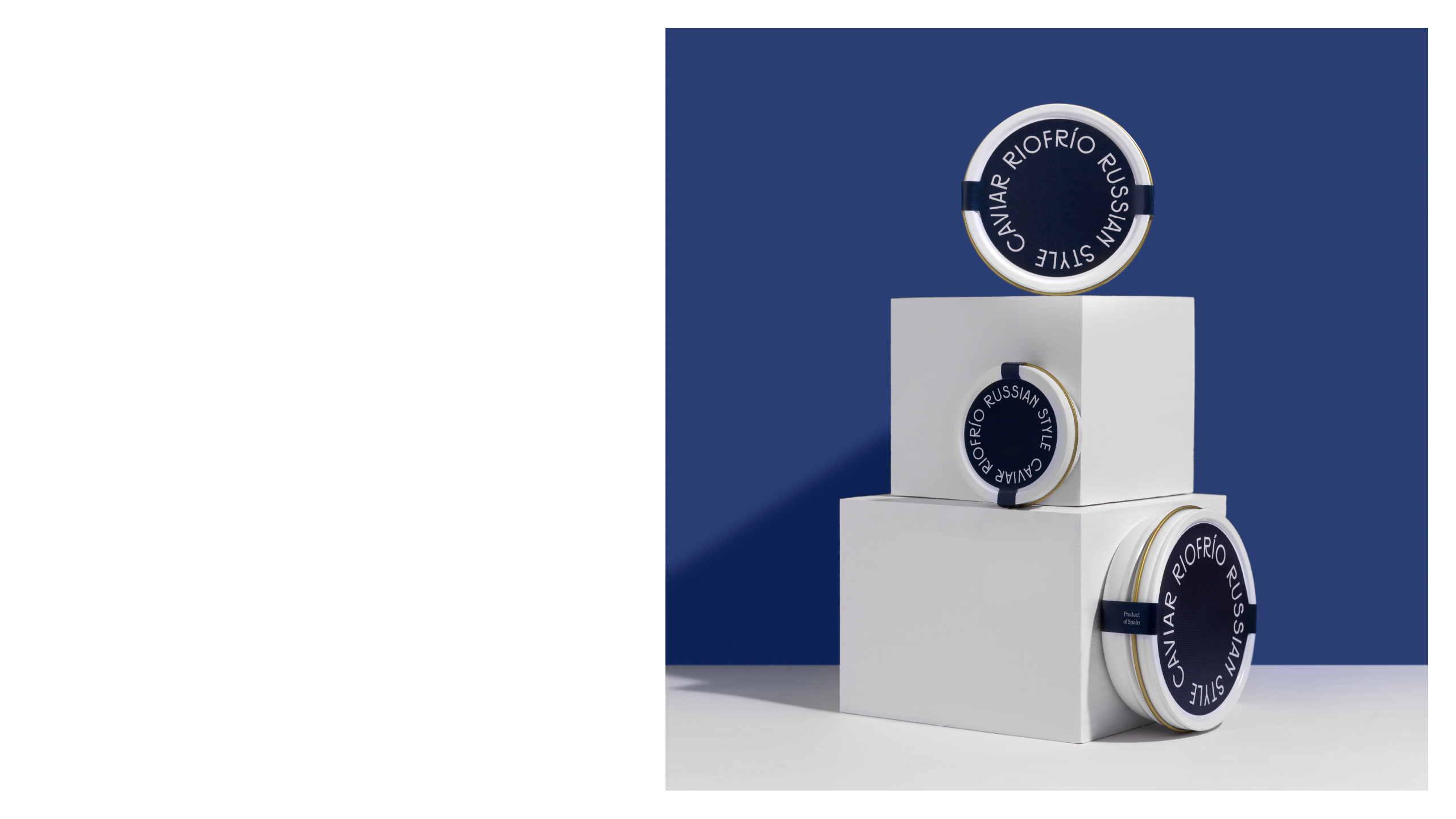
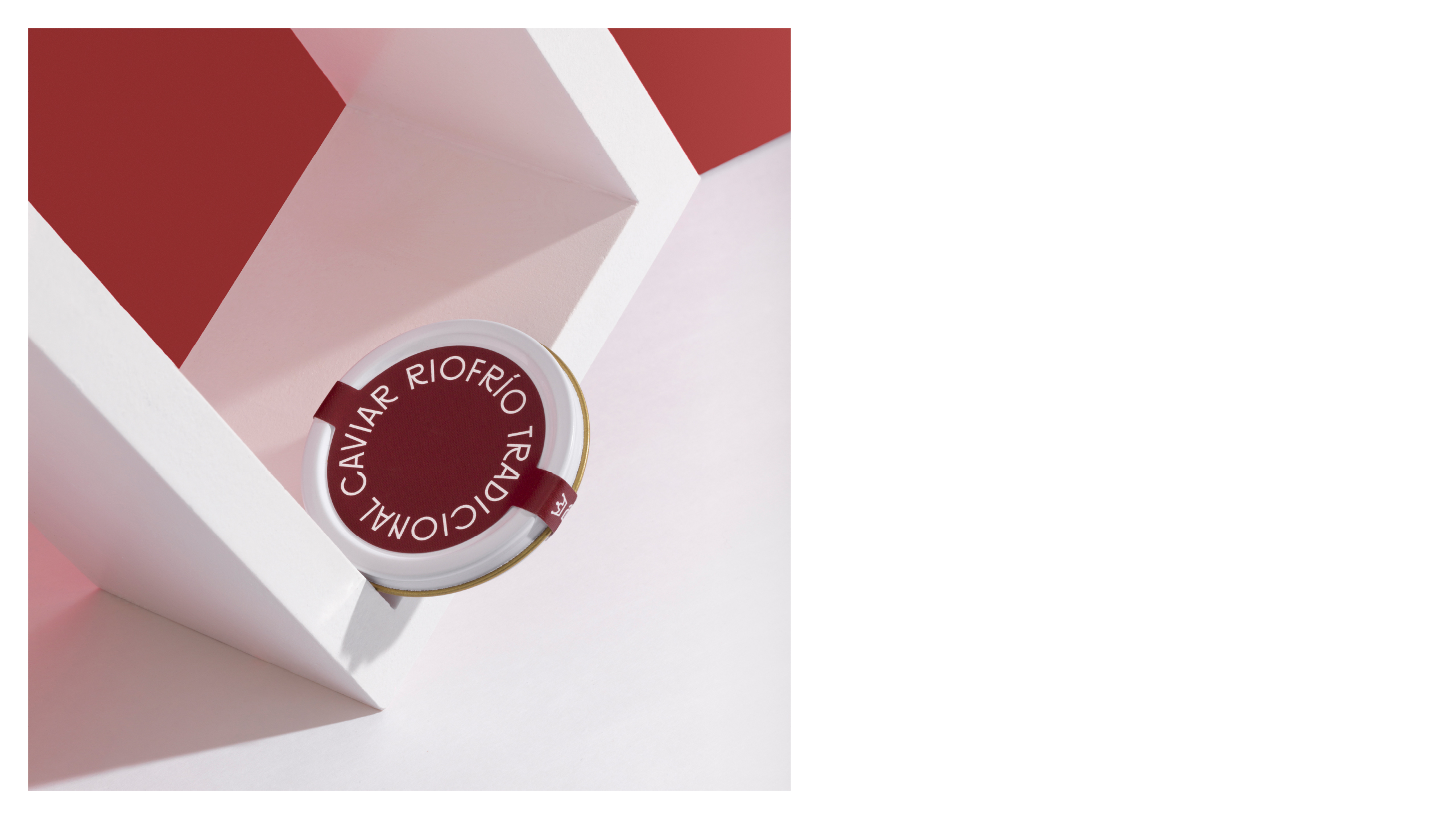
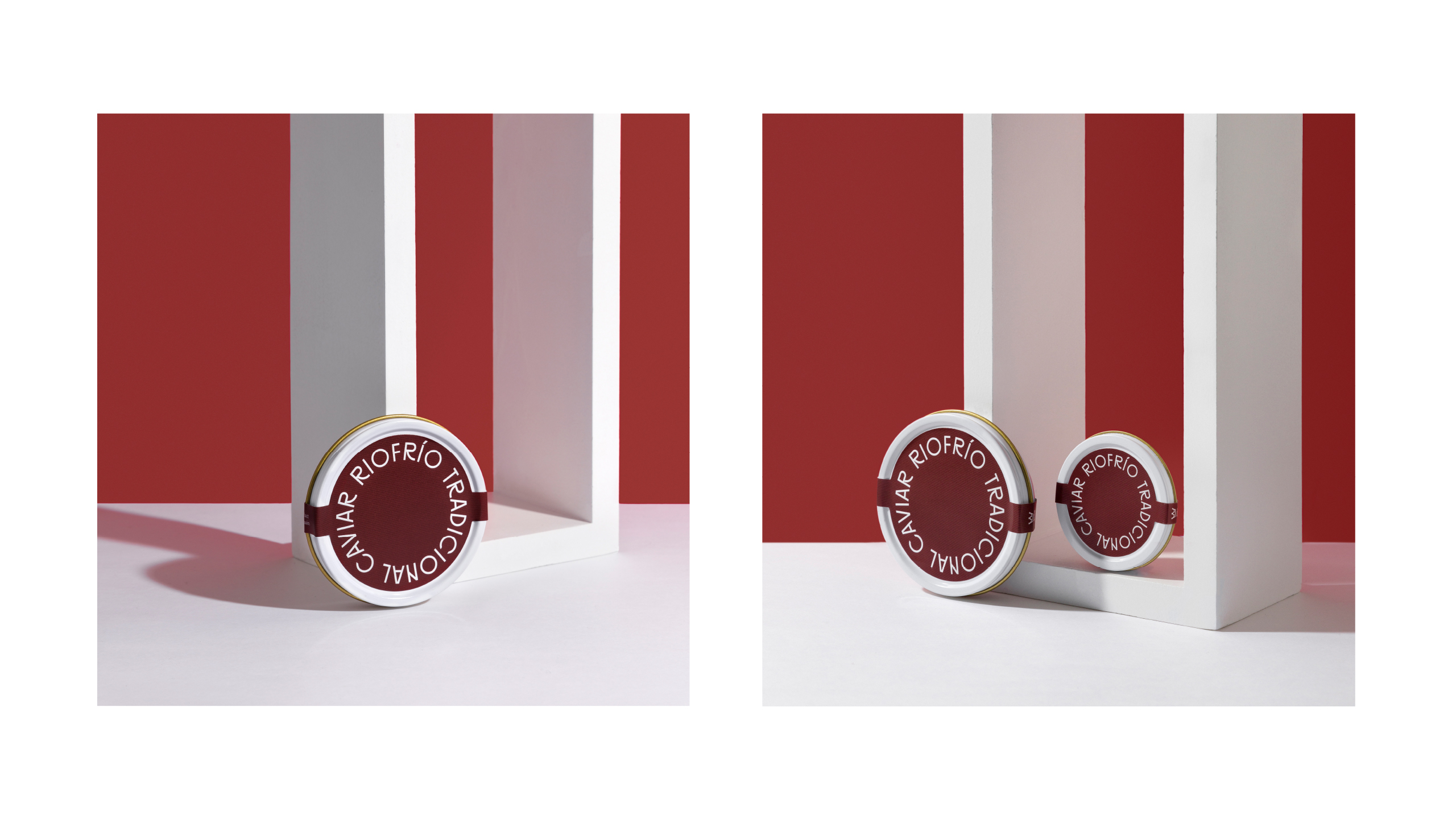
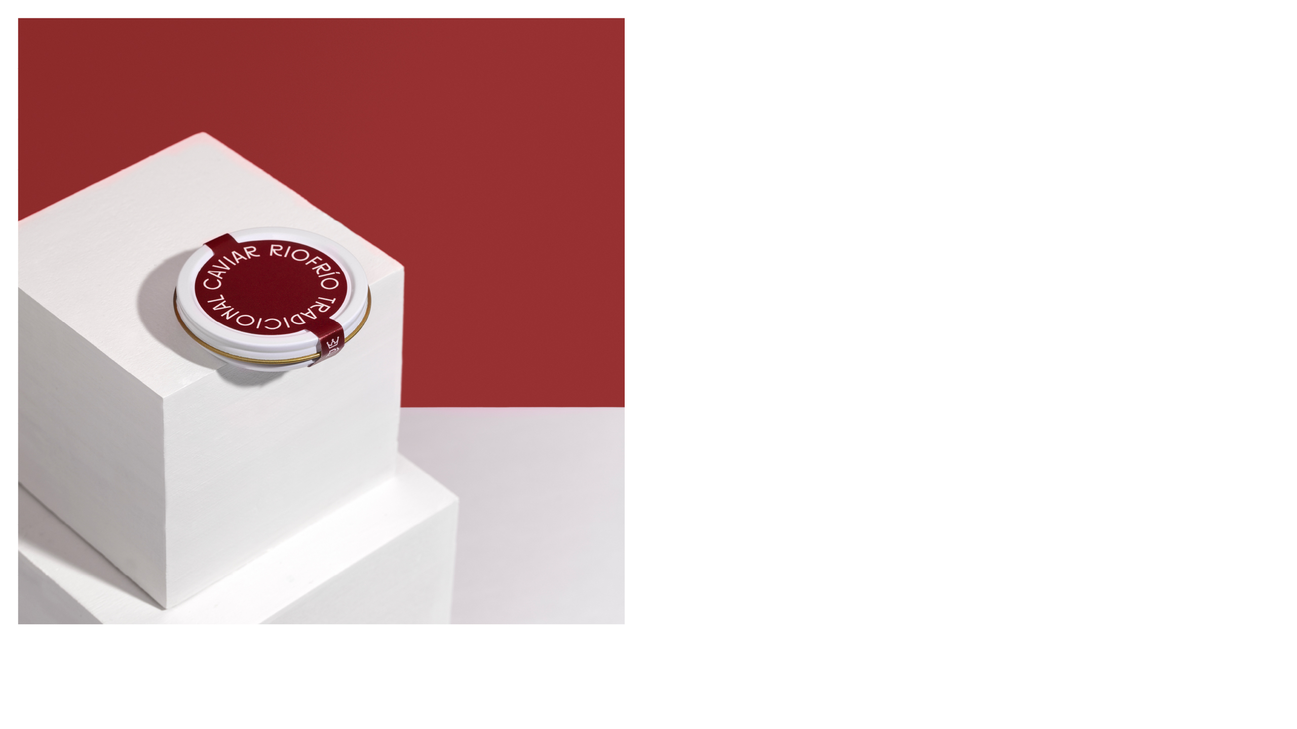
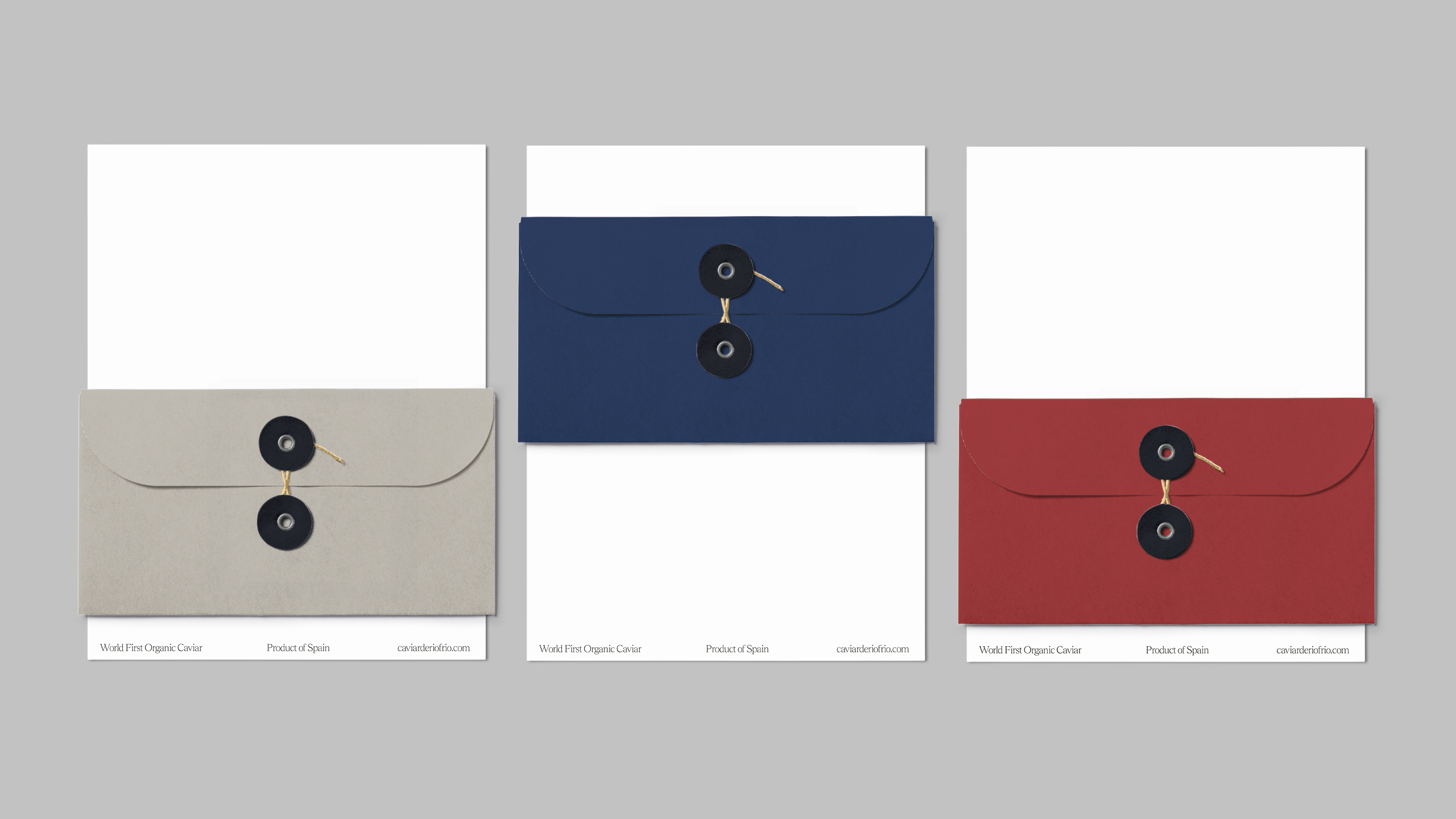
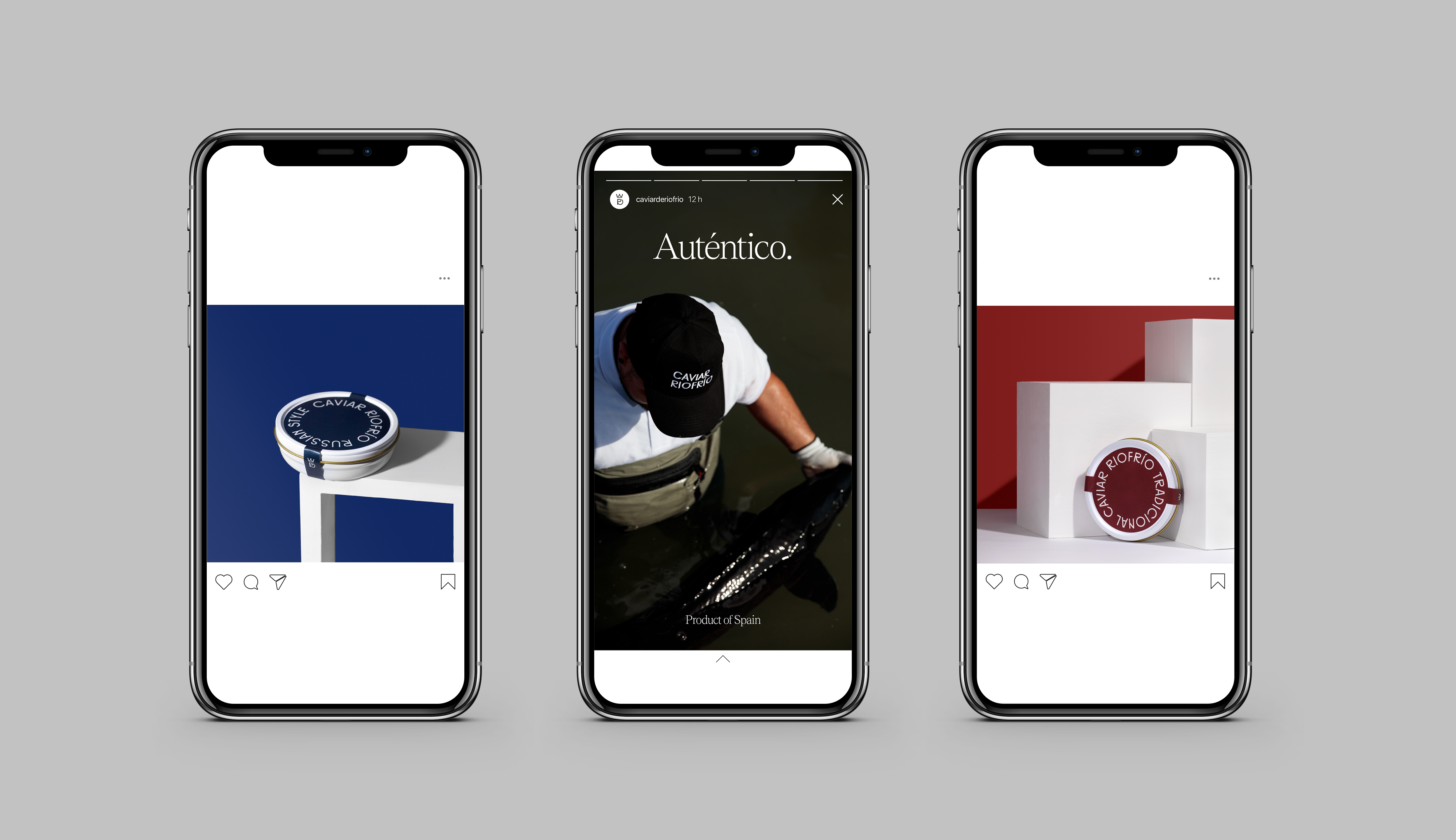
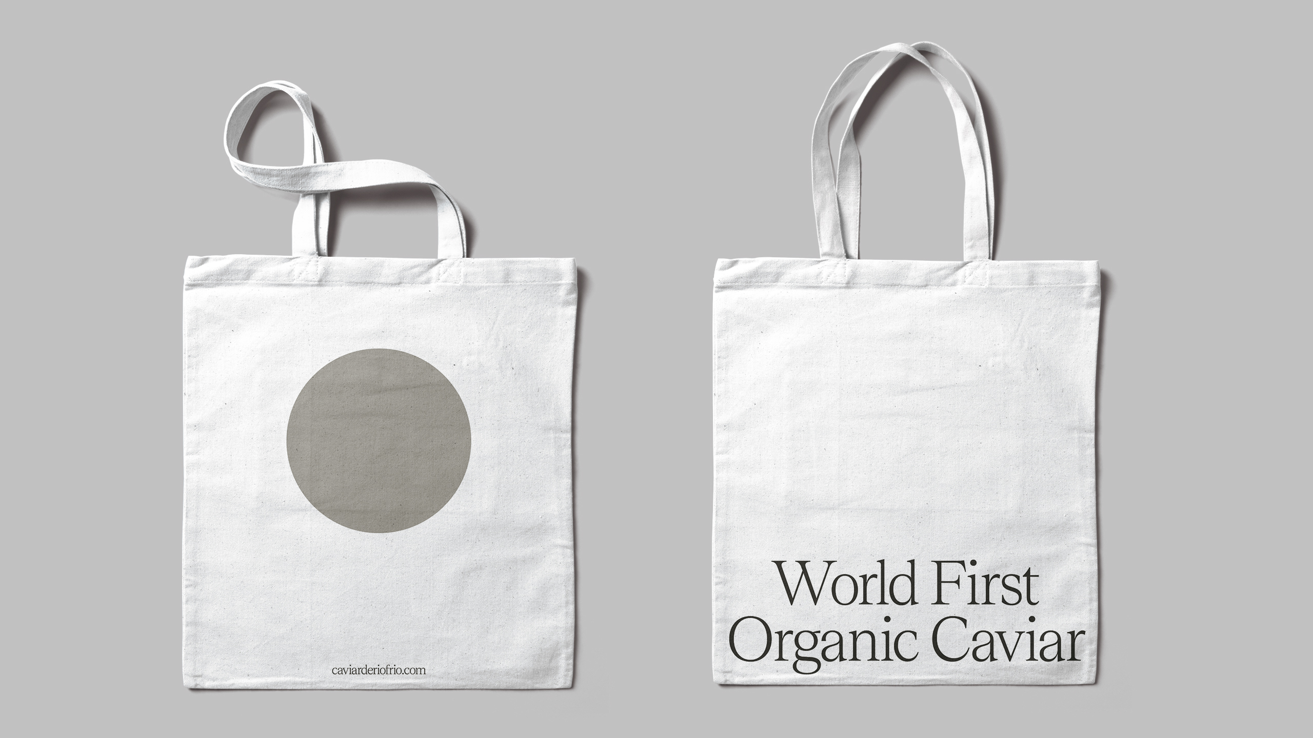
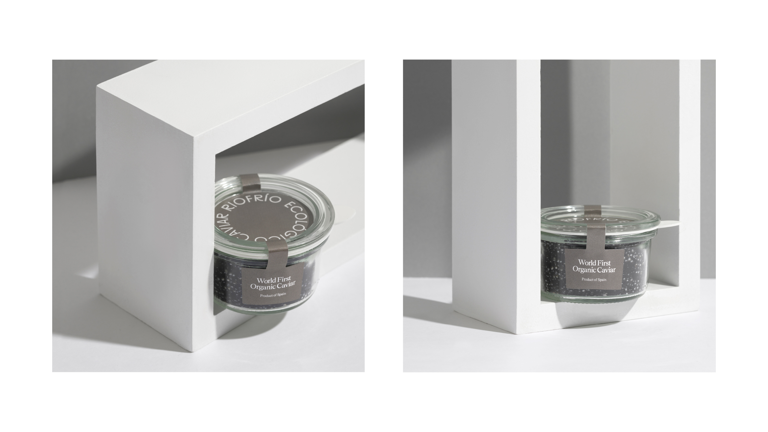
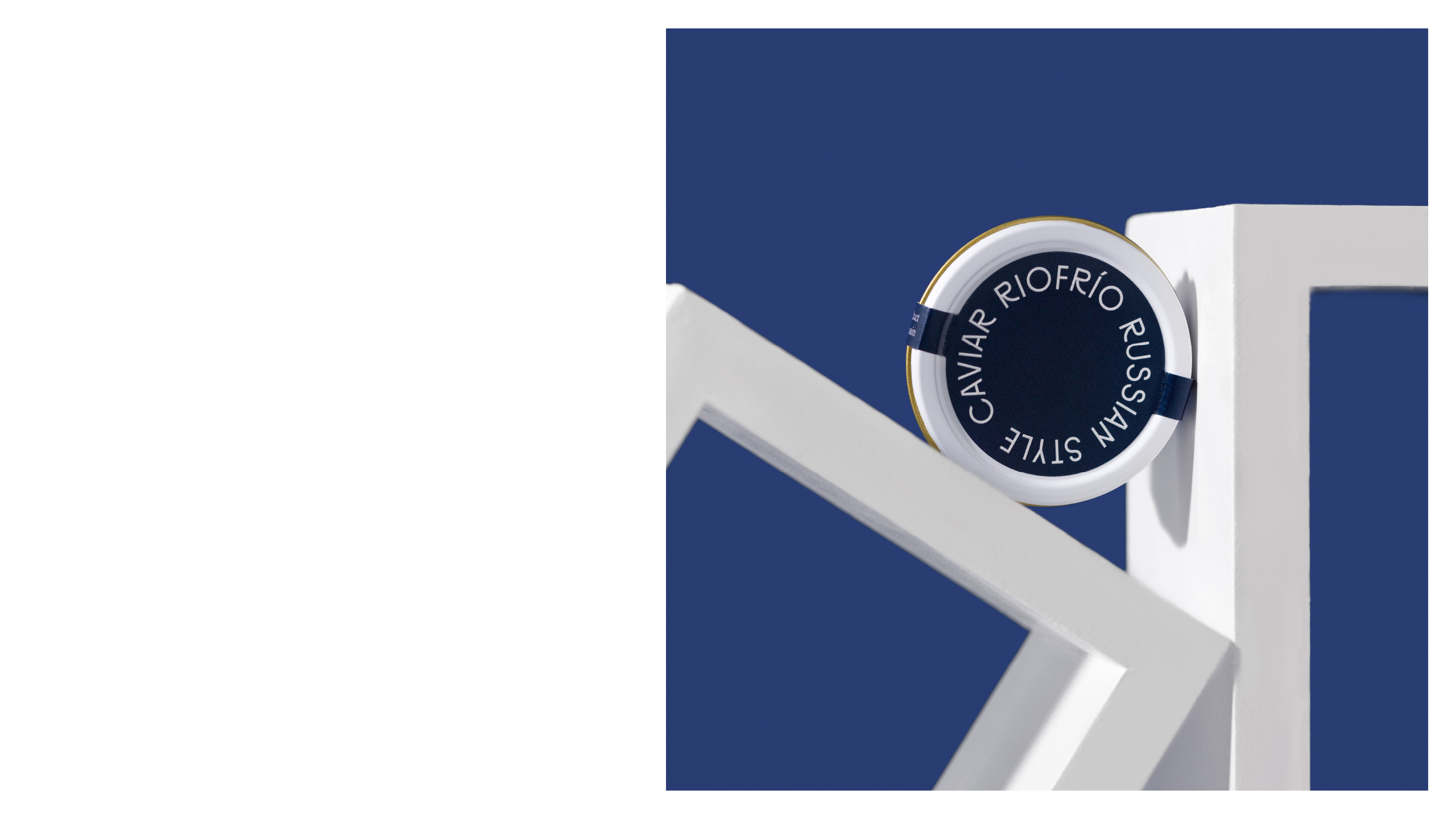
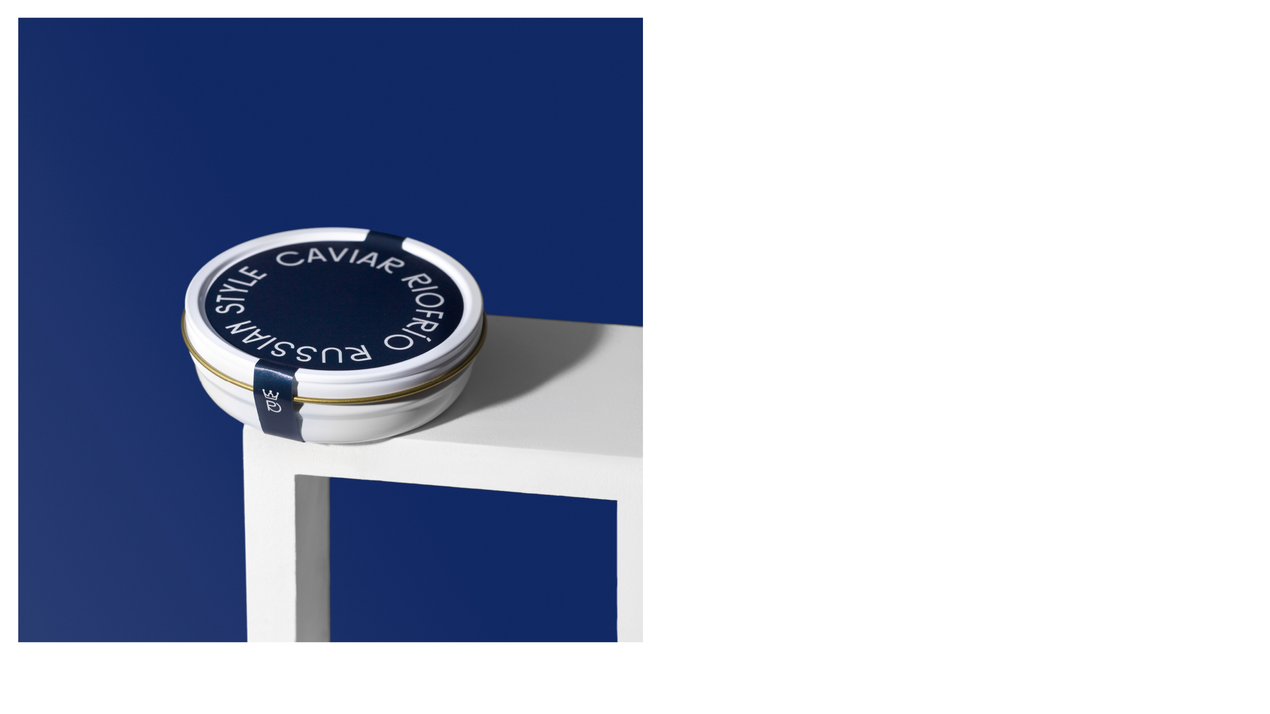
Caviar Riofrío is a renowned brand of caviar founded in 1963. In need of rebranding and a review of their original product image, they contracted BUENAVENTURA STUDIO to create a new look to appeal to modern consumers. The sleek jars and choice of deep red and blue, juxtaposed by the light gray, stand out on a shelf and incite curiosity compared to a traditional glass jar.

Caviar Riofrío is a world benchmark for luxury and haute cuisine. It is one of the leading sturgeon producers in Europe, and the first certified organic for caviar.
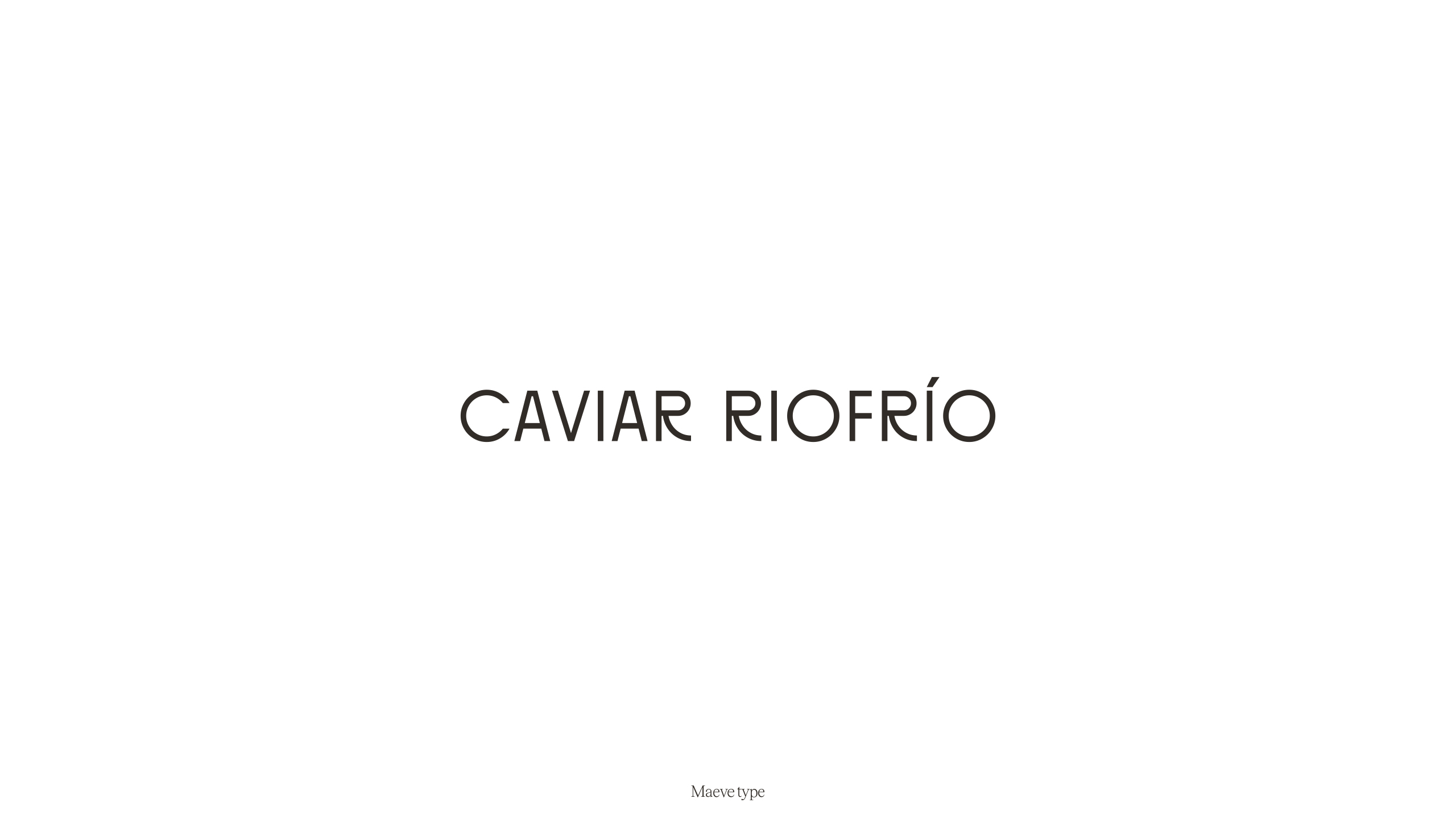
In 1923, the great Bauhaus master László Moholy-Nagy wrote a short essay, delving into the role and importance of typography. He insisted that typography “must be communication in its most intense form.”
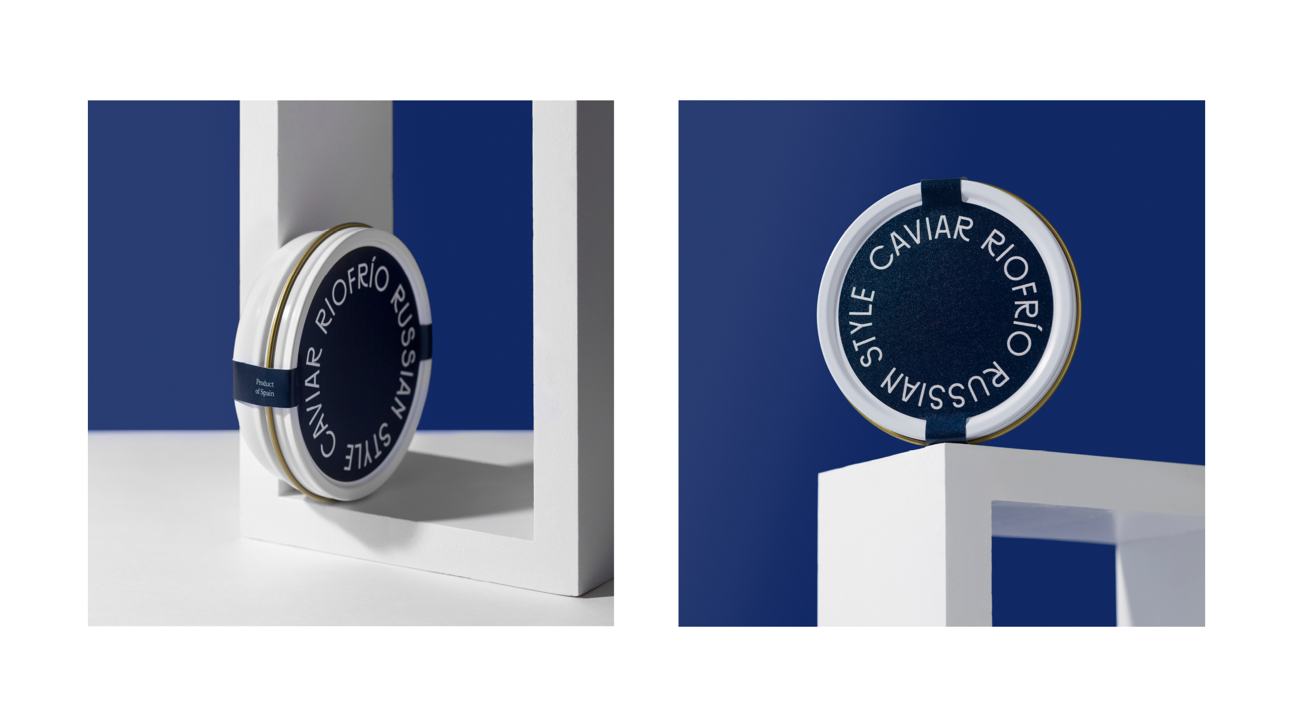
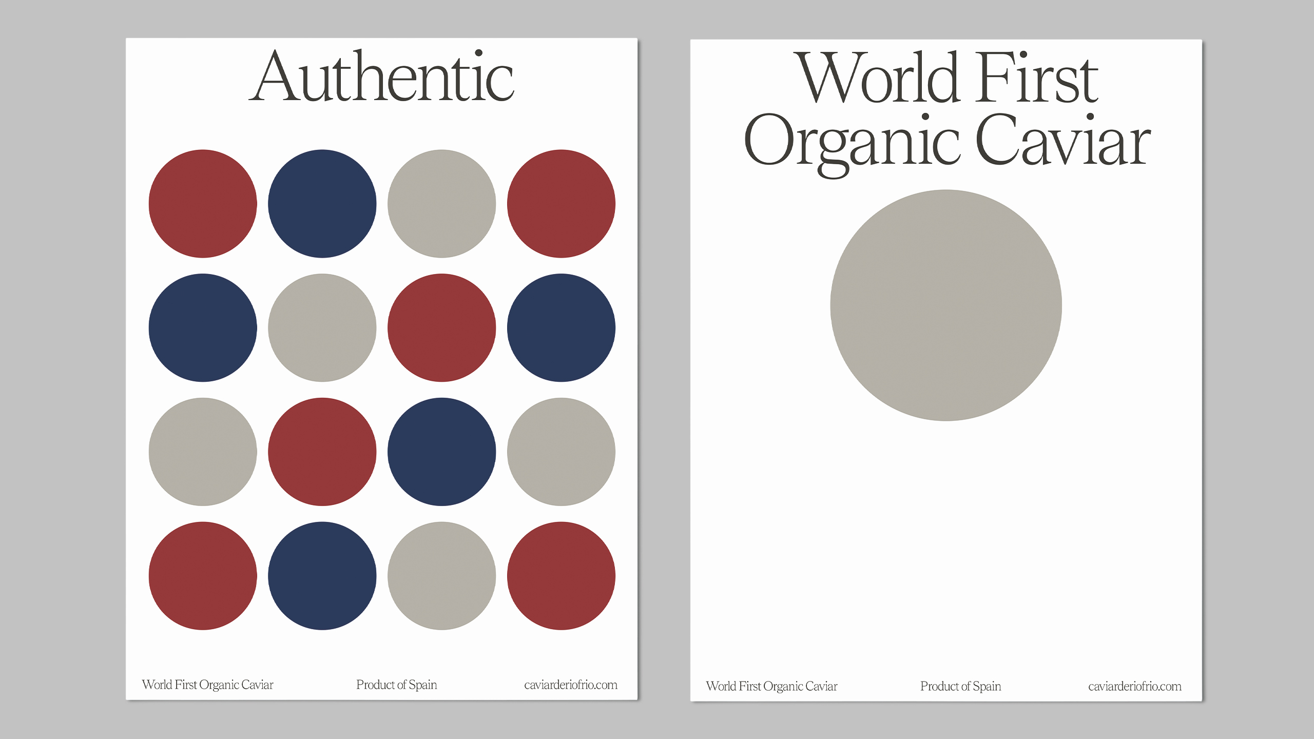
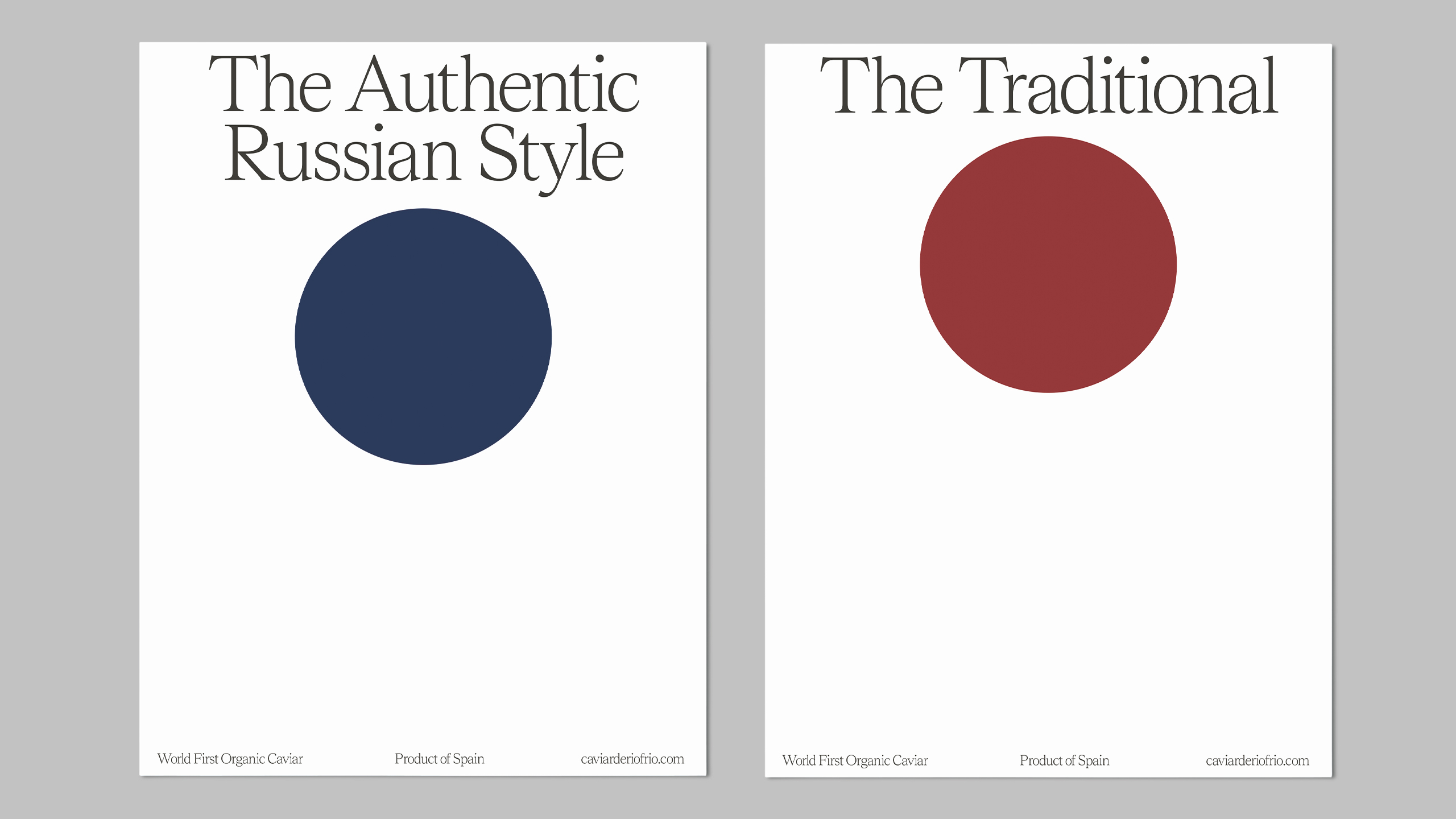
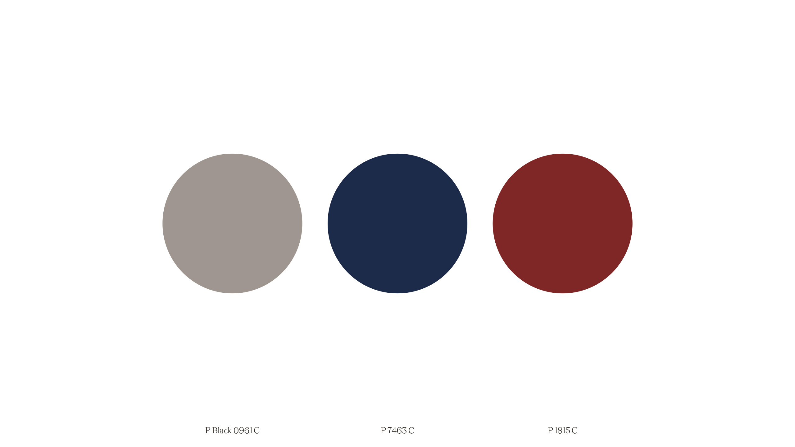
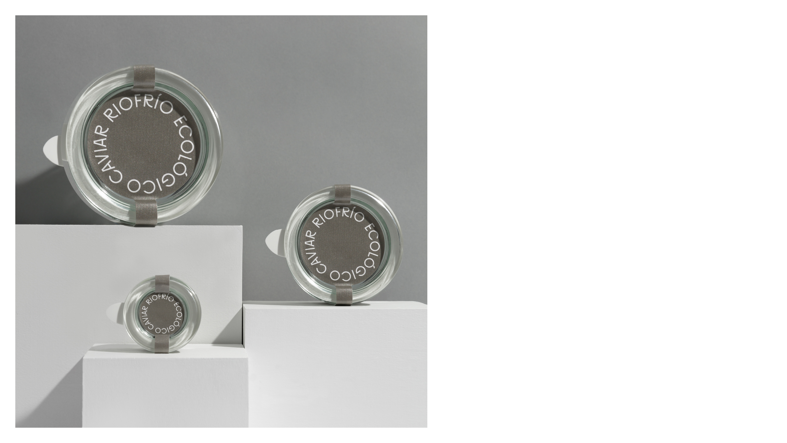
From this idea, we created a typographic visual system based on the movement of sturgeons, which led to adopting a circular shape, an icon in the world of caviar. We chose to integrate each of the ingredients into the branding, with an emphasis on absolute clarity for customers. For this reason, each respective style of caviar is color coded.