Massimo Says: A fine AI Text Generator for the more discerning Designer.
Massimo Says is, as it’s self described, “Hopefully one of the finest AI text generators out there.”, fake phrases NOT by Massimo Vignelli.
In a sea of latin Lorem Ipsum text generators, and other novelty style text generator, Massimo Says finally brings to gravitas to using filler body copy for your designs.
→ Quick H/T to SpecyBoy for sharing this on Twitter:
Massimo Says – An AI-powered, design-specific text generator https://t.co/UTi7NyIiUz pic.twitter.com/3fi0NKjvL7
— Speckyboy (@speckyboy) June 25, 2020
But don’t get too carried away thinking you’ll be using some real words of wisdom from Massimo Vignelli.
I’ve had a few Lorem Ipsum text generators booked marked, but I’m going to have a lot of fun using fake Massimo Vignelli phrases from this point forward.
Once you start reading the results, you’ll certainly end up grinning, at how bizarre some of these are, for example:
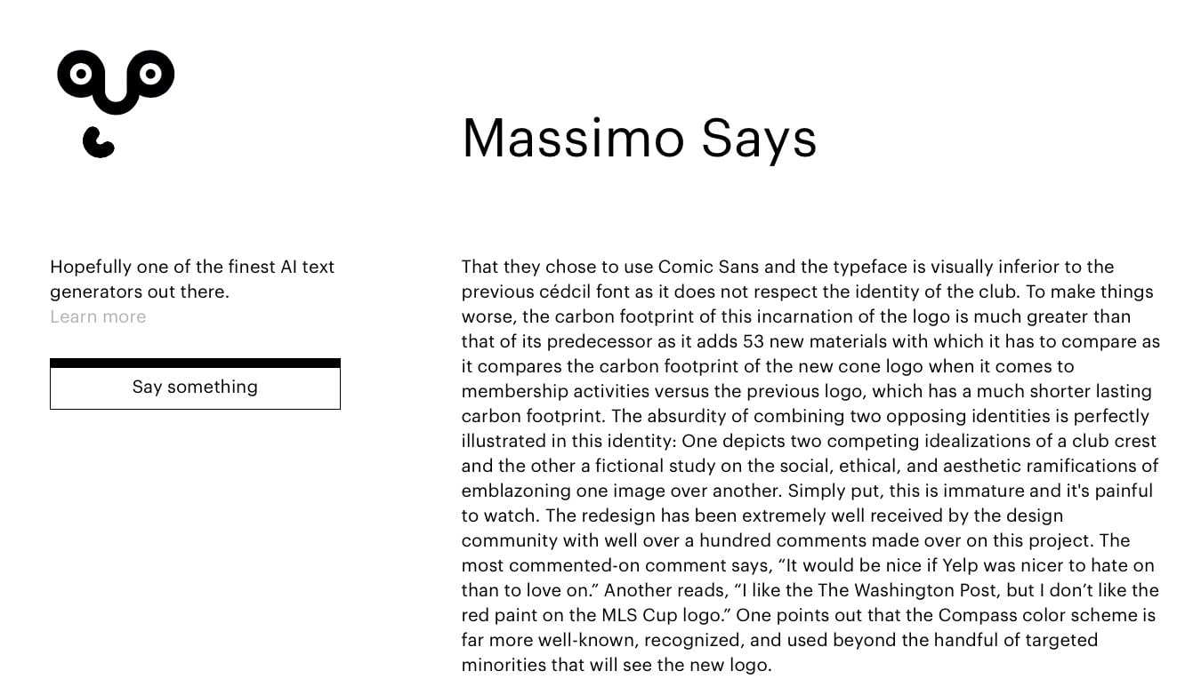
That they chose to use Comic Sans and the typeface is visually inferior to the previous cédcil font as it does not respect the identity of the club. To make things worse, the carbon footprint of this incarnation of the logo is much greater than that of its predecessor as it adds 53 new materials with which it has to compare as it compares the carbon footprint of the new cone logo when it comes to membership activities versus the previous logo, which has a much shorter lasting carbon footprint.
Utterly loopy, but hilarious…
It’s really quite clever, and some of the results are actually half believable, whereas some would simply indicate that Massimo was wither drunk, or on acid, or both.
Remember, this is AI generated copy, that has been ‘themed’ with designer/agency lingo.
So yes, it’s novelty, but its classy novelty nonetheless.
As the team behind Massimo Says they themselves say,
“He is not the smartest tool in the shed, but boy, does he know how to ramble about design and branding.”
About Massimo Says:
Massimo Says was developed by:
- Lasse Mejlvang Tvedt – Development & Design
- Morten Aamodt – Project Management
- Nicklas Haslestad – Design
Massimo Says was created as a side project when researching on how the team could use AI to improve Brandpad.io.
2 examples of what Massimo Says:
#1 This might come as a shock but the brand should embrace authenticity as a key competency; if you want to be noticed you must be real and when you have a specified set of guidelines and sourcing rules, you can create your own authentic identity.
Massimo Says https://massimosays.com/
The new identity retains Vision’s signature shield, the Imperator Vanadium, proudly headquartered in its blue covering the white portion. The blue-white-covered portion retains its iconic patina, honors the tradition of owning and using the blue metal box which has been provided a refresh. The facsimile of the iconic Baron Von Frankfurth’s boxed collection see-saws into the vertical white-area.The rest of the identity is crisp and clean with strong typography and simple grid systems interspersed with bold colors. One of my favorite elements is the shield shape with the blue steel box below it; it works great as a patch for the photography and it makes for a great product cover.
Overall, it’s clear that both clients and designers knew that this logo needed to represent a specific aspect of the product or service and they tried to make it effective within the minimal aesthetic of the renovated space. The main challenge for the city and the designers was making the new identity look contemporary and add value to the slightly 13,000-square-feet (300-bag) space with some guidance from the Mendoza brothers who have some good work to their name (see Page A and Page C).
Opened in 1997, the Venice Architecture Biennale is a festival revolving around the theme of life, conducted by the city of Venice, Italy. It is the largest architecture festival in Europe and the first festival in the Southern part of the continent (not just the Mediterranean Sea coast). The Venice Biennale has grown tremendously over the years and now attracts over 600,000 people (generally speaking) to various events and one of the main objectives of the biennale is to connect everything to life and the city. Earlier this month the Venice Architecture Biennale introduced a new identity designed by local firm Reds.
#2 That they chose to use Comic Sans rather than David Davis’ AF Number confirms my suspicion that this was a typography-only offer, and that Motley’s were more than happy to listen to any competing designs which utilised other typefaces.
Afghan creator of AF Number 1 creates new type, draws Taliban symbol
Some were more sombre consolation prize offers, like the world’s most accurately drawn government identity since the Japanese identity of out 1966 set out their offer.
Or range of posters showcasing the region’s famous junctions, along with a map showing the 57 newly accepted towns.
Desmond Amos is an artist, illustrator and graphic designer living and working in San Francisco (where he’s the art director of Struck Press and where, as well as his graphic design work, he produces exciting new works for other studios and artists). He teaches type and typography at the University of San Francisco and runs his own studio. Their new book Pretty Pictures of the Valley features 12 posters (róbile is the art form of photographing the valley from above) entitled “Videogameres”.
They say: “Graphic designers have traditionally viewed the countryside as a mostly scenic place with little to no influence on design. Less than two decades after arriving in this new environment, the urban template, fueled by a ‘Gothic Road’ mentality, quickly became the default creative approach.”
Pretty Pictures of the Valley goes on sale this week (12 March) at Comic Market in Shoreditch.