
Human After All creates identity for HBO’s platform for queer communities
Human By Orientation aims to be a cultural hub for queer communities across the US and it was Human After All’s task to bring it to life in technicolour
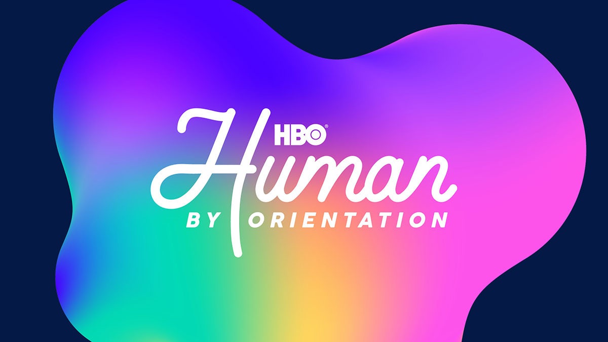
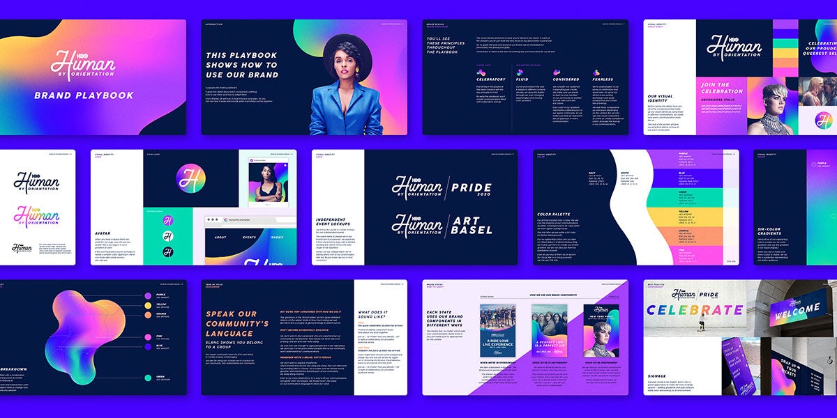
US TV network HBO has teamed up with London design agency Human After All to build a brand for Human By Orientation, the recently launched platform for queer communities. Working from the ground up, Human After All have developed the strategy, visual identity and tone of voice to create a colourful brand packed full of celebration and hope.
Human By Orientation aims to be a cultural hub for queer communities in the US, but as the name suggests, it’s open to everyone because LBGTQ+ programming in both TV and music performances appeal to a much wider audience.
“It’s a bold play by a mainstream, premium brand to help define new norms in society by celebrating and promoting queer culture,” explains Paul Willoughby, Human After All’s ECD. “Like many other content producers, HBO has recognised that audiences traditionally thought of as minorities are growing rapidly in the US, and they want to create an evergreen space hosting queer programming to be in a relationship with the audience all the time.”
The brief from HBO was very open and it was up to the agency to take what was still a very new initiative and turn it into a living, breathing brand. “Our first thoughts on the brief were basically huge excitement. I’d seen the initial Human By Orientation launch event in SXSW Austin at an event venue with a giant ‘human’ logo stretching across a building,” says Willoughby. “This made me dream that maybe we might be a good fit for working on the project, as both us and HBO were quite clearly interested in humans!”
Once Willoughby and the team began to explore the brief, it was clear that they needed a better understanding in what made for “best-in-class brand comms for queer audiences”. So the team asked friends in the queer community to recommend brand moments that resonated with them.
Understanding this landscape helped the team shape how Human By Orientation could stand out and it compiled all the findings and insights into a discovery report that showed HBO where the opportunities were.
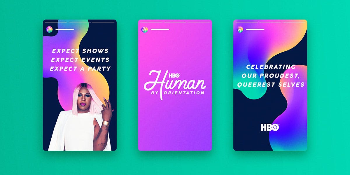
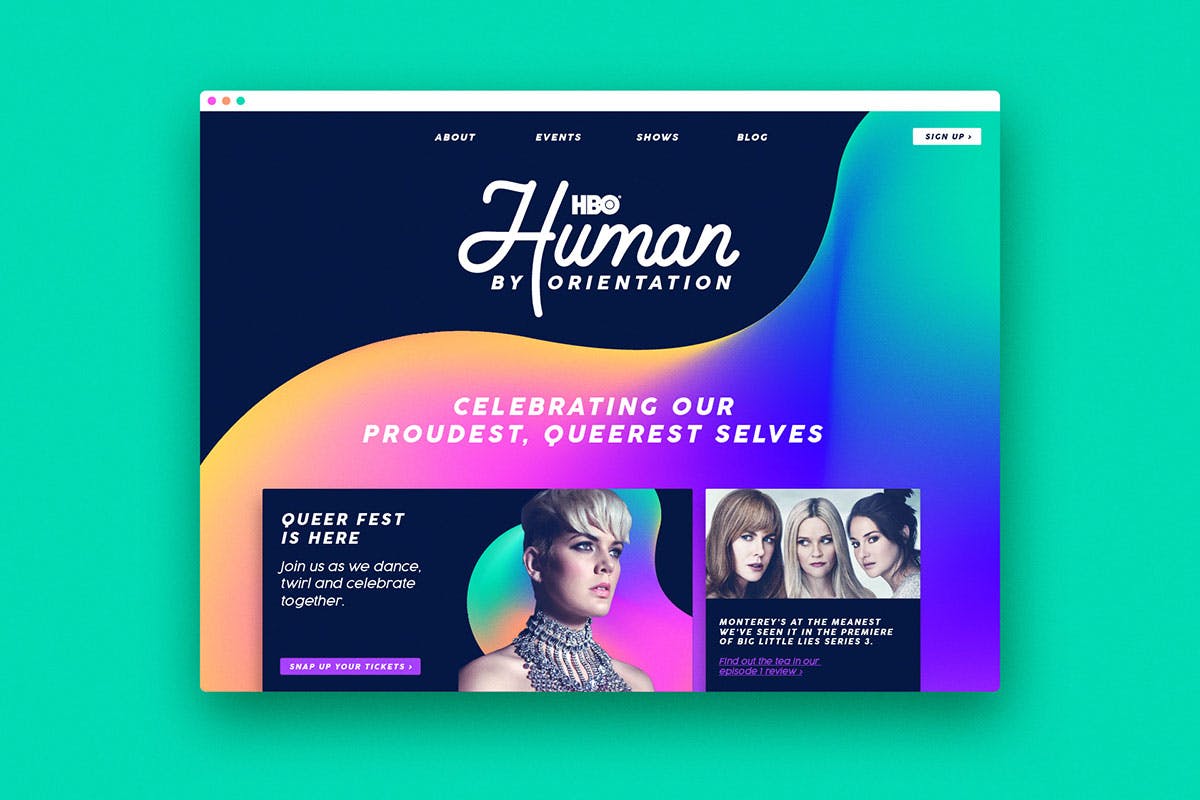
Real clarity came when Human After All landed on the platform’s brand purpose: ‘To celebrate our proudest, queerest selves’. “Defining a brand’s purpose is something we place great emphasis on, as it becomes the centrepiece of our creative brief and the driver of all communications going forwards,” Willoughby explains. “All of a brand’s communications should be coloured by the brand’s purpose, and this becomes something to measure all comms by.”
Human By Orientation’s purpose of celebrating our queerest selves aims to represent the broad change in cultural ideals that the brand seeks to make. “We’ve all seen that media is the most powerful medium to change commonly held views in society, and Human By Orientation’s purpose is to do just that – to expand representation and help increase the confidence of queer communities to live their lives in public,” says Willoughby.

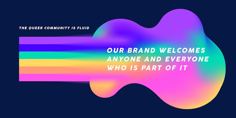
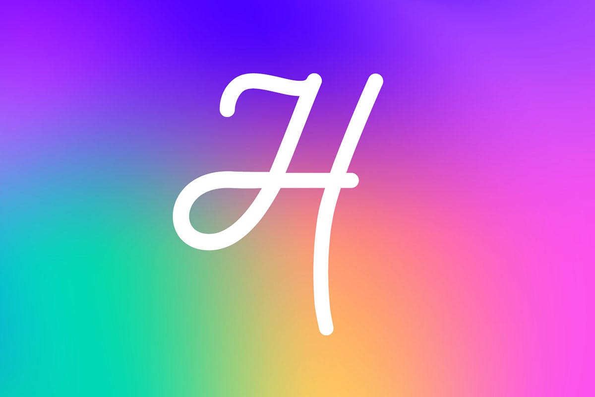
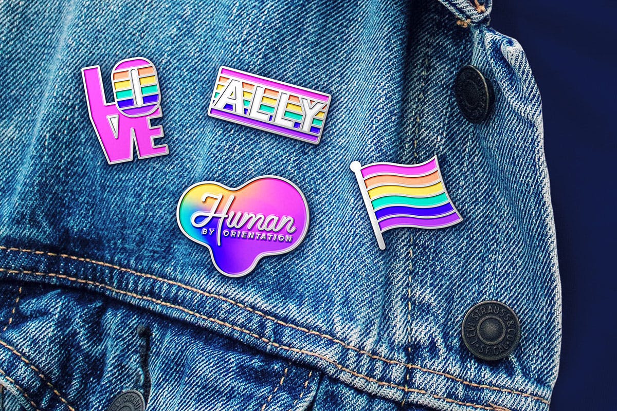
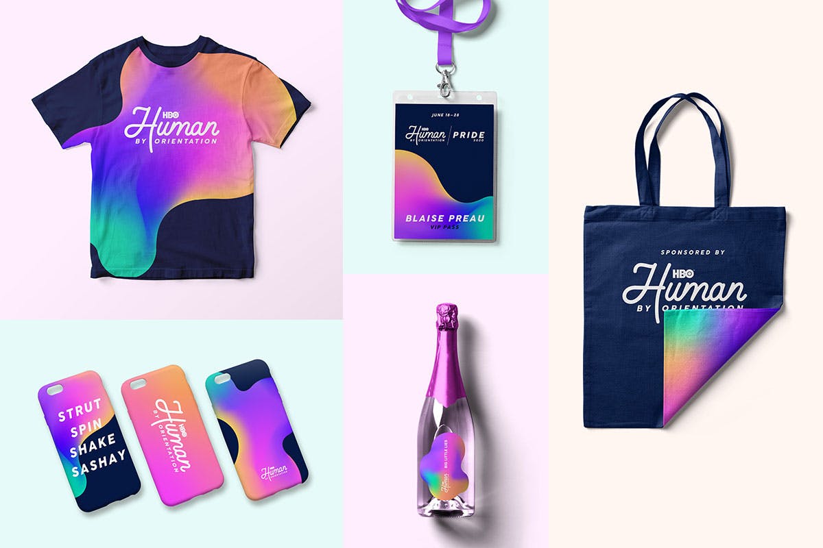
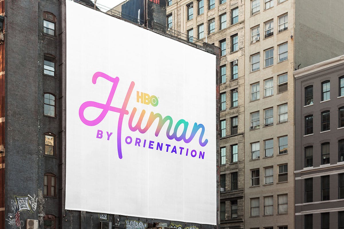
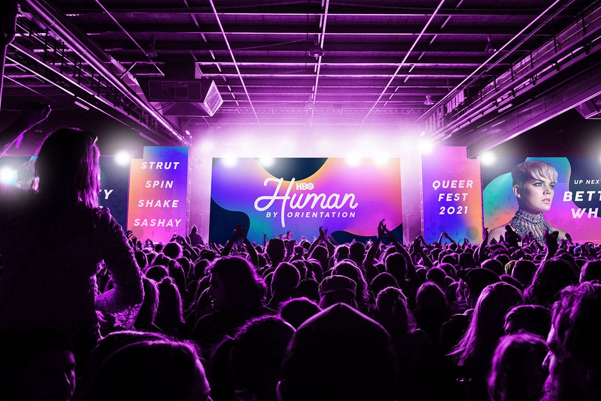
With the brand purpose set, it was time to develop the visual identity, which was inspired by the central brand idea of ‘blurring the lines’ to celebrate fluidity in people’s choices around sexuality. The colour palette stems from Gilbert Baker’s iconic rainbow flag offset with punchy purples, blues and pinks, all with an airbrush feel.
“We had a big debate about whether queer audiences still need to see an overt representation of the flag to get the association,” says Willoughby. “In the end, the fluid gradients – more abstract, yet still dazzlingly vibrant – felt like the right balance of something ownable, while still playing off the flag’s cultural heritage.”
A bold and elegant typeface has been used throughout and the photography that accompanies the brand materials uses the same midnight blue that appears in other parts of the identity, giving the portraits and imagery featured a sense of cohesion.
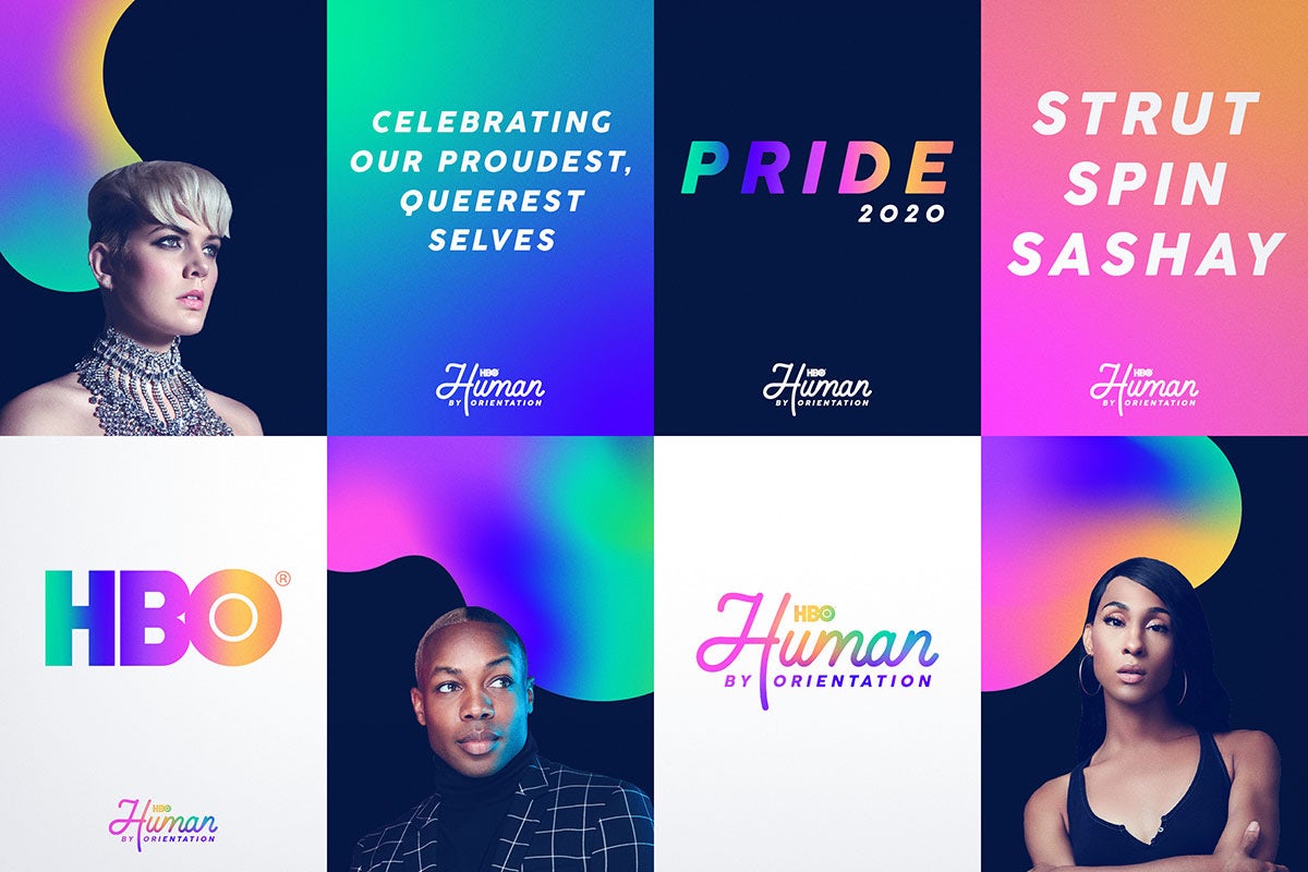

As with many projects, Covid-19 played its role in making the execution of some parts of the project more difficult. “A big challenge we had towards the end of the project was getting the brand toolkit ready for HBO’s ambitious 2020 digital Pride celebration. This event had been rapidly organised due to Covid cancelling in-person Pride events this year,” says Willoughby. “We were drip-feeding final design assets to the marketing agency Lupine Creative to ensure the site came out looking bang-on the freshly conceived brand. The Pride website and accompanying campaign went on to notch up 1.4 billion cumulative impressions, so we’re glad we managed to squeeze the work out!”
While the brand has been well received, what Human After All is most proud of is the part it’s played in this cultural shift, where LGBTQ+ culture and programming gets equal billing on a well-known network. “We hope that queer communities will benefit from the broader representation the brand promotes,” says Willoughby. “And that our future-focused, flexible brand toolkit will pave the way for more of that.”

Latest from CR


