
Nature magazine redesigns for the digital age
For its 150th birthday, the scientific journal hits refresh by rolling out a new custom typeface, logo and style guidelines across its print and digital platforms.
Nature magazine has been redesigned with digital audiences in mind. The updated visual system will be launched across its international print magazine, desktop website and mobile page.
The British scientific journal is celebrating its 150th birthday in November. In its history, it has published many scientific breakthroughs: the structure of DNA, plate tectonics, and the discovery of the first exoplanets.
The update is a response to digital users’ needs and an attempt to prevent “information overload”, its creative director Kelly Krause says. She cites as inspiration the New York Times and MIT Technology Review, the journal produced by the Massachusetts Institute of Technology.
The magazine worked with London-based design studio Mark Porter Associates on the project, which began in 2017 and covers magazine redesign as well as brand architecture.
Design inspiration

An inspiration was mid-century Swiss and European design, such as the vintage scientific journal, Naturwissenschaft und Medizin. Mark Porter, founder and creative director of his eponymous design company, says that this focus on information design — the type that appears on pharmaceutical packaging and in textbooks, for example — was a driving force.
It was also about striking a balance between Nature’s content and its personality.
The “rigorous Swiss design” was infused with a British “quirk”, according to Porter. “We didn’t want it to be a characterless international product,” he says. “We had to try and capture its spirit.”
Print magazine
Nature is split into two sections; news and features at the beginning, and academic research at the back. For the news section, the studio created 200-page template document for efficiency. News articles are often published online first, Porter says, so the emphasis was on creating templates that meant editors and designers didn’t have to spend a lot of time reformatting for print.
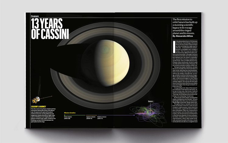
For the features, which are more stylised — featuring full-bleed photos or reportage — the studio provided guidelines. “That’s where Nature really has freedom to be proper editorial designers,” he adds.
The news and features can be read on the mobile — the academic papers are more commonly printed out as PDFs. The mobile site has been designed with information-packed articles in mind. “The app is there to be assessable and useable,” Porter says. “It’s a relatively restrained and simple design because that’s what the content demands.”

New typeface
A new font has been created, named after neurologist Anita Harding, a scientist who was herself published in Nature. The typeface was created in conjunction with foundry, Commercial Type.
Krause says it has long been an aspiration to create a typeface specifically for a scientific publication, but that there were two main challenges.
“The content is demanding and requires tremendous concentration, so legibility and readability is absolutely essential,” she says.
Another consideration is that various typefaces are needed to write out scientific equations and formulae. If these are not done well, the “reading experience can be jarring,” Krause says.

The font was designed after identifying these needs. In an attempt to make the equations and formulae clear, the sub- and superscript characters were “carefully honed to convey scientific meaning rather than typical Greek-language prose”.
Italics have also been made “more slanted” in an effort to make them more distinct. Often, single italic characters are used as isolated symbols, such as ‘h’ for Planck’s constant, a scientific principal denoting the quantum of electromagnetic action.
Evolution of a logo
Since the magazine’s launch in 1869, its logo has changed at least ten times. All of these were designed for print publication. The new logo breaks away from this. As Krause says: “finely worked features, digitized into pixels, can look fuzzy on smartphone screens.”
The logo is also an attempt to create continuity in the magazine’s branding history. It is based off the Harding font, but with added details to the tail of the a and the top of the r. This subtle formatting is a nod to previous logos, Krause says — with its “echo” of the Baskerville Old Style logo from the early 1970s.
Simplified branding
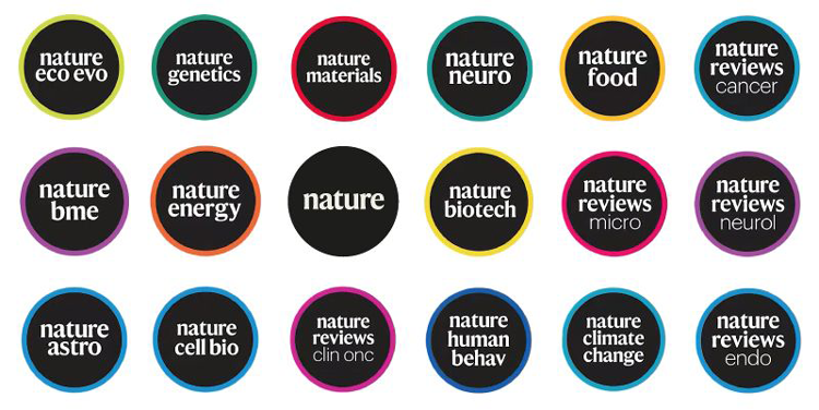
Nature has many branded journals and Porter worked to “rationalise” this branding, which had grown without much control and become “chaotic”. Each journal specialises in specific fields such as genetics, human behaviour or climate change. “We wanted to make the hierarchy of these titles clearer,” he adds.
A design system has been introduced so that each journal can follow a coherent look.
The journals’ logos have been simplified for use in social media avatars, which are often small, especially Instagram. Titles have also been streamlined for digital audience: Nature Reviews Clinical Oncology has been changed to nature reviews clin onc, Nature Machine Intelligence to nature m.i., and Nature Ecology & Evolution to nature eco evo, for example.
Another big change is the removal of the red bar from the top of its website. The journal had used red since the 1990s — moving away from its distinctive orange — but has shifted as associations with the colour have. Krause adds: “With the rise of the web, red is now often associated with unpleasant online features such as error messages.”
Although a lot of these design details have been rolled out ahead of Nature’s 150th birthday in November, the scale of the magazine — it has over 50 print journals and hundreds of web journals — means that the digital roll-out will continue over the following years.

-
Post a comment


