
In the 1980s and ‘90s, our technology-loving civilization rode the wave of Personal Computing – one computer per person. As computers became smaller and less expensive to produce, every worker—or indeed, every person—could have one at his/her disposal. With the rapid rise of Ubiquitous and Mobile computing, the situation had certainly changed by the 2010s. It’s more or less fair to say that every person is the owner and user of many computers, desktops or laptops, tablets and—of course—smartphones. We receive our computing services even from things that don’t look like computers at all—for example, Amazon’s Alexa or smartwatches. What does this mean for UX design? How can we design experiences that take this variety in computing resources and interfaces into account and help ourselves optimize our results? Let’s find out.
Mark Weiser, a senior researcher at Xerox Park and widely regarded as the founding father of Ubiquitous Computing, argued in 1994 that the future of computing would be dominated by ubiquitous computing devices. Contrary to the Personal Computing model, where each person owns a computer, Ubiquitous Computing is a model where each person owns and uses many computers, or even where many computers share many users. It’s not hard to see that this prediction came true: A modern smart home, including not just Internet of Things devices such as smart lighting, smart thermostats and smart energy meters but also personal and shared devices such as tablets, smartphones, and desktop and laptop computers, provides shared services to all family members and guests.
“The Ubiquitous Computing era will have lots of computers sharing each of us. Some of these computers will be the hundreds we may access in the course of a few minutes of Internet browsing. Others will be imbedded in walls, chairs, clothing, light switches, cars – in everything. UC is fundamentally characterized by the connection of things in the world with computation. This will take place at a many scales, including the microscopic.”
-Mark Weiser & John Seely Brown, 1996
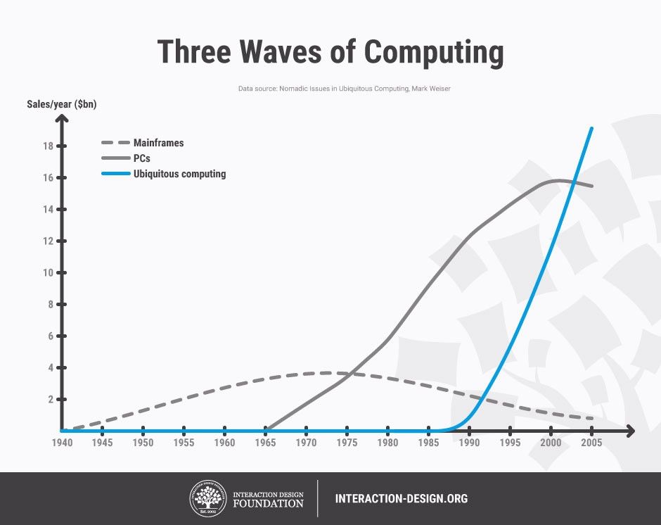
Author/Copyright holder: Teo Yu Siang and Interaction Design Foundation. Copyright terms and licence: CC BY-NC-SA 3.0
Ubiquitous Computing is the third wave of computing, according to pioneering researcher Mark Weiser. He correctly predicted that devices such as tablets, smartphones and connected Internet of Things gadgets would overtake the market and transform the way we think about computers and their services (diagram based on Weiser, M. 1994).
For a UX designer, understanding the users’ environment during the Empathy or Define stages in the Design Thinking process means understanding the devices available to them and what they are best suited for, or the how and why users make use of these devices.
Understanding the context of device use to inform UX design
In their book “Pervasive Computing: The mobile world”, Uwe Hansmann et al. (2003) discuss the information technology infrastructure that would power the ubiquitous computing wave. In their discussion, they offered the insight that computing services would be provided via a range of devices available to the users, either directly or as part of a service infrastructure. One critical aspect of this insight was the purpose of use of each device:
Servers will be used to store and process large volumes of information – indeed, think about cloud services such as Dropbox or Google Drive, or the massive servers that process big data to provide recommendations in services like Foursquare. These devices are not directly accessible to users, but they are part of the user experience, as the information architecture in user interfaces largely depends on the processed information this infrastructure provides.
Workstations are devices such as desktops and laptops: People can use these devices for longer sessions, spanning from a few minutes to several hours. Because of their large screens and input modalities (keyboard and mouse), they are well suited for editing and managing considerable volumes of personally relevant information, or for accomplishing complicated tasks that require the cognitive processing of lots of information.
Devices are what we refer to as our tablets, smartphones or other personal, mobile gadgets (e.g., fitness trackers). They are primarily used to access the information stored in the servers and managed by workstations, or to create small bits of information themselves, which can be uploaded to servers. Interaction with these devices is best limited in short sessions, a few seconds or minutes at the most, typically because the user might be mobile (thus often interrupted or distracted by more urgent things—for instance, paying attention to the road while walking), but also because the limited input and output modalities of these devices (small screens, awkward touch-based text and pointer entry) frustrate users during prolonged use.
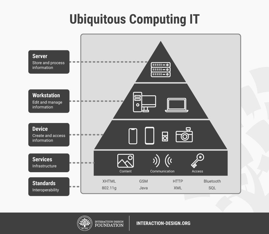
Author/Copyright holder: Andreas Komninos and Interaction Design Foundation. Copyright terms and licence: CC BY-NC-SA 3.0
The tiers of ubiquitous computing information technology infrastructure by Hansmann et al. (2003). Services will be distributed across a wide range of different types of computers, and users will employ a different device depending on how they need to interact with a service. We can expect to have a larger volume of devices, compared to workstations or servers. The ecosystem of devices and services is underpinned by an array of common standards that guarantees interoperability.
Let’s consider an example of the above. If you wanted to engage in a complex task, such as finding a new TV to buy, you would probably want to do this on a desktop computer. With its large screen, you can open multiple browser tabs or stack browser windows side by side, helping you navigate and compare technical specifications and prices from multiple e-shops until you find what you want and go through the checkout process. The same task would be much more difficult using a smartphone. Because you would need to visit multiple e-shops and only one website can be displayed on the screen at any time, you would need to remember what you found previously or frequently switch through the many websites to refresh your memory, making the interaction very frequent and, of course, putting considerable strain on your cognitive load and memory. Other examples might be editing a long document or email, where the small screen on a smartphone presents not just input problems but also problems with having an overview of the document structure (you need to scroll a lot!) and managing spelling mistakes.
Inversely, if you wanted to quickly fact-check something during a conversation in the pub (e.g., to find what year the Bugatti Veyron car model came out), you could very easily do this with your smartphone. If you wanted to check in to a place on Facebook, you could again create this small bit of information with your smartphone – there’s certainly no need to wait until you are at a stationary computer! Or, to record your daily jogging activity, a wearable fitness band is just perfect; you don’t even need your smartphone for that. For a UX designer, what would be the point in engaging in the design of a website for desktop computers that allowed users to record their jogging but required them to carry a laptop while doing so?
That last question was rhetorical – of course, there’s no point. But the question highlights that good UX design depends on understanding not just what the users want to do (and their motivations) but also the devices that they have available to them (or haven’t, but that’s something you might create from scratch).
Choosing adaptive or responsive UI strategies with Task-Oriented Design
Task-oriented design (TAD) is not a strictly defined methodology, but according to Lewis & Rieman (1994), it’s simply an approach to systems development that places a heavy focus on finding out the goals that users need to meet while interacting with a system, and then designing that system so that it can best accommodate the tasks that lead to accomplishing these goals. The process of breaking down a user’s goal into tasks is called Task Analysis.
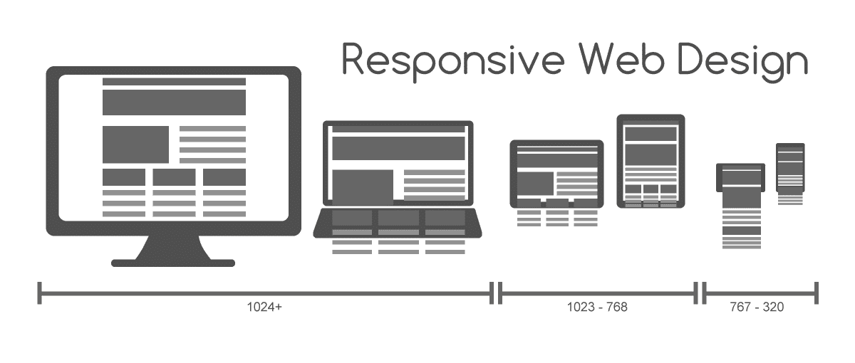
In the days of old, the services offered by websites and applications were tightly coupled to the hardware that these ran on. For example, back in the early 2000s, you could only visit a website through a personal computer. From our vantage point, years later, we can easily see how it’s simply not enough to think of services as something that’s so heavily bound by hardware. Instead, a service should adapt, as much as possible, to the hardware devices currently available to the user. This has led to the introduction of concepts such as responsive design, whereby the interface (usually a website) adapts to the physical layout of the device on which it is being viewed, in order to afford maximum usability. You will have seen this often with the mobile versions of many websites, where code ensures that the interface layout changes drastically to facilitate navigation and information seeking through the small displays of modern smartphones.
Author/Copyright holder: Muhammad Rafizeldi, Wikimedia. Copyright terms and licence: CC BY-SA 3.0
In responsive design, the content is “liquid” – i.e., restructured and laid out differently so as to better fit the device on which it is being displayed. All of the content and functionality are still there; they’re just presented differently.
The concept of adaptive design builds on this principle but doesn’t only concern itself with laying out interface elements differently. In adaptive design, depending on the user’s goal and device context, the service may alter not just its layout and visual appearances but also the way it offers services. In web design, this is often accomplished by having separate, dedicated, custom versions of the same website, tailored for mobile devices. Some services might not appear in the UI, because it doesn’t make sense for the user to be able to perform them in the given context (device and use mode). For example, a custom mobile website for an e-shop may completely lack a multiple-item comparison feature, because fitting so much information about multiple items inside a small screen is just impractical. Alternatively, some services may be provided differently. For example, if a programmer defines that an input field should contain only numbers (e.g., used for entering a telephone number), the mobile device will display a special version of the keyboard that allows the input of just numbers, to ensure that the user enters valid data. The equivalent field on the desktop version of the website may simply have additional code attached that checks that the entered data is valid (i.e., numeric only).
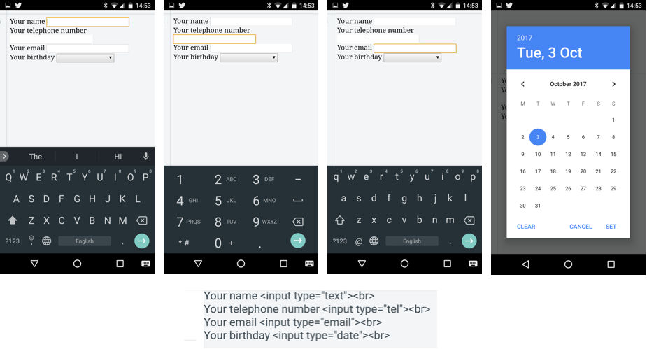
Author/Copyright holder: Andreas Komninos, Interaction Design Foundation. Copyright terms and licence: CC BY-SA 3.0
An example of adaptive system design: Google’s Chrome browser and GBoard keyboard for Android. The snippet of code shows the HTML specified by a web designer, indicating the various purposes of the input fields to the browser (context of entry). When the user focuses on each input field, different versions of the keyboard appear – to help with entry tasks. From the left to the right, a standard text field invokes the default keyboard view along with a suggestion bar. A “telephone” field invokes a numeric-only version of the keyboard that contains symbols (+, #, *) used in telephone dialing. An “email” field invokes a special version of the alphanumeric keyboard that has a shortcut to the @ symbol and no suggestion bar. Finally, a “date” field invokes not the keyboard but a special dialog window to allow users to select a date accurately. Note that the functionality of the keyboard is different in each case – for example, you can’t force the keyboard into an alphanumeric mode for the telephone field.
A task-oriented approach to design teases out such user requirements and guides design to help users achieve their goals, by optimally designing not just for the task at hand, but also for the device available to the user and the situations in which this device is used.
Designing for users, devices and use context
Often, the use of a certain type of device also implies a lot about the way users engage with that given device. As Hansmann et al. (2003) highlighted, users in the age of Ubiquitous Computing can choose the most appropriate type of device to achieve a goal depending on their current context. For example, reading the news on a desktop computer typically means the user is stationary and prepared to dedicate a considerable amount of time to that activity. If users are on their mobiles, they could well be seated, but this might quickly change (e.g., as they approach their train stop), so perhaps it’s best to give them just the really important news first, because the interaction with the device is likely to be interrupted at any time by other priorities. The level of interruption during mobile use is all too real: researchers Oulasvirta et al. (2005) found that when we are using our mobile or cell phones, interactions are impulsive, fragmented and inherently short term, as our use of the mobile device continuously competes for our cognitive resources with the simultaneous performance of mobility (e.g., walking) as well as environmental (e.g., being aware of our surroundings) and social tasks (e.g., being aware of those around us and our relationship with them). It was found in that study that for these reasons, users’ attention to their cells or mobiles spans between a mere 4 and 8 seconds. This means that any task (or sub-task) you would want your users to perform on their mobile devices shouldn’t take longer than that amount of time. Going beyond this might run the risk of causing frustration (the ultimate sin for any designer) and accidents. We certainly don’t want to encourage less-attentive users to walk into things, out in front of moving things, or off things that are any distance above the ground!
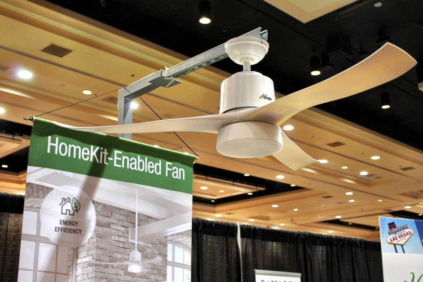
Author/Copyright holder: tomemrich, Flickr. Copyright terms and licence: CC BY 2.0
How do you design the UX for that which has no interface? A connected IoT device such as this fan, for example. In many cases, the interface has to be purely virtual, or very limited (think of just an on-off switch and maybe a few LEDs). Here are your key considerations: Where are the users? What are they doing? What are their goals? What’s the best way of interacting with this device?
UX consultant Larry Marine (2014) outlines some of the contexts of use associated with different types of devices and the assumptions that we might be entitled to make about our users when they are using such devices.
Stationary computers (e.g., laptops and desktops): With these devices, users are typically stationary and interaction sessions to complete goals are longer, ranging from several minutes to even hours. They are the preferred type of device for performing more complex tasks. As stated previously, the large display area that can fit a lot of information allows users to spend more time processing that information, rather than interacting with the device to get it. Also, because of the ability to use keyboards and mice, the creation and management of large volumes of information are much easier. The accuracy and feedback-rich nature of such input devices (e.g., you know when you’ve pressed a key or clicked a button) allows users to perform complex operations (e.g., blind-type, drag-and-drop, multiple selections) with little frustration.
Tablets: Because of their relatively large size that requires either the use of both hands or some support (e.g., on the body or a table), tablets are typically used from a stationary position. Even when the users are mobile, they would typically need to stop in order to use their devices. Nevertheless, tablets tend to have a relatively large display area, so they could be just as good for reviewing large volumes of information as stationary computers. On the other hand, they lack the accuracy and feedback of keyboard and mouse devices, because input largely relies on the touchscreen and virtual keyboard. As such, tablets are not appropriate for managing and creating large volumes of information. In this respect, an adaptive design such as the design of the keyboard operation and automatic switch between alphanumeric and numeric-only modes or the automatic input of values (e.g., entering a city name by resolving the geographic coordinates fetched by the GPS) can help considerably.
Smartphones: These devices have, by and large, become our sidekicks, our trusted companions that go everywhere with us and often, literally or metaphorically, save our lives when we need to find some information or generate some quickly. Let’s think about what this means for a moment. We use our smartphones mostly to support other tasks that we perform, such as finding our way to the nearest café or finding a cab to take us somewhere. This means that interaction with these devices is spontaneous and sporadic. We use them for short periods of time, to accomplish simple and very focused information-retrieval tasks swiftly (e.g., finding out our location) or to respond to an incoming alert (e.g., replying to a short message). The small display sizes mean that only small amounts—or short bursts—of information can be presented at any time to a user. They also mean that input is largely frustrating, whether it involves selecting material on the screen or entering text with the virtual keyboard. As a result, interaction sequences have to be very short and simple, both for minimizing the amount of interaction and for allowing users to quickly resume their ongoing tasks. You should also automate as much as possible, both in terms of filtering out and presenting only the content which is contextually relevant (e.g., showing only a list of cafés within walking distance instead of all cafés in the city), and in terms of data entry (e.g., automatically fetching the users’ geographical coordinates instead of requiring them to input these manually using a map).
Larry Marine’s article stops short of the latest development of the third wave of computing, which is the proliferation of the Internet of Things. We can add to his list as follows.
Internet of Things devices:small, connected devices that are pervasive (i.e., embedded in the environment around us) and work autonomously to make our lives a little more comfortable. They serve single purposes and should be designed to support just those and optimally so. Users are seldom close or attentive to those devices. Other than setting them up, and sometimes intervening to override their behavior, users can be mobile or stationary, but they are typically far away from these and engaged in other, unrelated tasks. These devices pose the hardest interaction problems. As they are meant to be largely transparent, their interfaces might be completely virtual (i.e., visible only through another device, such as a smartphone) or completely minimal, with a low-resolution display, mechanical controls (e.g., knobs or buttons) and possibly status LEDs. Interaction with these devices is meant to be mostly implicit—for example, our mere presence in a room at night might be enough to switch on the intelligent lighting for that room to the levels of our personal preference. One important consideration for these devices, though, is that they are inherently shared devices. While smartphones are highly personal, IoT devices often serve many users simultaneously (e.g., family members in the same room), whose individual preferences might conflict. Given that, we cannot really rely on large-scale success from designing for a “bachelor-pad” market.
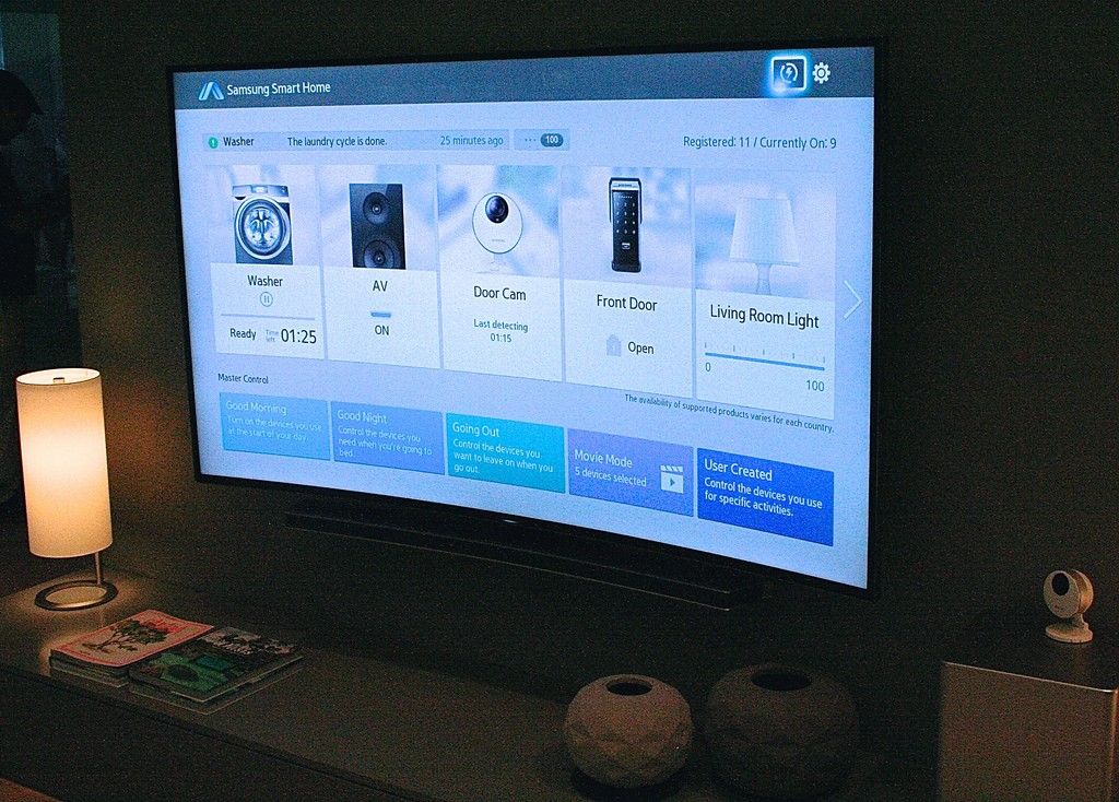
Author/Copyright holder: CODE_n, Flickr. Copyright terms and licence: CC BY 2.0
Connected device virtual interfaces, such as Samsung Home (pictured) or Apple’s HomeKit, consist of a framework that provides a unified application through which users can control all the connected devices in their home. This is another great example of adaptive design – these apps adapt to whatever functions each device can offer and display only those controls to the user that are relevant.
Naturally, these are general assumptions that may not always hold true, depending on the context of the UX that we are designing for. However, keeping these assumptions in mind and adapting them for your own project will greatly help you in deciding whether a responsive or adaptive design is best suited for the UX design of your application (which you should really begin to think of as a service).
The Take Away
The third wave of computing—Ubiquitous Computing—brings new opportunities as well as challenges for us as UX designers. Responsive and adaptive design are one way in which we can begin to address the design challenges of offering services to users via all the devices they own or have use of. To create efficient designs and pleasurable user experiences, we can employ task-oriented design approaches to defining the users’ problems and ideating new solutions. The analyses of tasks, however, should focus not just on the users’ goals and subtasks for achieving these but also on the nature of the devices that users may employ to carry out these tasks, and the implications these devices have regarding the way and environment in which users are to use them—and enjoy doing so. Only when we accommodate the entire scope of use in this way can we craft designs that will arrive on target in the marketplace and satisfy users time and again, wherever they may happen to be.
References & Where to Learn More
Hero Image: Author/Copyright holder: Bretislav Valek, Wikimedia. Copyright terms and licence: CC BY-SA 3.0
Hansmann, U., Merk, L., Nicklous, M. S., & Stober, T. (2003). Pervasive computing: The mobile world. Springer Science & Business Media.
Cousins, C. (2015). “Is adaptive design better than responsive design?”.
Lewis, C., & Rieman, J. (1993). Task-centered user interface design. A Practical Introduction.
Marine, L. (2014). “Responsive Design vs. Task-Oriented UX Design”.
Oulasvirta, A., Tamminen, S., Roto, V., & Kuorelahti, J. (2005, April). Interaction in 4-second bursts: the fragmented nature of attentional resources in mobile HCI. In Proceedings of the SIGCHI conference on Human factors in computing systems (pp. 919-928). ACM.
Weiser, M. (1994, March). Ubiquitous computing. In ACM Conference on Computer Science (p. 418).
Weiser, M., & Brown, J. S. (1997). The coming age of calm technology. In Beyond calculation (pp. 75-85). Springer New York.


