
A graduate company rebrand based around “thousands of journeys”
Supple Studio has rebranded talent specialists Gradcore with a visual language, including a bespoke font as well physical materials.
Supple Studio has given graduate employment company Gradcore a “graphic” rebrand in an attempt to make it stand out from the crowd.
The identity rolls out across brand guidelines, a website (designed in conjunction with digital consultancy Mud), and physical material such as stationery and printed material for events.
Gradcore, originally called Graduate Link, was established in 1996 as a liaison between universities, graduates and businesses.
The Sheffield-based company runs graduate schemes, university employability health checks and consultancy services.
It also has a social focus, as it attempts to help graduates from underrepresented backgrounds deal with barriers they might face in the search for employment.
“Thousands and thousands of journeys”
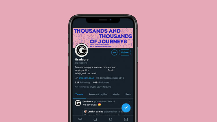
The starting point for the rebrand came from Gradcore’s positioning (which had already been written before the rebrand): “Thousands and thousands of journeys. We’re helping them begin. We’re seeing them continue.”
Supple’s creative director Jamie Ellul says: “Gradcore came to us as they felt their brand was feeling dated and lacked the energy they bring to the graduate employability and early talent sectors.”
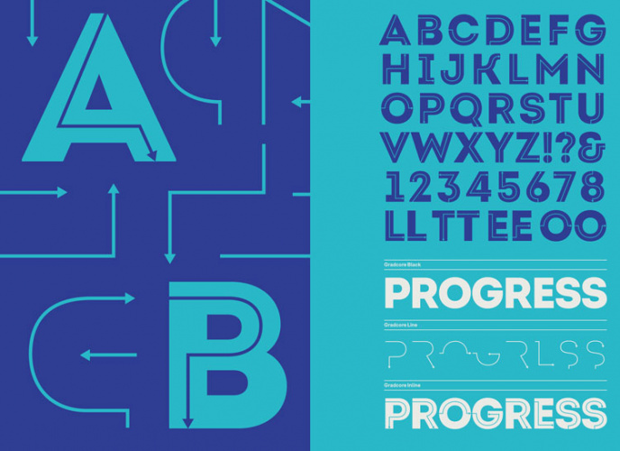
From this, Bath-based Supple created an identity “based around arrows and pathways as a shorthand for journeys”. Working with FontFabric, a Bulgaria-based type foundry, it created a bespoke variation of the typeface Intro Inline.

The letterforms were tweaked to create an arrow inline. It was then split into three – a solid, inline with solid and inline – which means it can “create interesting colour combinations and layered typography very easily”, Ellul says.
In the new wordmark, arrows run through the letters as a way to emphasise the sense of journey. The new font can be used across Gradcore’s services, which include products aimed at different audiences.

Standing out from the crowd

Phil Skinner, the studio’s design director, says that the new identity is flexible. “Some iterations use more pattern and bold colour,” he says, “whilst others are purely typographic.”
The main colour used is teal, chosen for its “optimistic” connotations, Skinner says. A secondary palette of softer pastel colours – including pink and lilac – has also been incorporated which provide a “softer” feel to the brand, Skinner adds.
The graphic identity helps the company to stand out from the crowd, according to Skinner, as Gradcore’s rivals tend to rely on “the usual photography of students”.
Skinner says that in the future he hopes Gradcore will be able to use animated versions of the patterns, as they “come to life” in motion.


-
Post a comment


