Remove canela
article thumbnail

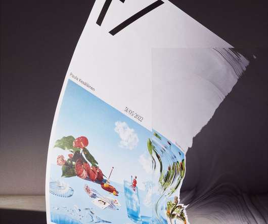
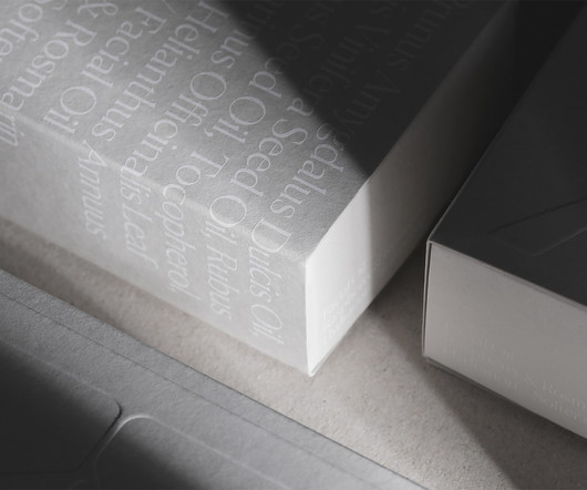
Sofia Pusa's brand refresh for a Finland photography agency is inspired by the crucial F-stop

Creative Boom

Credit for all creative direction and motion graphics goes to Sofia with still life photography by Paula Kesäläinen, web development by Oscar Goméz, and featured typefaces are Canela and Graphik by Commercial Type. Discover more of Sofia's work at www.sofiapusa.com.

Agency 536
article thumbnail

Krayna

ID Identity Design

Confidence is certainly one virtue of Canela (by Miguel Reyes / Commercial Type), which covers most area on the bottles and boxes as it was applied, in different magnitudes, to product designations, volumes, as well as ingredients and directions for use.

Insiders

Sign Up for our Newsletter

This site is protected by reCAPTCHA and the Google Privacy Policy and Terms of Service apply.

Trending Sources

article thumbnail

DixonBaxi captures the spirit of real football fans with Everton FC rebrand

Creative Boom

Paired with Canela, the typographic system achieves a balance between uncompromising historical character and a bold new take on impact.". The font in question, the suitably named Rupert Condensed, is a custom font with elements of The Tower's pointed roof. It's bold, striking and full of attitude.

article thumbnail

13 Illustration Graduates to Watch From the Maryland Institute College of Art

Colossal

MICA is redefining the role of artists and designers as creative, solutions-oriented makers, and thinkers who will drive social, cultural, and economic advancement for our future. What will you create? See more thesis work and full artist profiles at mica.edu/gradshow23.

article thumbnail

A refreshing new identity for wine connoisseurs SommSelect

Creative Review

The wordmark is based on a customised version of the primary brand typeface, Canela by Commercial Type. A new logomark leverages the prominence of the letter ‘S’ in the company’s name to create an elegant, corkscrew-like letterform.

article thumbnail

A new book designed by Span pays homage to lowrider culture

Creative Boom

The body of the book is set in Canela, a typeface designed by Miguel Reyes at Commercial Type, chosen by Span for its contrast and delicate flairs. Adam describes it as having "flamboyance and grace, reminiscent of a lowrider," sitting between serif and sans serif and defying traditional classifications.

article thumbnail

Arcana

Typewolf

Fonts: Canela , Apercu Mono , Surt

Fonts 129