rio colorful ice cream branding concept

Rio: Colorful ice cream branding concept

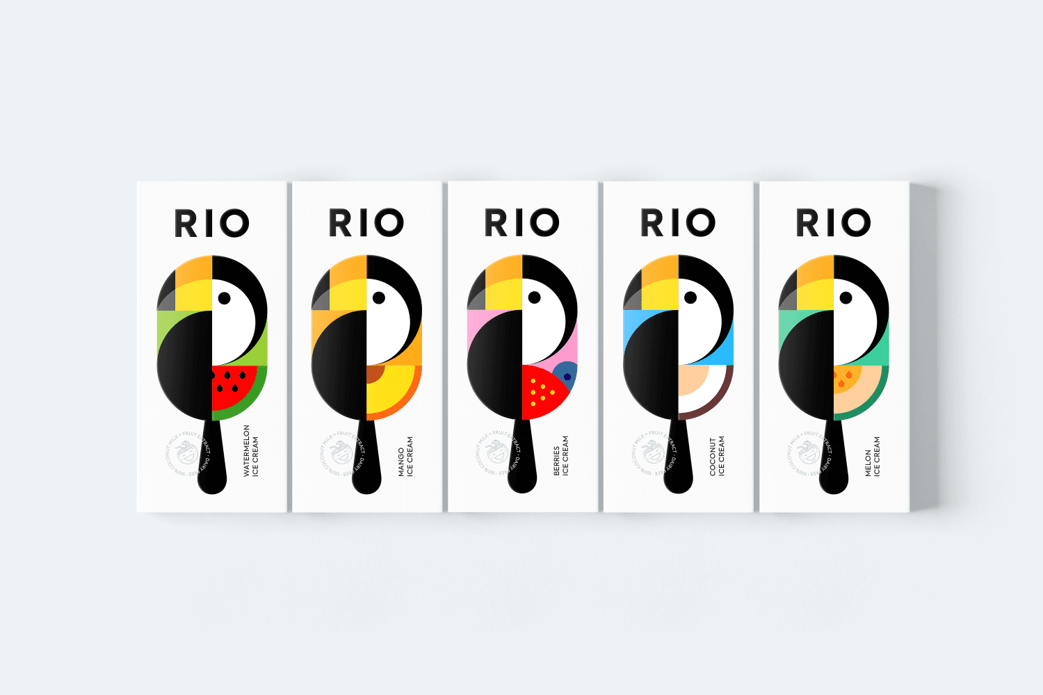
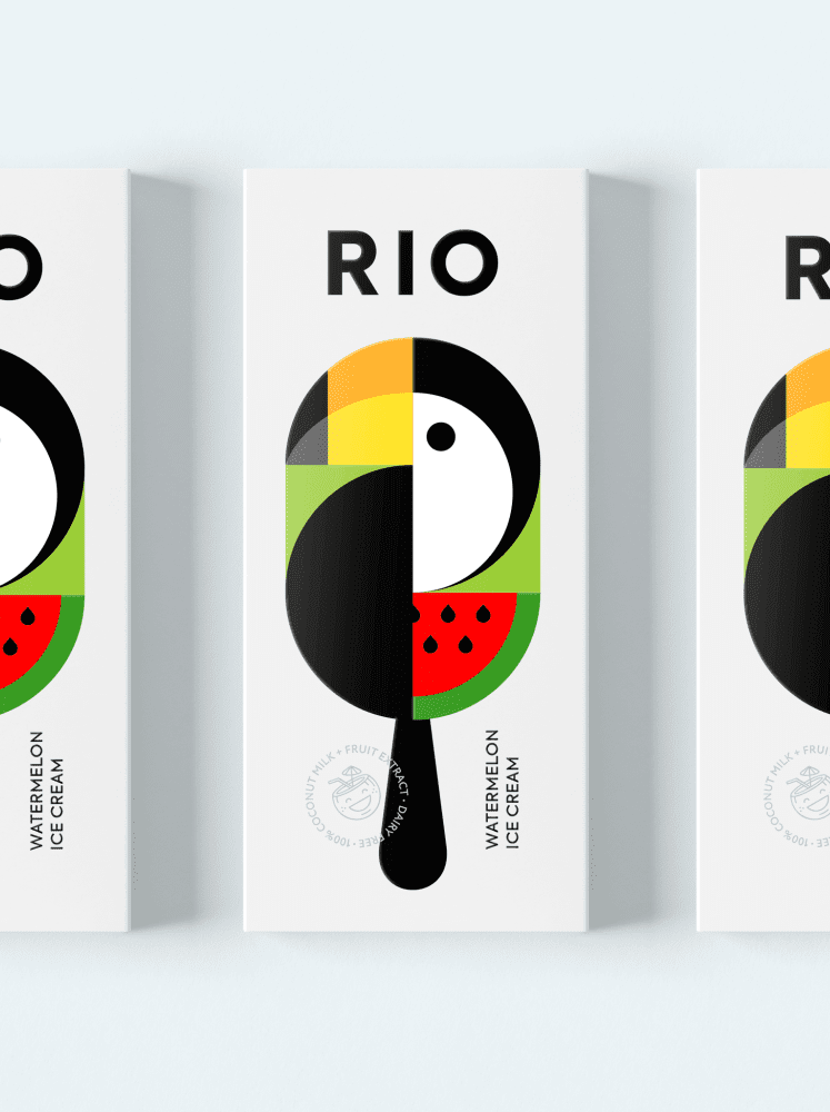
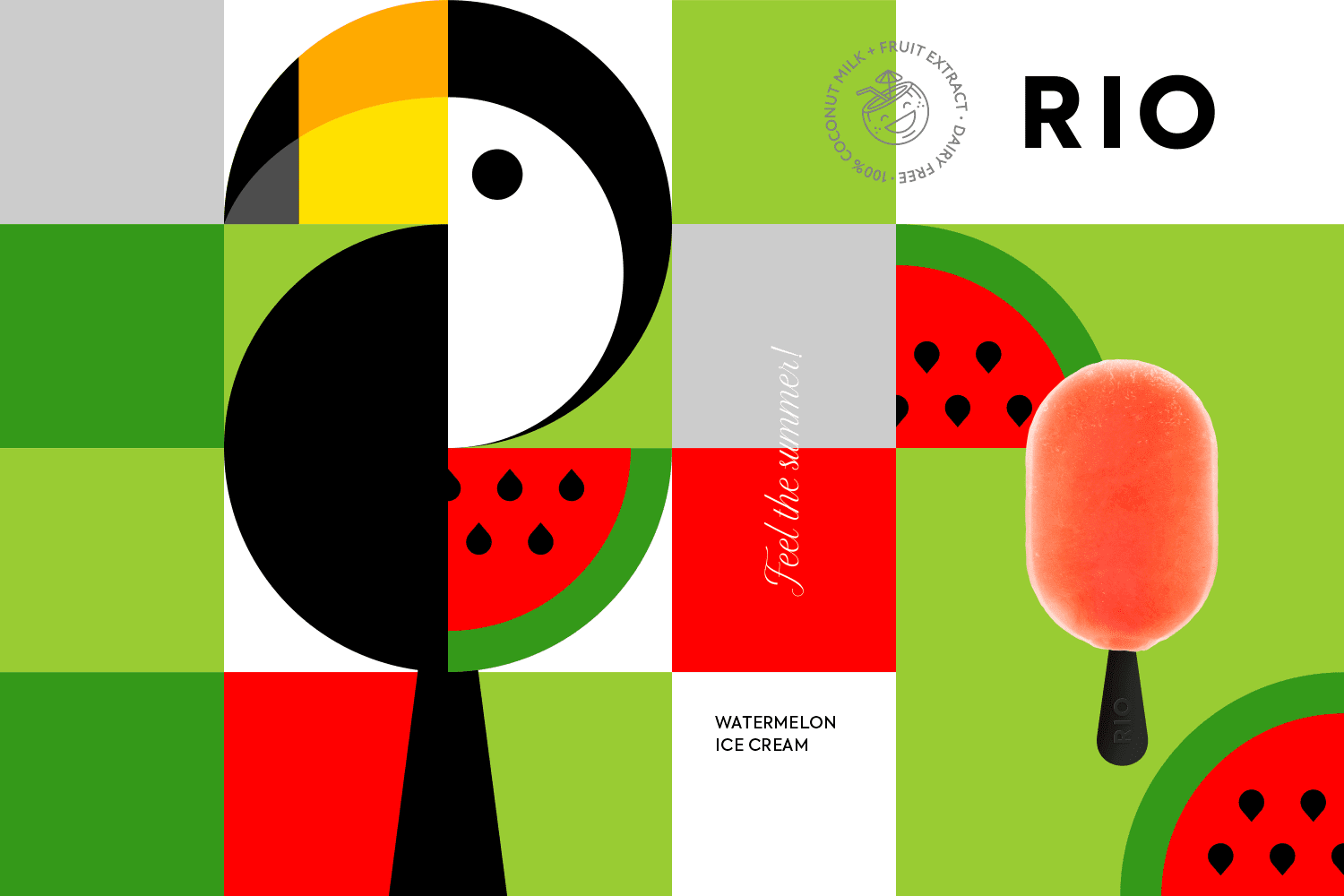
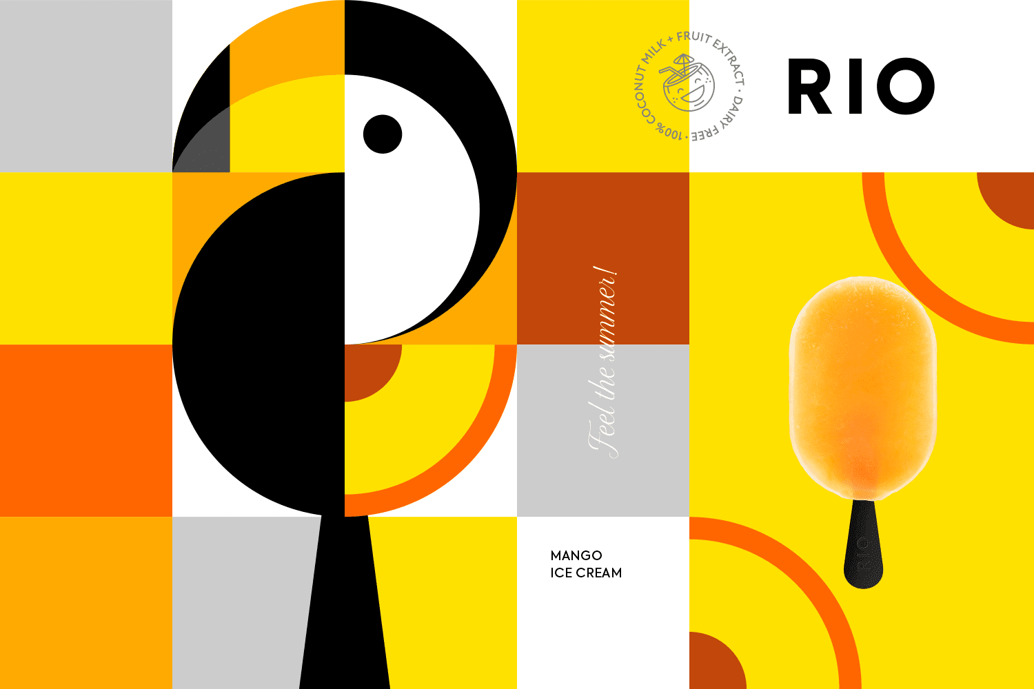
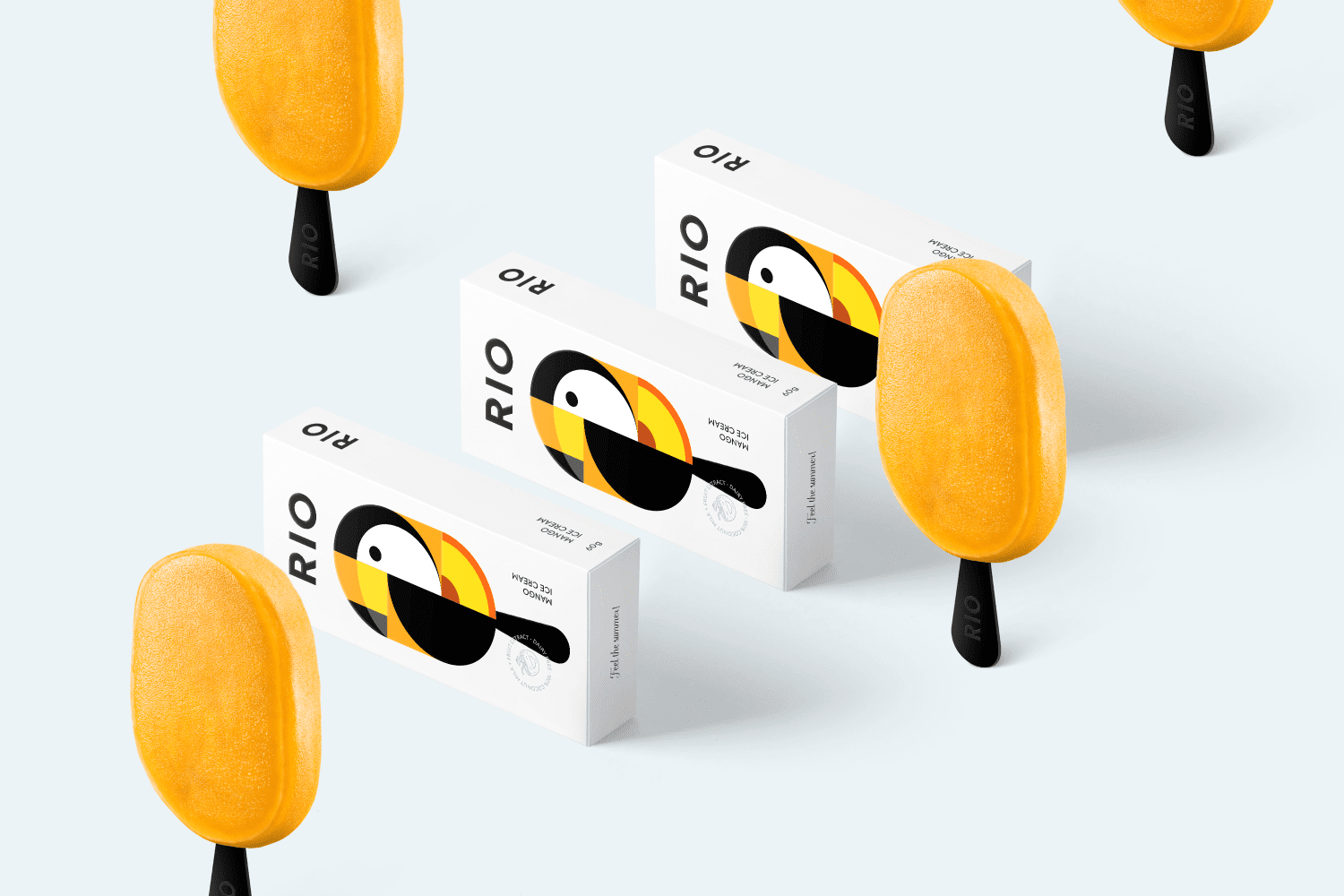
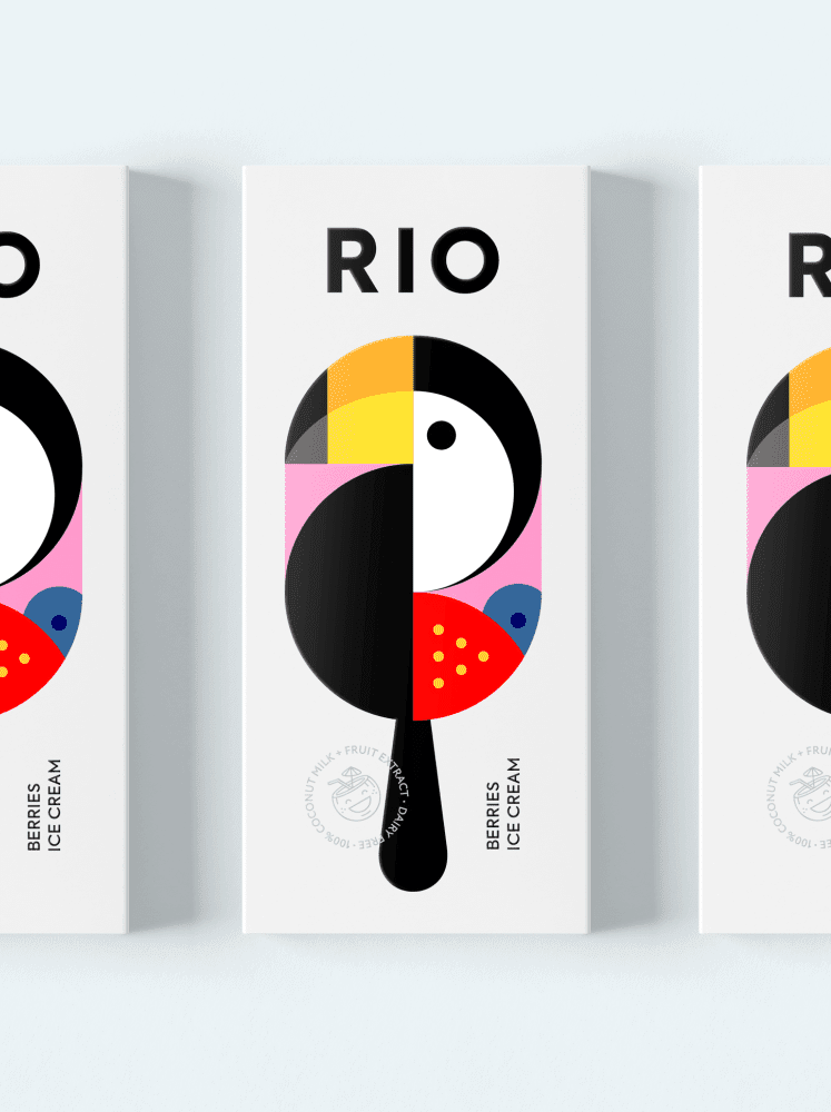
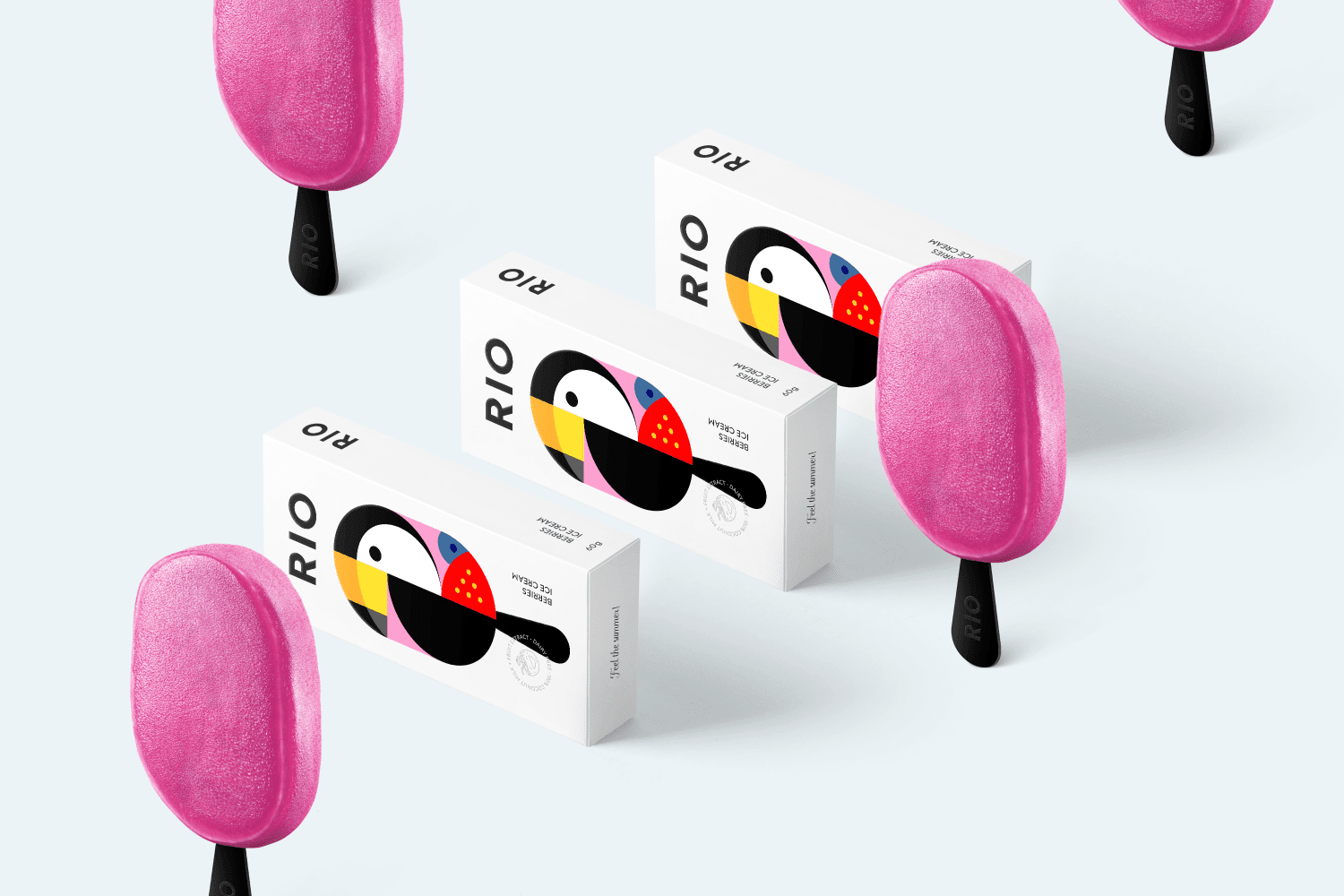
RIO is an ice cream concept inspired by one of the most colorful cities in the world – Rio de Janeiro. Conceptualized by Kazakhstani graphic designer Berik Yergaliyev, the branding chosen for the project reflects the main associations of the city – bright, yummy and sunny.

The beautiful bright colors and the toucan bird which also reminds us of Rio was chosen as the mascot for the logo.

The main idea for the packaging is to convey the bright taste and its natural ingredients ( made of coconut milk), great and simple graphics always works!
RIO’S main flavors are mango, watermelon, berries, melon and coconut.

rio colorful ice cream branding conceptrio colorful ice cream branding conceptrio colorful ice cream branding conceptrio colorful ice cream branding conceptrio colorful ice cream branding conceptrio colorful ice cream branding conceptrio colorful ice cream branding conceptrio colorful ice cream branding conceptrio colorful ice cream branding concept

rio colorful ice cream branding conceptrio colorful ice cream branding conceptrio colorful ice cream branding conceptrio colorful ice cream branding conceptrio colorful ice cream branding conceptrio colorful ice cream branding conceptrio colorful ice cream branding concept

www.behance.net/madebyberik


EXPLORE DEEPER