University Press Cover Round-Up
We welcome you to another in our ongoing feature in which notable book cover designer Jordan Wannemacher periodically highlights a selection of recent university press cover designs. Please enjoy this celebration of amazing work.
This list is in no particular order. Credits are listed below.
If you are a book cover creative and want your work or the work of your department reviewed by Jordan be sure to get in touch with us!
As with any cover design we feature in our publications, we encourage you to head to your local library and/or bookstore to view the work in its full splendor when possible.
Authors note
Full disclosure: I hesitated to do my normal monthly round-up this month with everything going on. I felt guilty bothering people to ask them for files or information when everyone is working so hard to adjust to this strange new normal. Everyone is struggling to juggle homeschooling, finding food, figuring out logistics of caring for loved ones, cooking every single meal with the level of dishes that accompanies, tending to mental health, all of this on top of trying to piece together some semblance of work and income. If I'm honest, I find it hard myself to focus on anything for any length of time right now and am struggling to keep moving with my own design practice. One comfort I have found though is when I do get into a flow and feel connected to book design. After all, I am craving normalcy, a touchstone with our "old world," and for me, nothing grounds me or feels more familiar than UP Book Design. With that said, the show must go on. Extra thanks to everyone who got back to me this month and agreed to participate in the midst of everything. I am so grateful to count myself among your community.

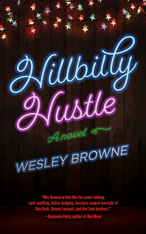
West Virginia University Press
Design/Art Direction: Than Saffel
I am such a sucker for neon effects on covers and this one paired with the rural roadside bar lights, works perfectly within the simplicity of the black background and negative space created. This automatically transports me to the exact place and tone this novel lives in before picking it up! Absolutely lovely.

University of Nebraska Press
Design: Nathan Putens
Swoon! Look at this art! Isn't it perfect? I love it when you can tell a designer worked outside of the computer and got their hands dirty to create an image. This is also such a great conceptual illustration of the subject matter and the shade of orange really pops the negative space created by the tear.
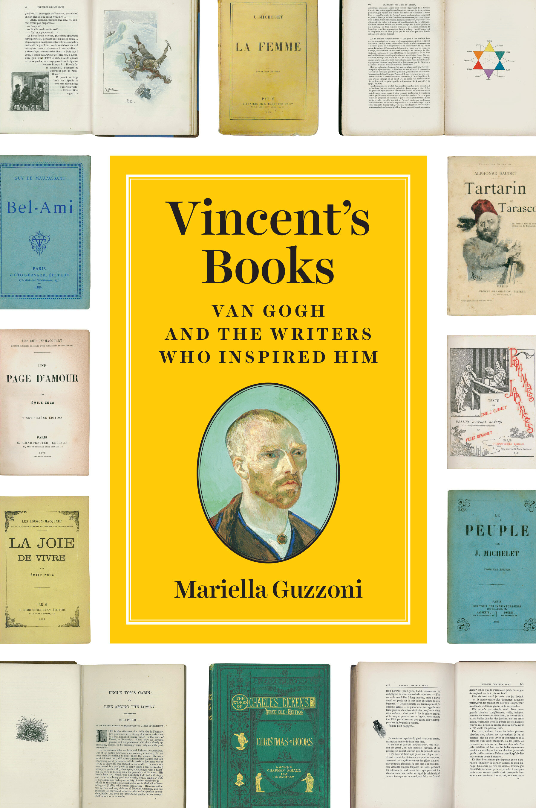
University of Chicago Press
Design: Matt Avery/Monograph
Art Direction: Jill Shimabukuro
If an author/editor/agent asked me to feature this many OTHER book covers ON their book cover I would have thought "no way that's going to work!" But the divinely talented Matt Avery, of course, found a way to make this concept work in an elegantly balanced way without feeling busy or overcrowded. Even with all the other type around it, my eye still can focus in on the title without getting distracted by the information about it. A perfect design solution!

Columbia University Press
Design: Martin Hinze
Art Direction: Julia Kushnirsky
This is such a lovely all-type solution to a highly conceptual title. I can't imagine an image that would fit for such a title, and this all-type illustration cleverly demonstrates the feeling of imbalance and conflict this book discusses. It's always so satisfying when letterforms are broken down to their simplest forms in a gestalt approach letting our brain fill in the blanks.

University of Wisconsin Press
Design: Eric C. Wilder
Art Direction: Jennifer Conn
Poetry covers are such a fun venue for designers to really play with imagery to capture the tone of literature's oft-most experimental form. This image really makes you take a double-take and the upside-down turtles legs really create dynamic diagonals leading your eye in all kinds to directions. I also love the pairing of the outline type, subtle and delicate.

Stanford University Press
Design: Kevin Barrett Kane
Art Director: Robe Ehle
Wow! These colors are so intense, they're almost psychedelic in the tension they create. Judging by the title and its treatment that's the perfect effect. The typography also gives me major David Carson vibes and I say that out of utmost respect for the godfather of grunge type.

Louisiana State University Press
Design: Michelle Neustrom
This typography and embossed design is the perfect tone and expression for this definitive volume. I love the cloth textured effect, the wide range of typefaces that work seamlessly together, and the charming touch of the instruments outlines. This appropriately captures the mood of the music and pays homage to old jazz records.

University of Virginia Press
Art director: Cecilia Sorochin
Designer: Derek Thornton
I absolutely love how dimensional and elegant this cover is! What a clever combination of elements to really elevate this art. The execution of a cover like this could really make or break it and Derek's fine attention to detail means he knocked this one out of the park. Absolutely lovely!
Jordan Wannemacher is a book designer based in the NYC area. She was born and art school educated in the Southeast at the Savannah College of Art and Design where she focused on graphic design and creative writing. Currently, she is running Studio Jordan Wannemacher, a boutique book design studio based out of her home in Montclair, New Jersey.