Luke Bird on Designing Diana Athill's Don't Look At Me Like That

Luke Bird is a graphic designer specialising in book design, branding, food packaging and limited edition packaging for music and books. Here he takes us through his process for creating modern and distinct covers for Granta Editions and, in particular, Don’t Look at Me Like That by Diana Athill.
Since 2018, I’ve been designing a sort of ‘standalone series’ for Granta in the UK, called Granta Editions. Unlike most series, there isn’t a cover ‘series style’, per se. Each book has its own distinct front cover design, with the rest of the jacket layout tying the books together. They have different coloured spines and matching coloured flaps with consistent typography, and an inside cover printed in a contrasting Pantone wash.
Most exciting, though, for book design nerds like myself: hidden in the back flap is a perforated bookmark, which can be torn away from the flap to use, when reading the book. The idea for that enchanting detail came from Sarah Wasley at Granta, who commissioned me to design the series.
Inside each book is a small description of the Editions series. It reads:
“Granta Editions are outsider classics. Books which slip free of easy definition and convention; books which we believe are of lasting, transformative literary value.”
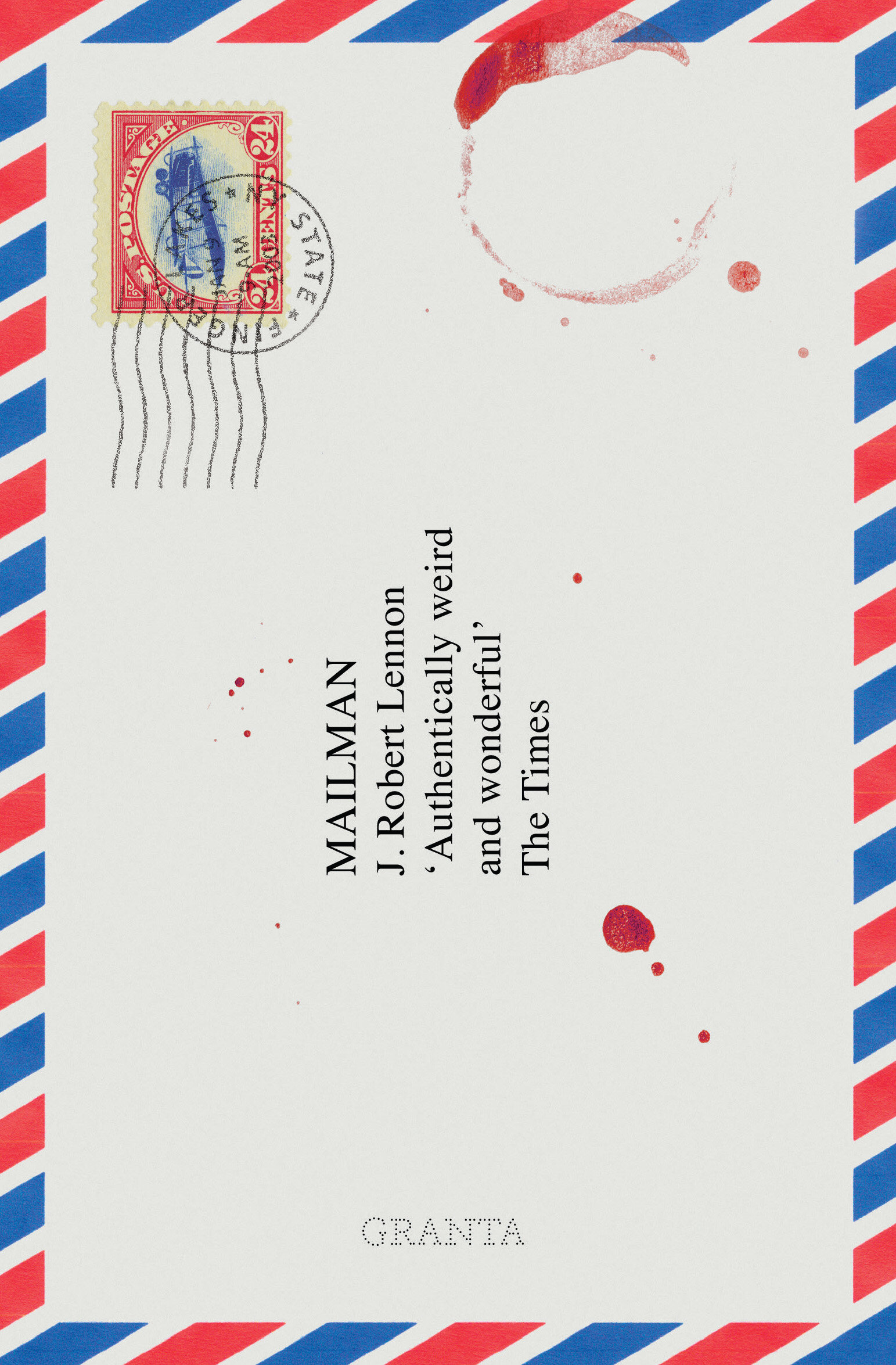
With that in mind, across all the books, Granta have been keen for me to push the boundaries and be brave with the designs. On the cover of J. Robert Lennon’s Mailman, they were good enough to persist with my slightly eccentric idea of printing it as a horizontally-rotated Air Mail envelope, while Ryszard Kapuscinski’s Imperium is a purely typographic design solution. As part of the collection I’ve also designed the covers for David Seabrook’s All the Devils are Here, and Sven Lindqvist’s Exterminate All the Brutes, among others.


If ever I’m designing backlist editions of classic books, I always try and design a cover which is every bit as modern and as fresh – if not more so – as a ‘hot new novel’. Backlist books can be relegated away from prominent displays in bookshops, and – as a minimum – they should draw-in both readers who are new to that book or author, and readers who love that book and can’t resist buying a new edition. It must look authoritative and confident; one for the ‘must read’ list.
The great Diana Athill’s Don’t Look at Me Like That is the sixth book in the Granta Editions collection. It’s a novel which centres on the character Meg Bailey, in England in the mid-1940’s. It’s a sort of literary coming-of-age novel about love and betrayal, and culture and art, above all.
The brief told me that the audience was likely to be 40+ readers of classic and literary fiction. They probably read the Guardian, and the London Review of Books, and they like Margaret Atwood and Colm Toibín. In line with the other Granta Editions, the brief also noted that “…it needs to marry a new and innovative approach with the feel and subject matter of the story and writing. Don’t Look at Me Like That is a classic piece of fiction, with a domestic story at its core; we need to show that in an eye catching and confident way.”
Granta have a particularly useful section of their briefing form, which asks the Editor to give some words which capture the tone and feel of the book. In this instance, they were “British, love, betrayal, friendship, independence, art, the 1940s, bohemian, femininity, independence, literary, feisty, shocking”.
It said that I should avoid putting a traditional period photograph of a woman on the cover, and pursue a more contemporary approach than Athill’s other covers. It suggested looking at vintage patterns twice in the brief, and mentioned some very, very bright wallpaper which featured in the book.
As ever, before I started jotting down any ideas, I wanted to read the book. As I’ve said in this forum before, I find it helps dramatically to read the book before designing the cover, and that is especially true of novels. Often, small details can leap out which act as inspiration, or give helpful visual clues. Tiny but important passages can even form the whole basis of the cover. I noted the descriptions of pattern and colour and interior decoration, and that Meg both studies textile design at art collage, and went on to work as a pattern designer in industry. I got a good sense of Meg’s character, too, and, armed with my notes and Granta’s brief, I started to form the first few visuals.
Like most designers, I love the idea of simple, graphic/typographic covers. I find it more pleasing when a design appeals through tone, type and shape rather than through trying to accurately depict details/characters from the story. As the brief called for innovation, I felt confident that I could take some risks with this cover, too.
Mary Evans (the online platform for licensable historical and fine-art images) was particularly helpful in my initial search for imagery. I grabbed some garish 1940s/50s textiles and patterns which I thought had an interesting feel and the right tone, and combined them with simple sans-serifs, as well as handwritten typography. Alongside these, I was keen to produce some patterns of my own, so I took inspiration from various swatches of vintage fabric and designed a very simple pattern of circles, triangles and rectangles, in a palette which I felt was befitting of the time. I hope it also feels a little bohemian. I felt that the sharp, angular shapes could reference the betrayal at the centre of the story, while the baby-blue rectangles and yellow spheres acted both as a pleasing juxtaposition and a softening of the design, as a whole.


From here, I spent some time combining this pattern with some portrait photography. I felt that if we were depicting Meg she should look cool and confident, and that the image should be black and white, to act as a balance against that busy pattern. Elsewhere, to reference Meg’s creativity and her time in art school, I produced a visual using a simple black and white line drawing of the back of a head, showing an elegant period hairstyle.
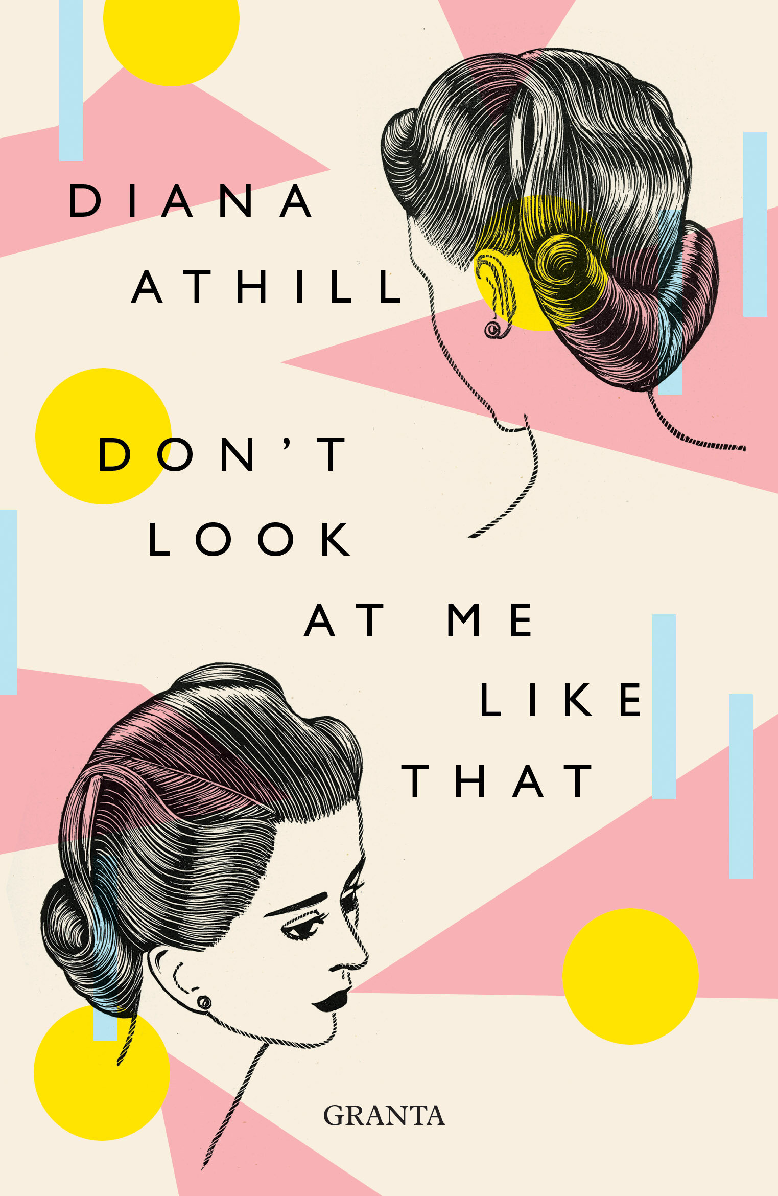


As is often the case, the most pleasing visual turned out to be the simplest. I combined the pattern I had designed with the typeface ‘Magnat’, which was designed by Studio René Bieder. According to the designer, the font draws inspiration from the 20s (rather than 2 decades later, when our story is set), but I felt the didot-esque contrast and modern deco-inspired flourishes were perfect for the cover. I’ve tried to be brave with the uncompromising size and boldness of the font.
Faced with the options, Granta immediately plumped for the simplest design. Though we spent some time toying with the type layout, the process ended up being quickly resolved, and we went ahead with designing the rest of the jacket. I sampled the light blue from the pattern’s rectangular elements for the spine and flaps, and a rich, egg-yolk-yellow Pantone for the inside cover printing.
Overall, my hope is that I’ve managed to capture, visually, Granta’s vision for the books in the Editions series. I hope the cover of Athill’s lesser-known jewel feels unconventional, brave, both of-a-time and timeless, and allows a new audience to sample this gem of a novel.
Final cover
Editor, artworker and lifelong bibliophile.