
Soirée Fantastique
Pierre Pané-Farré’s book juxtaposes early posters with city photographs, for both historical insight and typographic eye candy.

Soirée Fantastique is a captivating visual journey into the 19th century, to the early days of both posters and photography. Conceived and designed by Pierre Pané-Farré, the book won the Gold Medal in the competition Best Book Design from all over the World and also was awarded at the Walter Tiemann Prize 2018.

Stacks of posters from Oskar Leiner’s print shop.
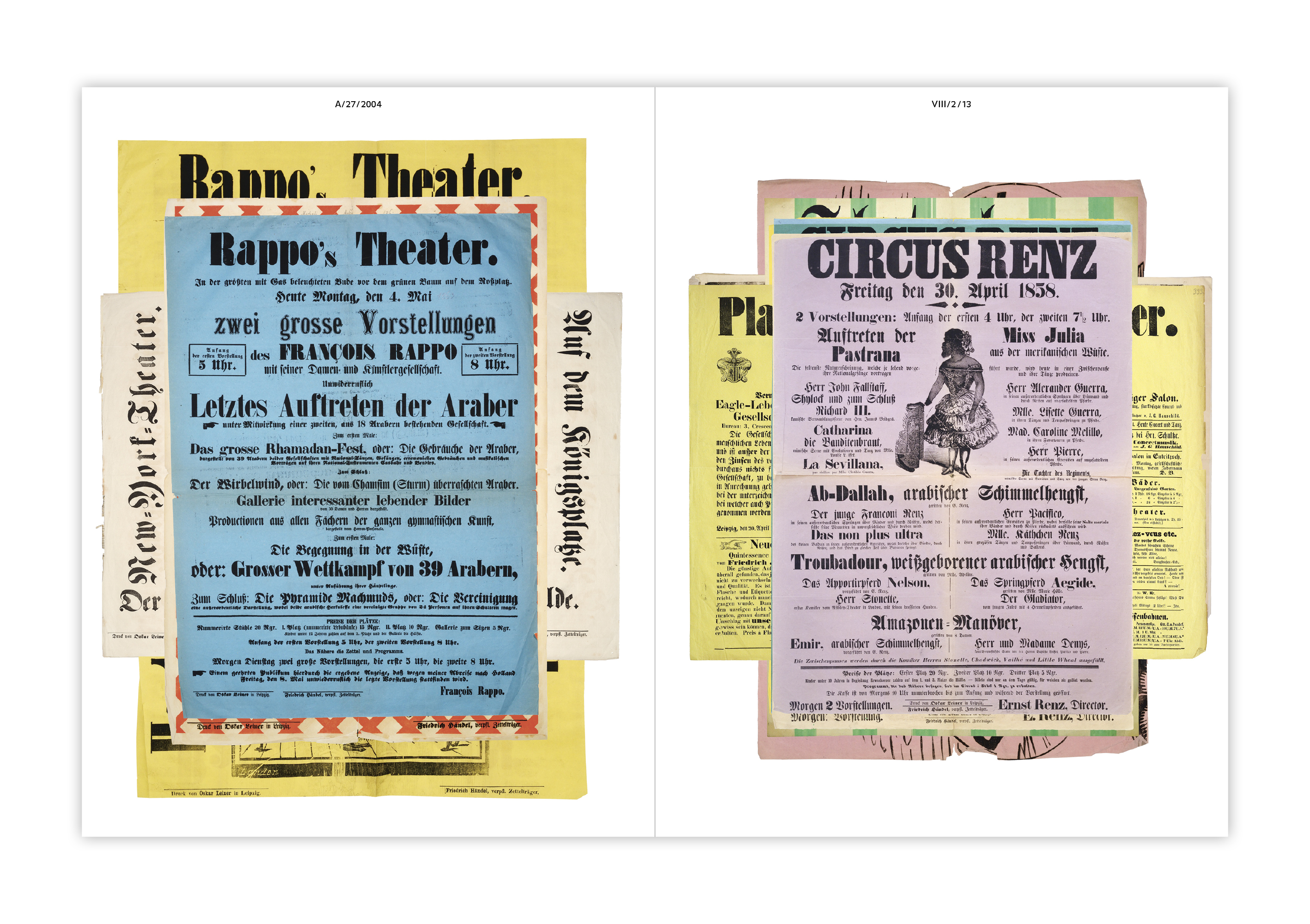
In the mid 1800s, posters began to be mass-produced. It was the first time that typographic letters became visible in the urban space on a bigger scale. The basis for this book is a bundle of 330 posters from this period, which Pané-Farré unearthed in the archives of Leipzig’s city museum. They all originated at a single print shop, the Buchdruckerei Oskar Leiner, and date from 1847 to 1876. Most of them are letterpress-printed, sometimes combined with lithography, and show an increasing diversity of type styles and sizes. This – together with the use of woodcut illustrations, colored ink and paper, as well as larger paper sizes – suggests an intensified competition for attention in the streets. A selection of 64 posters are reproduced in color and presented in stacks, allowing the reader to reenact the experience in the museum’s archive and leaf through the broadsheets. They are interspersed with twelve poster details shown at actual size. These fragments are letterpress-printed from stereotypes in a single color.

City photographs by Alexander Seitz (left), letterpress-printed reproduction of a poster fragment (right).
The inclusion of 58 historical photographs form an ingenious counterpart to the posters. Taken by Alexander Seitz between 1860 and 1885, they depict Leipzig’s urban space in the period when the city grew into a metropolis, and became the center of German book printing. These are the same streets and squares where the posters once were posted and viewed, and some pictures actually show the venues where the advertised attractions like circus and variety shows took place.

The photographs are reproduced from the five-volume album Das alte und neue Leipzig. The original captions and image sequence were retained.

Detail of the title page.
For the book typography, Pané-Farré combined three typefaces. FF Balance Regular (Evert Bloemsma, 1993) is used for the short accompanying text (bilingual; English and German), the index, and the captions to the photographs. On the cover and the title page, it’s paired with caps in the No. 71 style from Knockout (Jonathan Hoefler, 1990), a gothic series inspired by 19th century wood types. In contrast, Balance is an intentionally contemporary choice. According to Pané-Farré, it was partly chosen for its inktraps. With this feature, Balance promised crisp results when being letterpress-printed from photopolymer plates.
The undisputed cover star is Schmale Egyptienne No.12, a digital revival of Eduard Haenel’s Schmale Egyptienne 28 Cicero (c. 1838–41), made by the book designer himself. The condensed slab serif was later released as part of the Affichen-Schriften series by Forgotten Shapes. It here is used with the high i dot and the compact Q, two forms that ended up in the font as alternates. Forgotten Shapes is a new type label that was launched by Pané-Farré together with Reymund Schröder and Stephan Müller in 2018. It’s committed to publishing “digital reconstructions of typefaces that have somehow vanished”.
Soirée Fantastique was published by the Institut für Buchkunst Leipzig in spring 2017 in an edition of 500 copies. Unsurprisingly, the book is out of print. If you still want to get your hands on some Soirée Fantastique goodness, rejoice: As a complement to the book, Pané-Farré printed a limited edition of letterpress posters. There are a few copies left both of the official color version as well as of the “bootleg” version, i.e. hand proofs printed in black.

The accompanying poster was letterpress-printed in iridescent colors. The fonts in use are various wood, brass, and metal types from the poster type collection of the HGB’s printmaking workshop. Most of them stem from roughly the same era when Leiner printed his posters. This was before typefaces had proper names; they go under generic designations like “Egyptienne” etc. We haven’t tracked down and listed them here, since the focus of this article lies on the book. If you’re really curious, we might consider a follow-up post.

The forme used for printing the posters.
Pierre Pané-Farré studied at the HGB Leipzig in the class for type design of Stephan Müller and Fred Smeijers and graduated in 2012. From 2013 to 2016 he was a master student with Smeijers. Soirée Fantastique was Pané-Farre’s final project at the HGB. In 2014 he co-curated Vom Buch auf die Straße, an exhibition at the Printing Museum Leipzig about large letterforms of all kinds. His research on early 19th-century poster typefaces was published on the Forgotten Shapes website, see Affichen-Schriften.
Full disclosure: The author of this article is a board member of the society that organizes the Walter Tiemann Prize. In 2018, he had the honor to serve on the jury for the Best Book Design from all over the World. Florian provided the English translation of the articles by Forgotten Shapes.


")


")


")


