Tangent GC Organic Detergents by Carl Nas Associates
Opinion by Richard Baird Posted 12 May 2020

Tangent GC began as a Scandinavian organic garment and shoe care company developing products that intended to increase the life of clothing and footwear, and entered the organic skincare market in 2016. The longevity of skin being an understandable extension of that original intention.
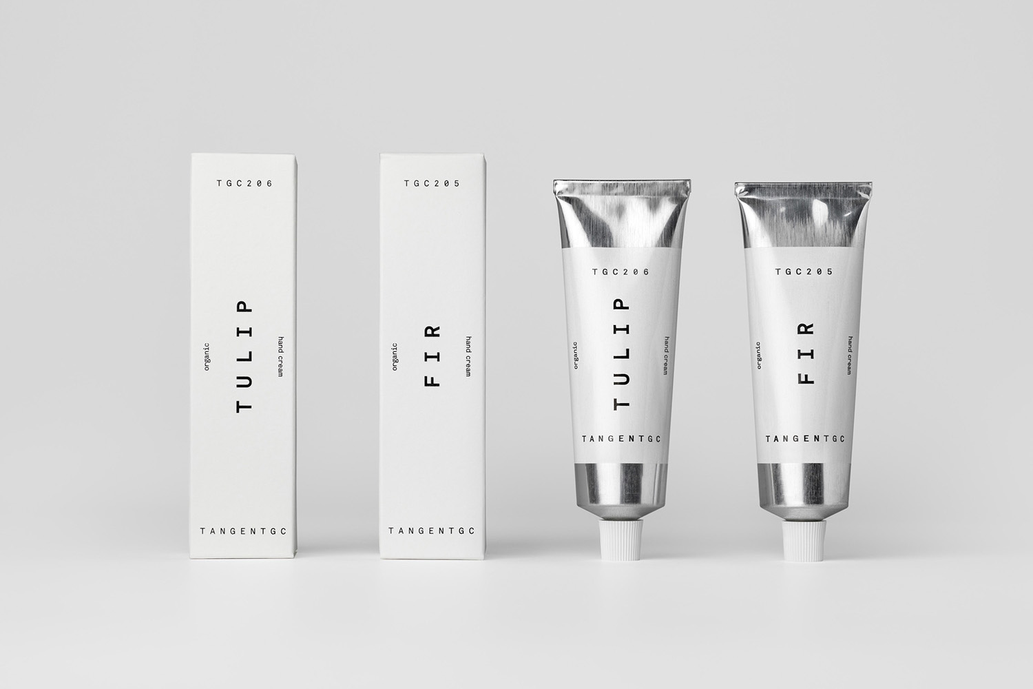
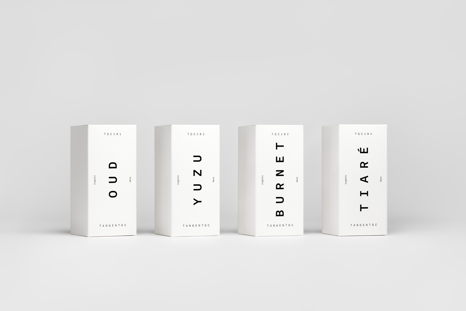
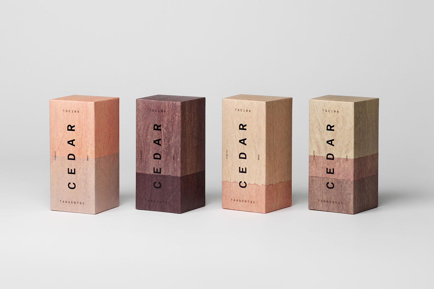
The company’s graphic identity, a typographical system designed by Essen International under the creative direction of Carl Nas, established an informational immediacy through the absence of superfluous stylistic detail and colour, whilst effectively dividing content and drawing out a distinction in the arrangement, orientation and typesetting of Akkurat Mono.
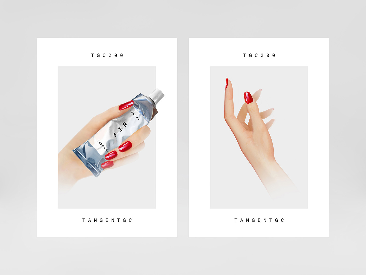
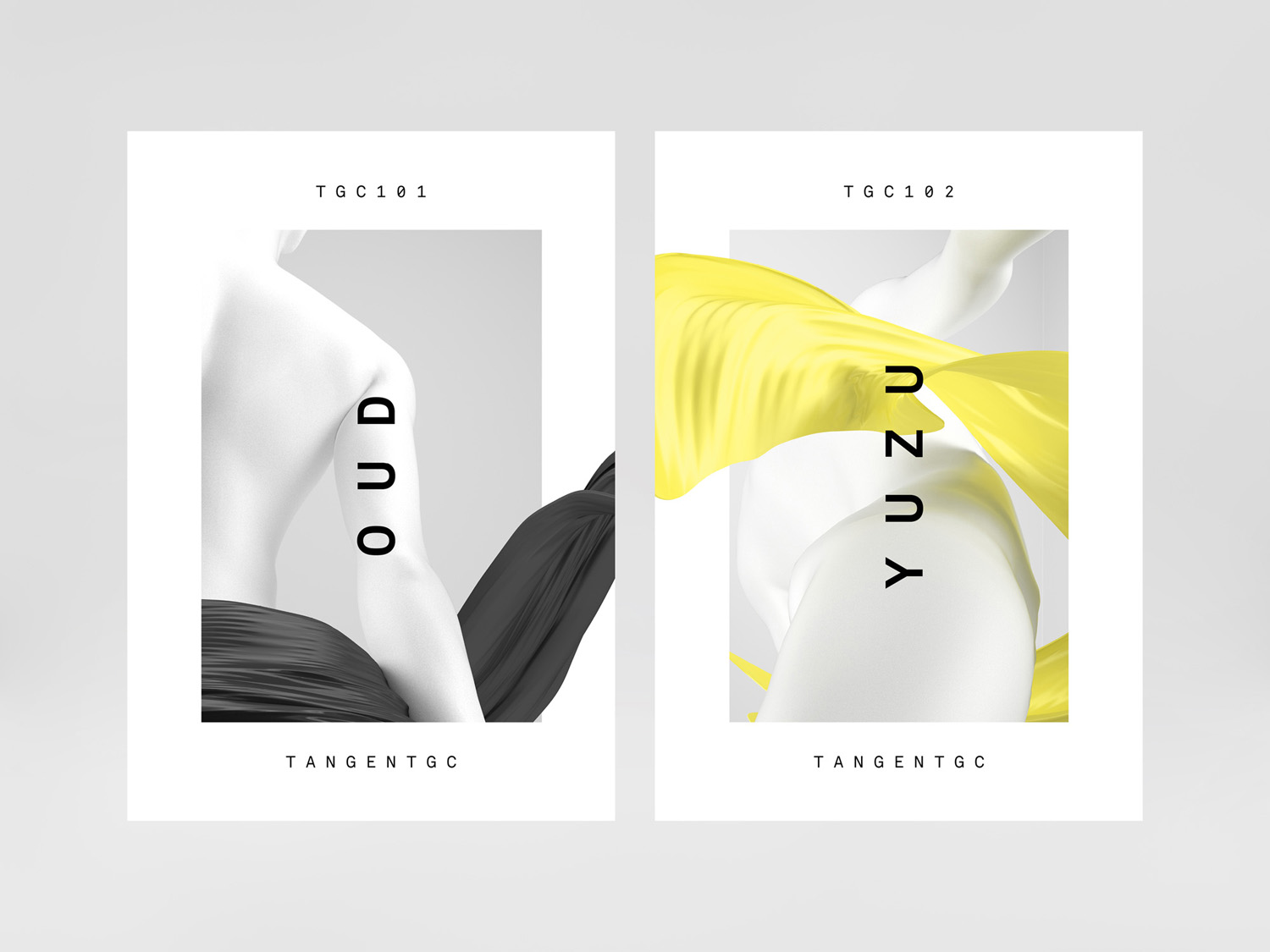
As Tangent GC ventured into the organic personal skincare market the company worked with London-based Carl Nas Associates to build out the visual language initially laid down by Carl Nas while Creative Director at Essen International. This new phase saw the studio applying this graphic system to skincare packaging, a soap range, and organic hand cream, which were supported by campaigns that featured swirling fabrics and illustration by celebrated airbrush artist Syd Brak.
Carl Nas Associates continue to work with Tangent GC into 2020, this time transforming their range of organic detergents, broadening the graphic language of type and its arrangement into a form and material language through bespoke structural design. The detergents come in two sizes, 500 ml and 1000 ml, and cover everything from the everyday washing liquids to specialty products such as those for cashmere and those formulated to be hypoallergenic.

The graphic system created by Carl Nas is so subtle each new design component that is brought into that system, be it a campaign illustration for the perfumed hand cream, or art work for the special editions, needs the same exceptional care and sensitivity, just like the detergents themselves. Structural design is one of those opportunities to distinguish a brand where many use off-the-shelf vessels, and introduce a tactile feedback to infuse graphic design and branding with a more visceral callback.
With such a reductive but distinctive visual identity and labelling system, the bespoke structural designs, made of lightweight bioplastic from renewable resources, are a fantastic approach to broaden the visual language into the material. It is easy to imagine how these would feel in hand. Small considerations such as extrapolating out the radius of the labels into the bottle’s structure, the matt finish and robust caps offer subtle elements that neatly align with a brand that seeks a longevity from clothes and longevity in skincare through natural means. The joy here is in the resolution of a dichotomy, the intersection of utility and care.


It is worth considering the careful balance of liquid volume and the proportions of the vessels across two different pack sizes, their relationship to one another and further brand continuity. Bioplastics do have something of a notable surface quality that, over time, will likely be recognisable, and hopefully established as a more universal material language.

It is not often blogs go back to earlier reviews, to see a legacy of products build over time, to see how these evolve and hold up (or not) over time. We often get the launch, that idealistic starting point, the one what that draws the clicks, but rarely see the robustness of concept and the usefulness of system play out over time, particularly in such an understated manner. This post is not about the seductive allure of colours and the typographical zeitgeist, it is a chance to see how a design studio has established a functional and adaptable visual language, and then managed to weave in a new material and form language as well, whilst maintaining that essential nuance and distinctiveness of the brand. More by Carl Nas Associates on BP&O.


Tangent GC by Carl Nas Associates