Iceland’s national football team gets a new identity
With an angular typeface and a logo inspired by Icelandic folklore, Brandenburg’s identity for Iceland’s national football team pays homage to the country’s “fighting spirit”
Iceland isn’t exactly renowned for its footballing prowess, but the country’s national men’s team has achieved some major milestones in the past few years, qualifying for the Euros for the first time in 2016 and becoming the smallest nation ever to compete in the World Cup in 2018. The women’s team has also been climbing up the global rankings and was named 18th in the world by FIFA in 2019.
In recognition of its growing profile, Iceland’s national football association, KSI, has unveiled a new identity for the Icelandic team, which draws on ancient folklore and traditional arts and crafts.
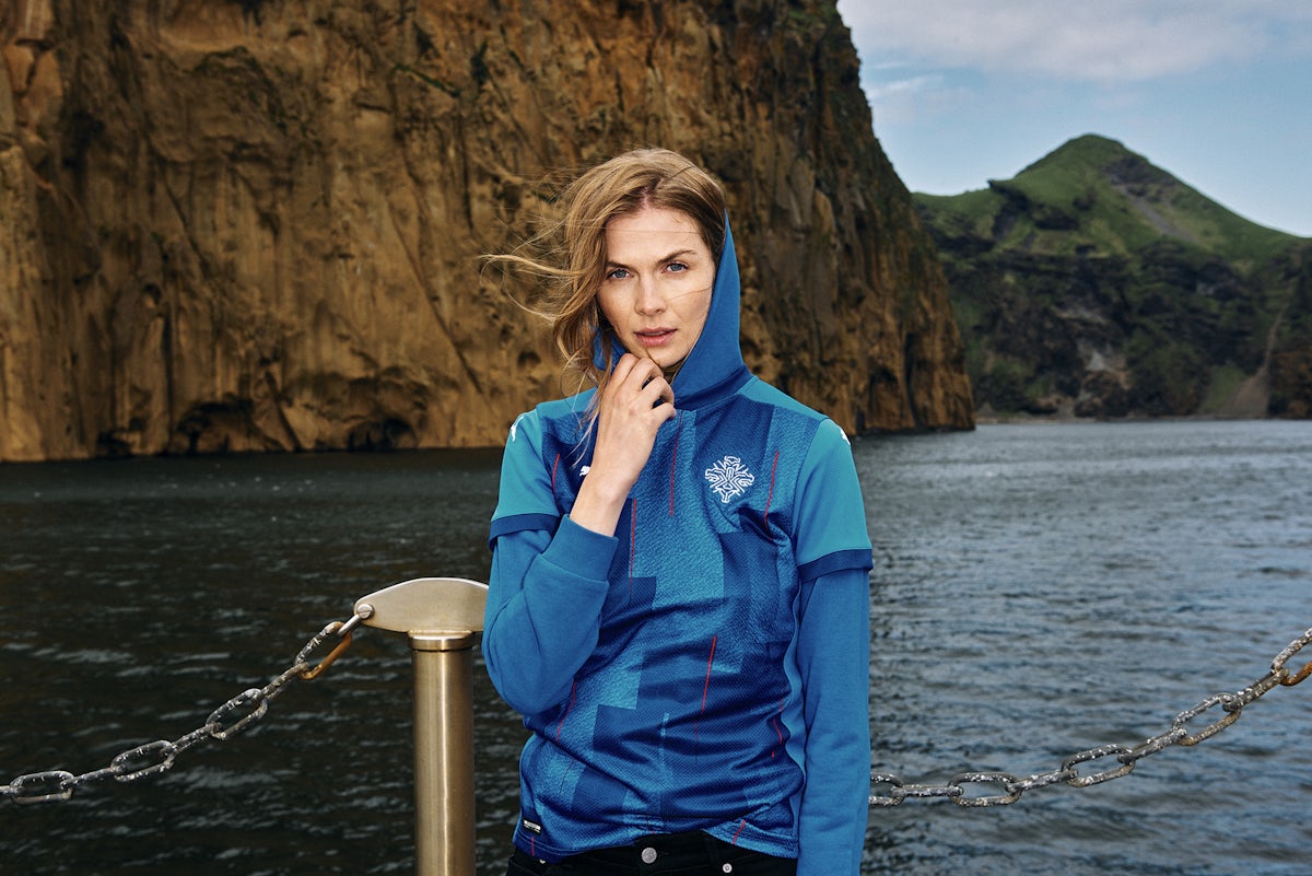
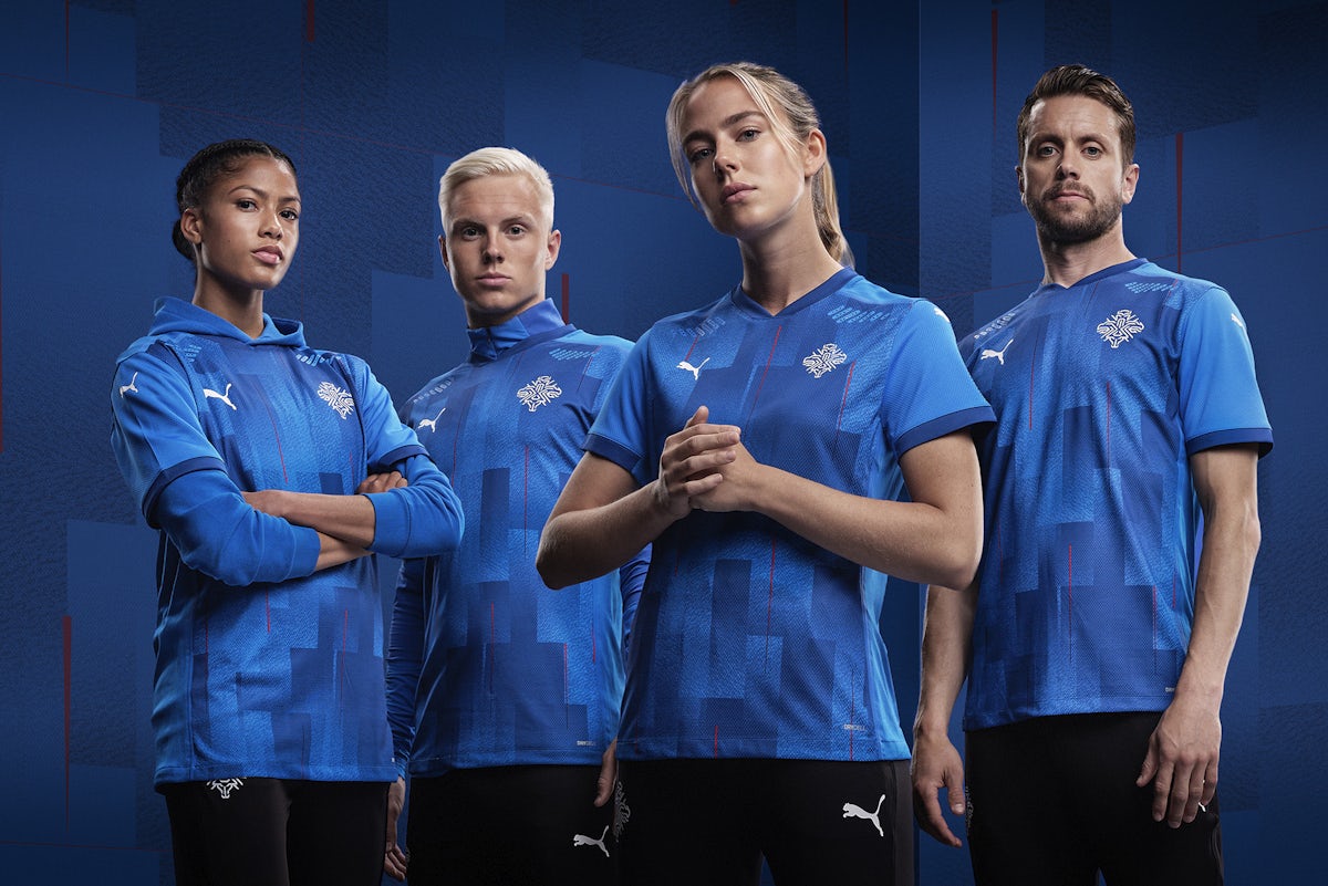
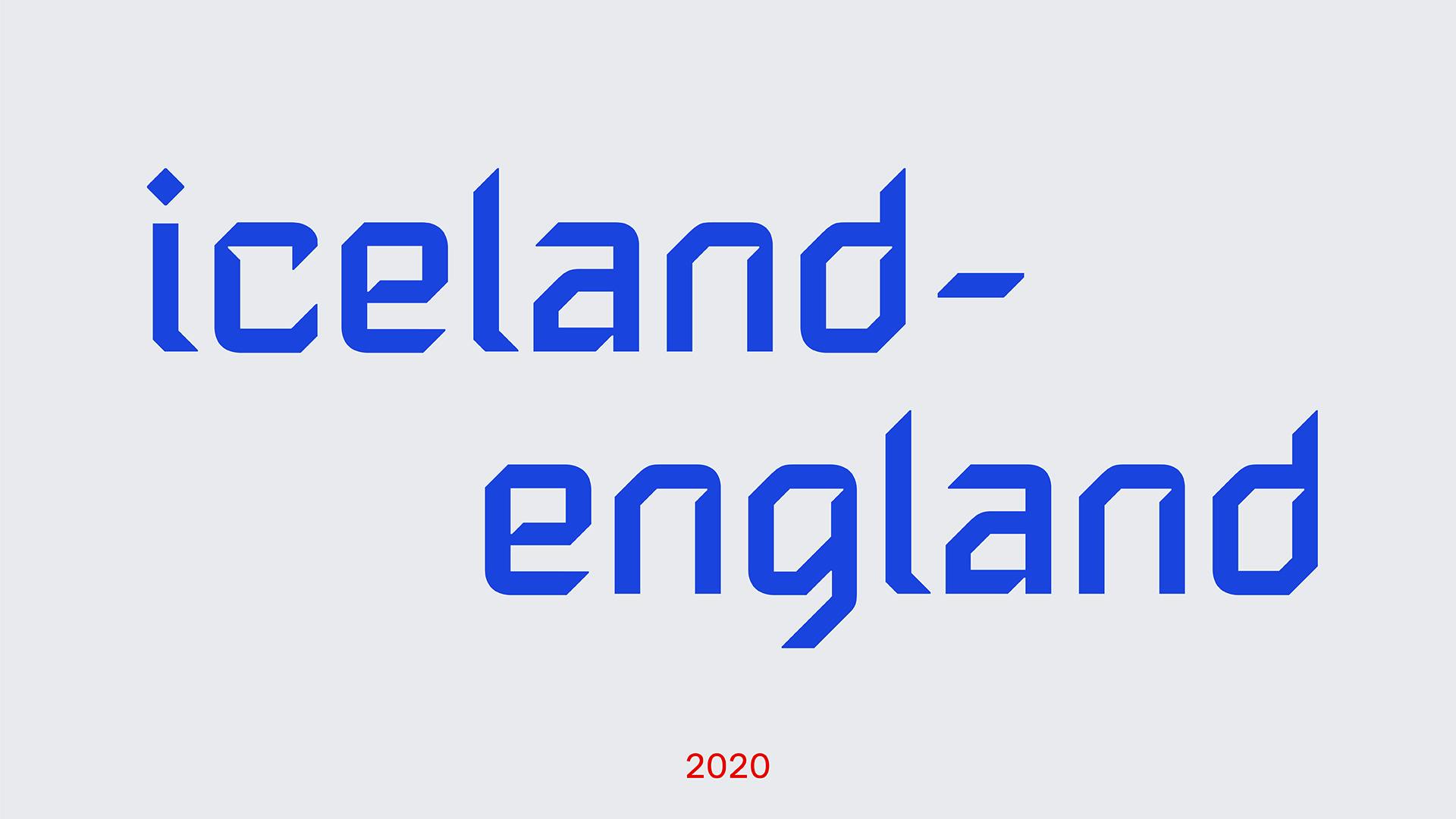
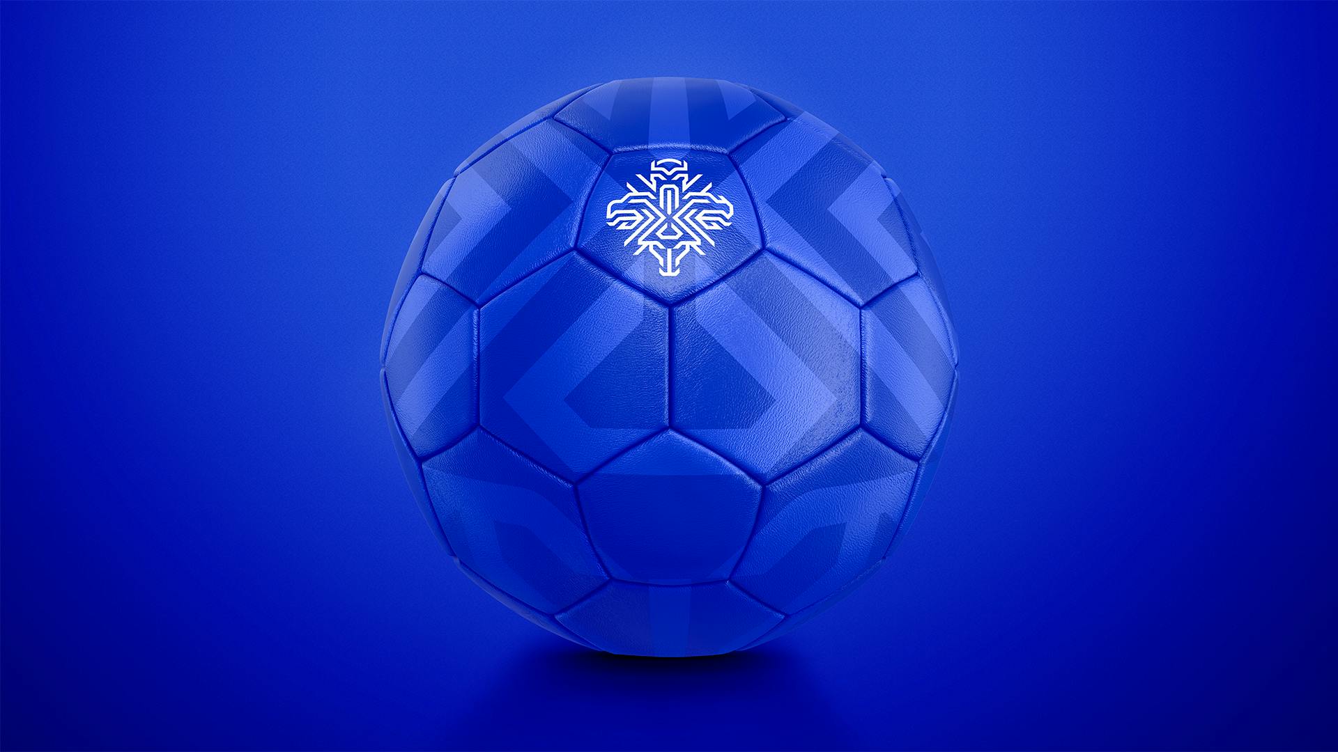
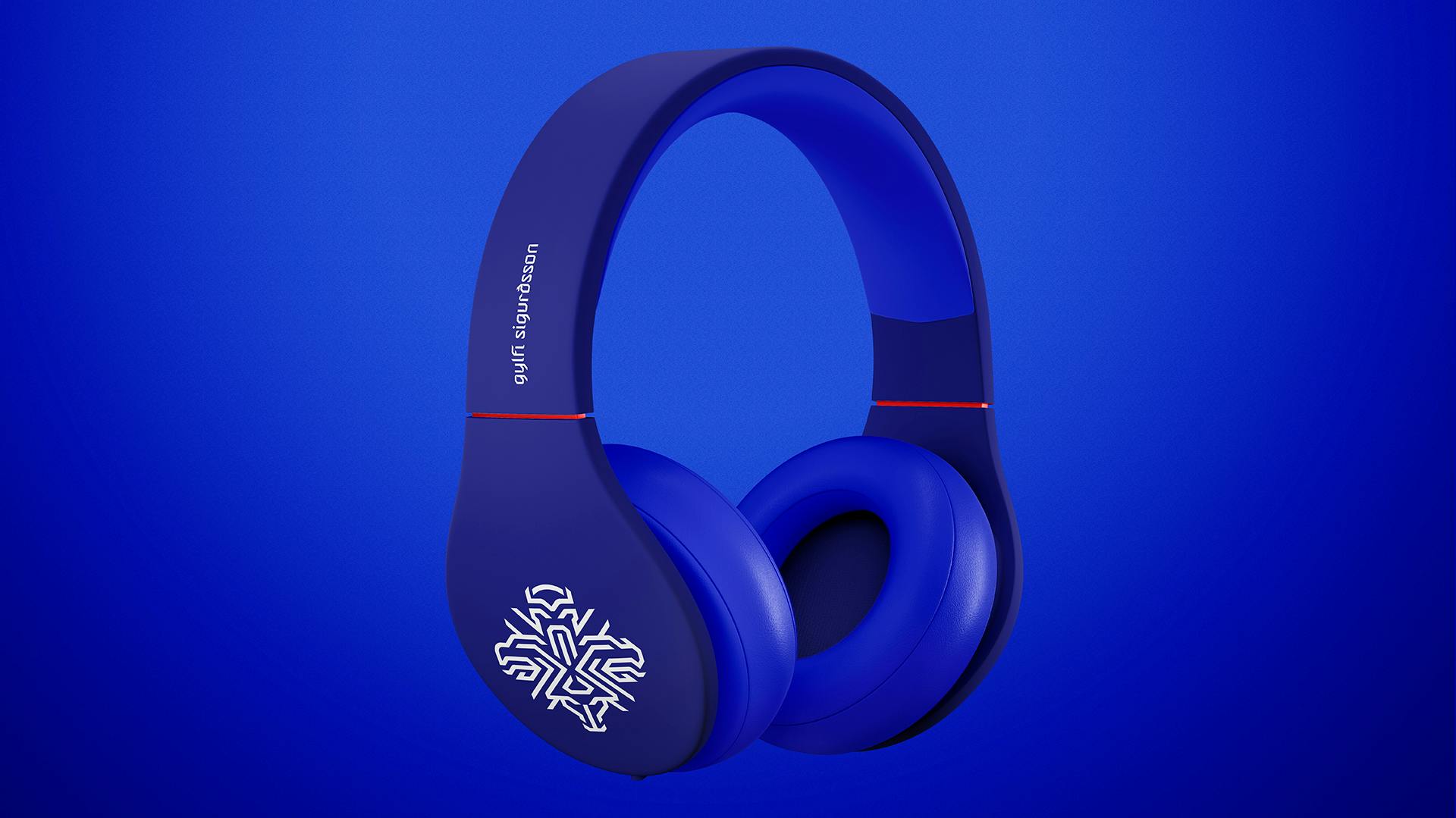
KSI worked with Reykjavík agency Brandenburg to create the identity, which includes a new logo and a custom typeface. The branding has been applied to a new team kit manufactured by PUMA and a range of merchandise, which includes boot bags, bobble hats, pins, headphones, scarves and, of course, balls.
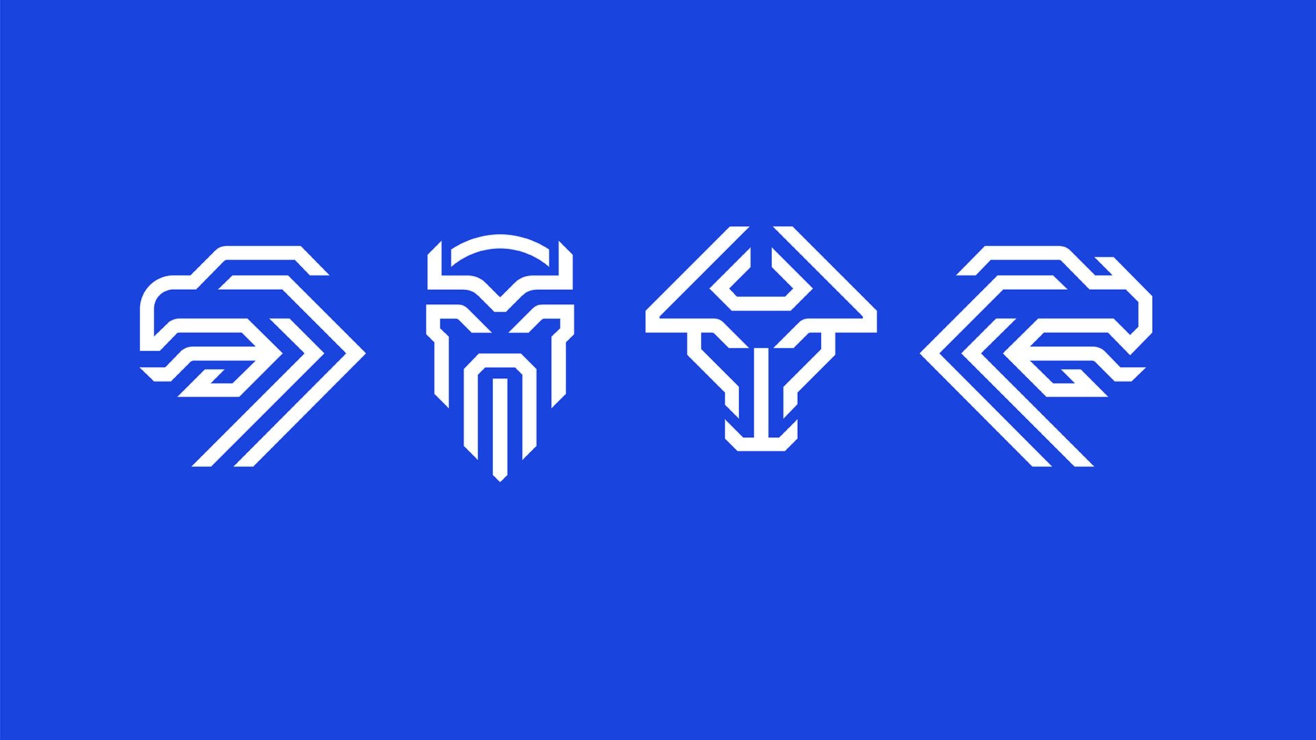
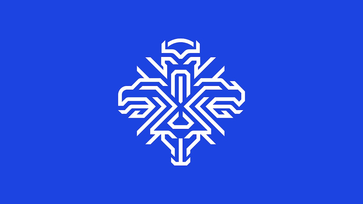
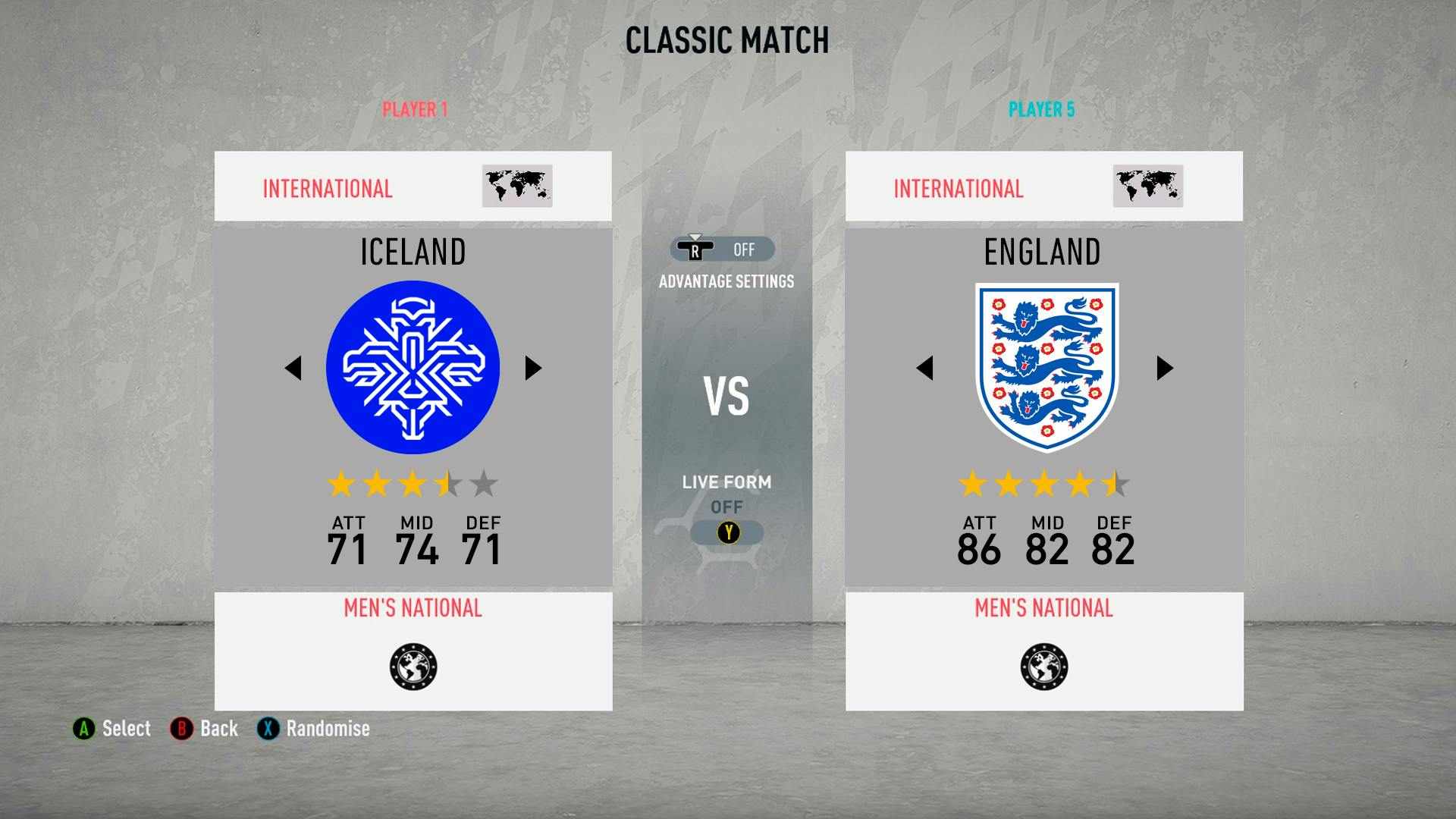
The rebrand sees the club’s 25-year-old logo – a shield featuring the Icelandic flag, a ball and the letters KSI – replaced with a symbol featuring the four ‘guardian spirits’ of Iceland: a bull, a giant, a dragon and an eagle.
The spirit symbols are a familiar sight in Iceland: according to folklore and Old Norse sagas, the supernatural creatures have protected the land since the arrival of the first settlers, and defended it against invasion. (They also appear on the country’s coat of arms, and in the logo for Iceland’s national bank.)
In a statement announcing the logo change, KSI said the spirits were a “perfect symbol” for the national team – representing strength, unity and Iceland’s “fighting spirit”.
“The new logo is a symbol of unfaltering solidarity, inspired by our heritage and formative history, which interweaves Iceland’s guardian spirits in a modern way,” says KSI. “Intricate but clear, it is founded on the previous coat of arms but stands alone as a distinctive symbol of Iceland’s national team.”
While the official crest shows all four creatures, the spirits can be used individually: “Modern trademarks need to be flexible and adaptable in a variety of ways. What makes the symbol even stronger is that the guardian spirits can stand alone to form a comprehensive framework,” says KSI.
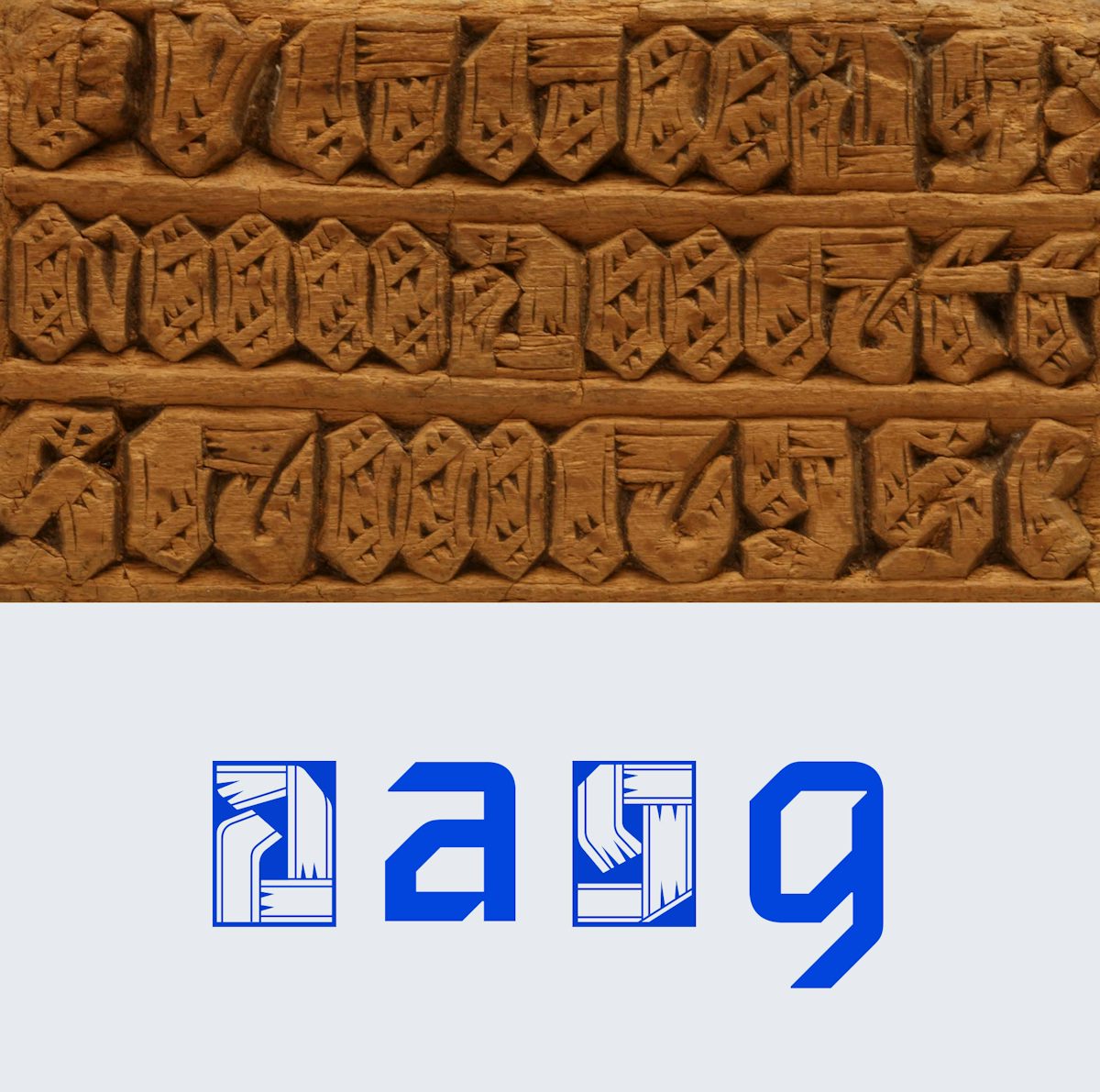
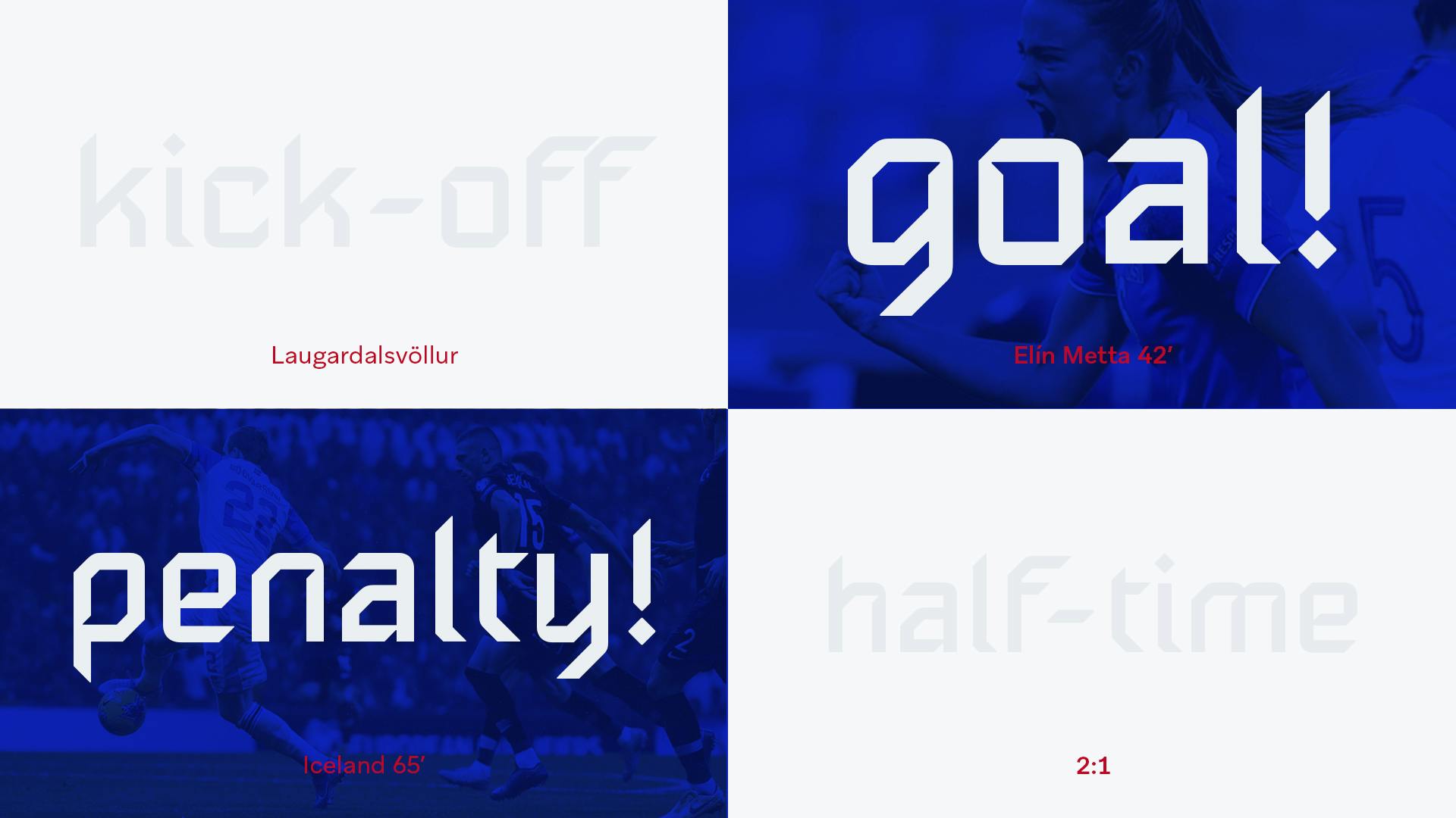
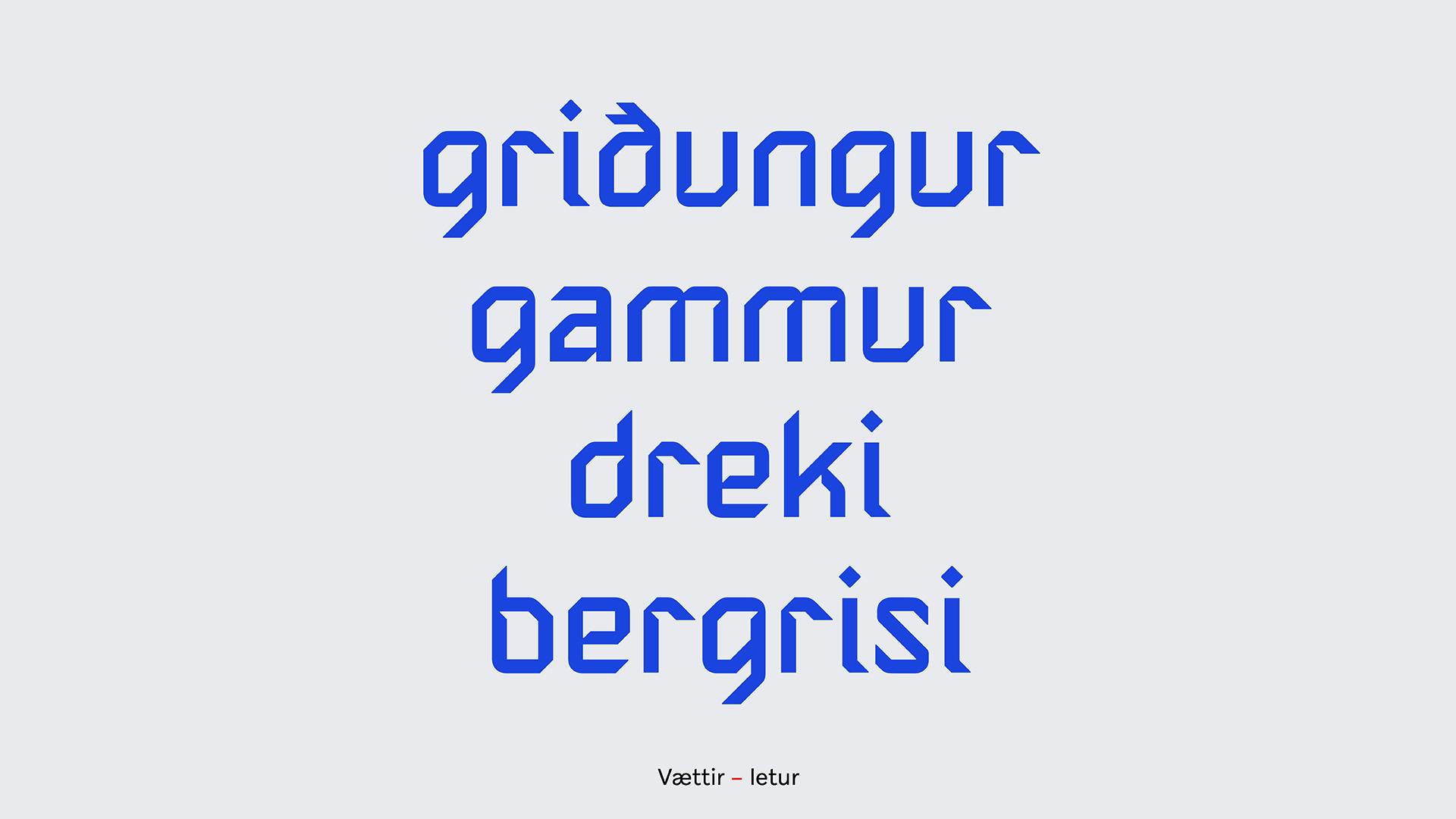
The logo is accompanied by a lowercase typeface, which KSI describes as “a distinctive blend of old traditions and modern styles”. With its sharp angles and unusual cuts, the letters offer a surprisingly contemporary take on Icelandic arts and crafts, and a decorative version takes inspiration from traditional wood carvings with letters encased in blocks.
Creating something that feels modern yet rooted in history is no easy feat, but Brandenburg has managed to create a bold identity that looks nothing like those in use by other football clubs. KSI has also released an epic video to mark the rebrand’s launch, which combines sweeping shots of volcanoes, mountains and crashing waves with archive news footage and illustrations of Iceland’s famous protectors, and positions the team as a powerful force. You can read more about the project and see images of the branding in situ, on KSI’s website.


Latest from CR


