Freadman White by Studio Hi Ho
Opinion by Richard Baird Posted 18 October 2019
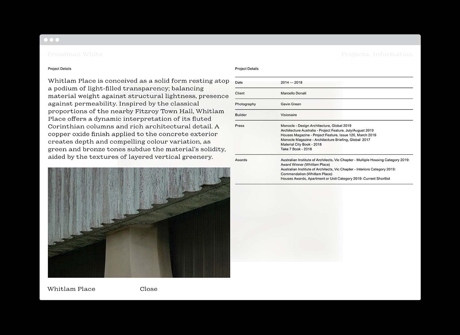
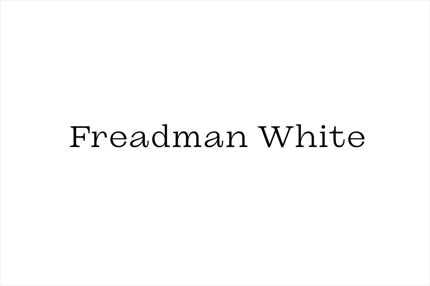
Freadman White is a Melbourne-based architectural practice, led by Ilana Freadman and Michael White, that seeks to embed a curiosity-driven and experientially charged tension into their architectural work, reveal beauty in simple and overlooked settings, and design contextually informed structures with a disciplined whimsy. Further, rather than responding literally to physical surroundings, the practice develops spaces that are visually intriguing, emotionally resonant, sensorial and textural “informed by memories of place and the achievements of modern architecture”. These notions emerge from a mandate that intends to make positive contributions to individual lives and the wider urban project. To express the nuances and enquiries embedded in the practice and a personality that is whimsical, curious, warm, thoughtful and uncompromising Studio Hi Ho—commissioned by Freadman White to develop a new brand identity—worked with typographer Dennis Grauel to create ‘Frisky Freadman’, a custom typeface and a convivial interpretation of the classic typeface Ionic.
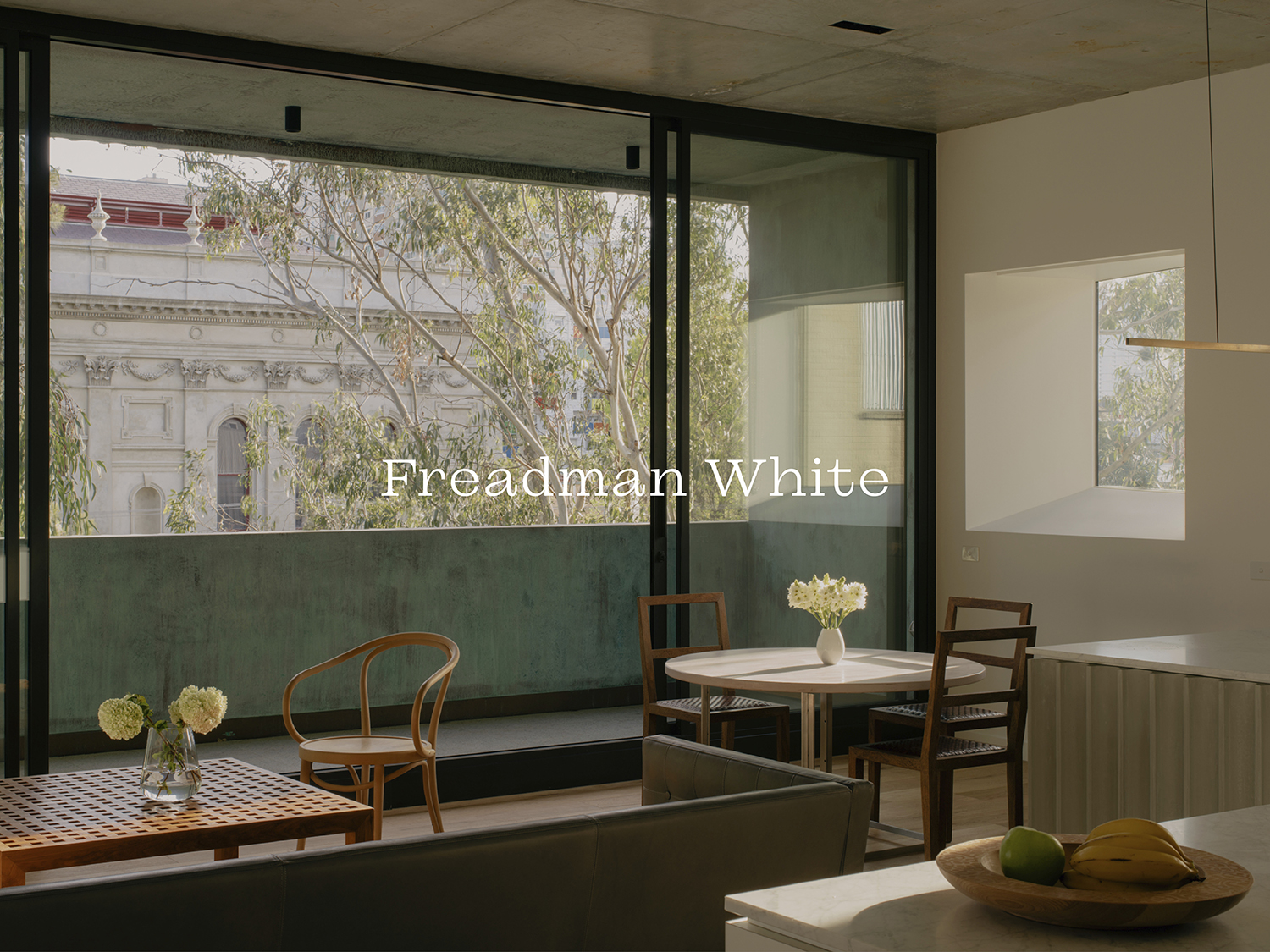
“Our projects narrate a desire to condition experiences of spaces. Quiet impact is sought through elegantly contrasting formal elements with atmospheric intangibles. Thoughtful modulations in light and shade, proportion, function and flexibility are expressed through uncompromising construction, enduring materials and a minimal, yet warm, aesthetic.” – Freadman White.
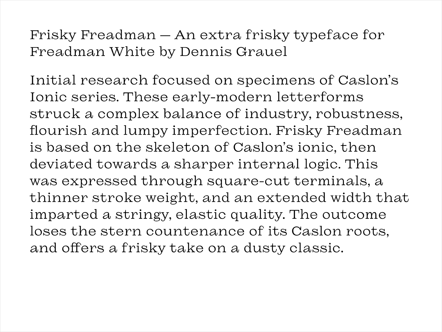
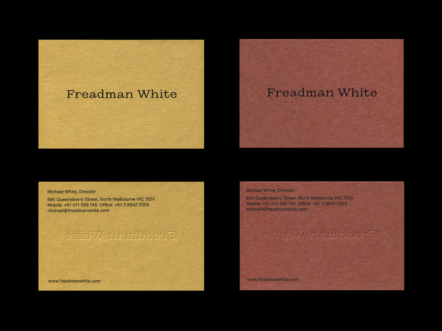
Studio Hi Ho sought to establish a strong design language for Freadman White that spoke, not only to industry peers and collaborators, but to small private clients in an approachable and welcoming way. This pragmatic foundation, the need to communicate directly, is fused with the nuance and sophistication of the practice’s more abstract enquiries. These are woven together and expressed in the referential roots of ‘Frisky Freadman’ and its customisation; a celebration of imperfections, the beguiling and visually intriguing. Just as Freadman White revels in the beauty found in simple and overlooked settings, and designs contextually informed structures with a disciplined whimsy, so does typographer Dennis Grauel. There is a synergy here. The ideas are not on the surface and not immediate, they are there to be discovered through rational thought or simply felt by an architectural outsider. There is a provocation to consider the meaning within the design of unusual letterforms. This is honoured by the application of the typeface across the website, and in conjunction with the colour and texture of Japanese paper and embossing of business cards.

“Baking the brand DNA into the typeface allows simplicity in executions and the client to easily implement the identity in ongoing brand communications. The Japanese paper sourced for print collateral is provides a rich colour palette and tactile point of difference. Also integral to the re-brand is Gavin Green’s photography. Moving away from the standard architectural style of clean light, oversaturated skies and wide hero frames, Gavin’s images are focused on moments and pause, to communicate the emotional feeling of a space.” – Studio Hi Ho.
‘Frisky Freadman’, although full of idiosyncrasies, is in fact economical and pragmatic in its purpose, the conveyance of works and ideas, but also a feeling and the implication of further meaning. Thus, it is surface and subtext, pragmatic and provocative, rational and emotional. The typeface serves to distinguish unusually and conceptually within its architectural context, in dialogue with industry, but characterful and inviting on a visual and personal level. It does not do this with a care and elegance. It has a relationship to the space of the page, and the mood of photography, it does not simply narrate, employing, to create effect, the notion of paratext. More work by Studio Hi Ho on BP&O.
