Crash Course: Squarespace Images Block
We as humans are visual people, so it makes sense that by adding images to your website you immediately make it more dynamic. But you don't have to just plop an image in and call it good. With the Squarespace image block there are 6 different layouts to choose from to add more creativity to your site. And they work the same no matter what template you're on! Watch the video for a crash course on the Squarespace images block or read below for a description of each layout style.


Inline Layout
The inline layout is probably the most straightforward and basic of the image layouts. This one places a plain image into your block area with an optional caption. You can select to display your caption below, overlaid, show on hover, or not display at all.

Poster Layout
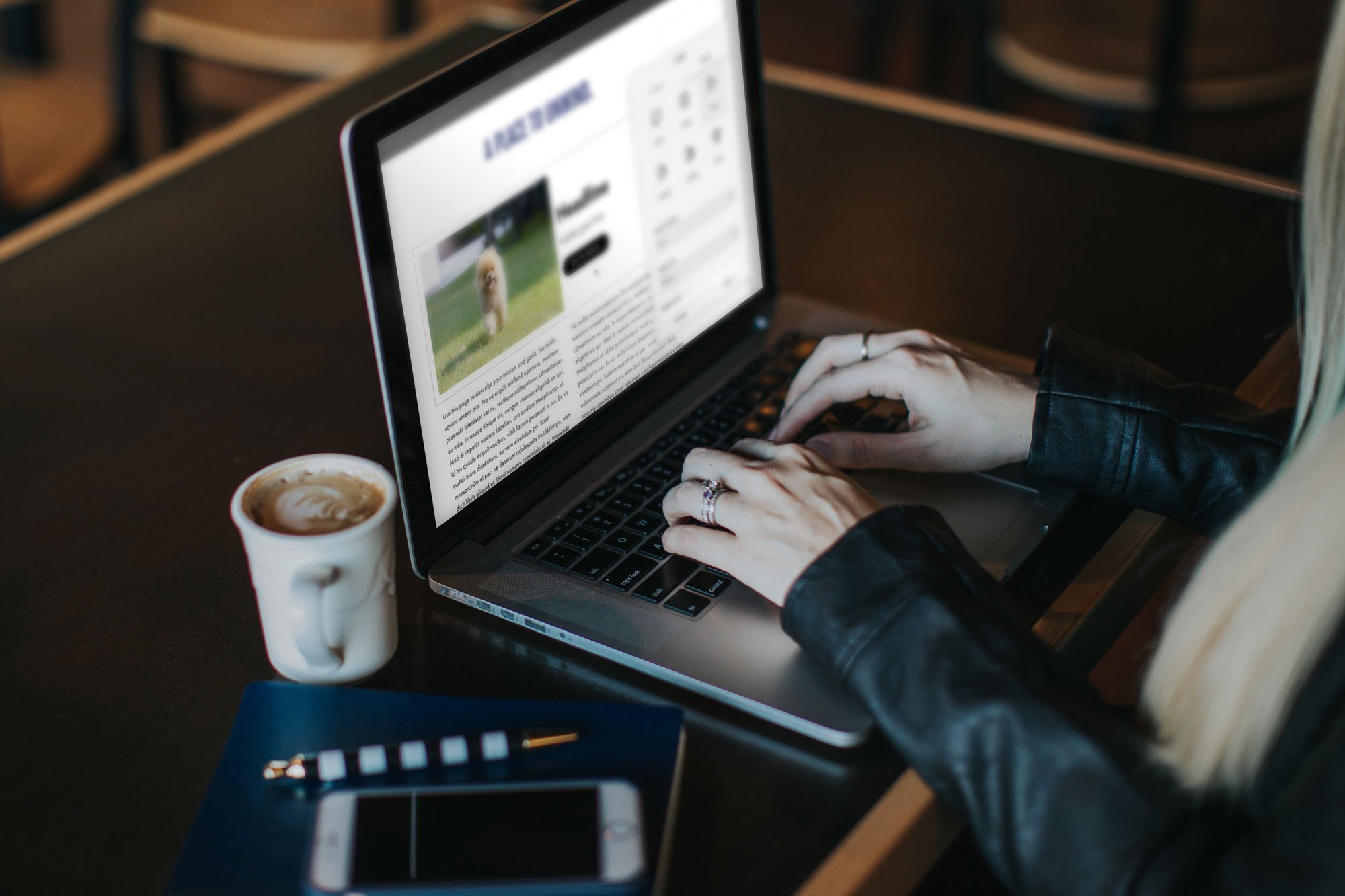
The poster layout allows you to display a head line and subheadline right on top of your image to create a sort of background. You also add a link to your block by adding a button or have the entire image be clickable.

Card Layout
The card layout lets you align your headline and subheadline to the left or right of the image in your block. Again you can add a link to the block in the form of a button or have the entire image be clickable. You can also add a background color behind your text to give it that "card" effect (check out the end of the video to see how I like to style this layout).

Overlap Layout
The overlap layout option is super similar to the card block, but with this layout you can have the headline text partially overlapping your image. As per usual, you can also include a subheadline and make the image clickable or add a button. You can also add a background color to your headline to give it a highlighting effect, which is super trendy right now.

Collage Layout
The collage image layout keeps the headline, subheadline and button to the side of your image similar to the overlap and card layout -- but this one creates a color block behind the entire content area and the whole thing overlaps the image.
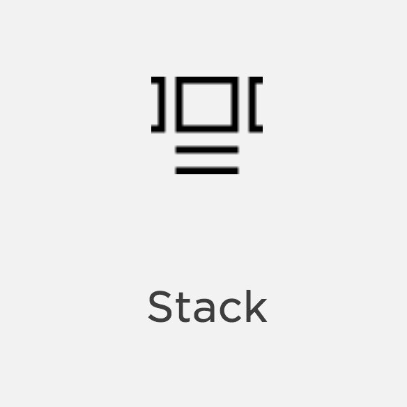
Stack Layout
The stack layout displays your text below the image area with an optional background color. It’s very similar to the card layout, but your “card” is underneath your image instead of to the side. Again you can include a headline, subheadline and button to be placed underneath the image area.
Once you’ve got your image added and picked the layout that you like, you can head over the the Style Editor to change your colors, fonts, sizes so that it works exactly the way that you want it to and it matches with your branding. How have you used the image layouts creatively on your website?