Pentagram's heartwarming identity for a charity that helps pets and their people
Marina Willer and her team at Pentagram are behind a super cute new identity for leading pet charity Woodgreen that has been designed to reflect the charity's special mission: "to help pets and their people".
Established in North London in 1924, Woodgreen provides a safe haven for vulnerable pets in need of urgent care or a loving new home and offers expert advice and hands-on support to owners of pets, not only dogs and cats but also a range of domestic animals including rodents and chickens. It's also home to the BAFTA-nominated TV series The Dog House which matches homeless dogs with hopeful new owners.
Marina was asked to create a brand that would represent Woodgreen in a "clear and compelling way", and one that would inspire volunteers and staff to help communicate the full range of Woodgreen's services. "The brand strategy needed to reflect Woodgreen's unique position and focus on the bond between pets and people," explains Pentagram, "without losing sight of pets being at the heart of the Woodgreen brand and the main focus of their work."

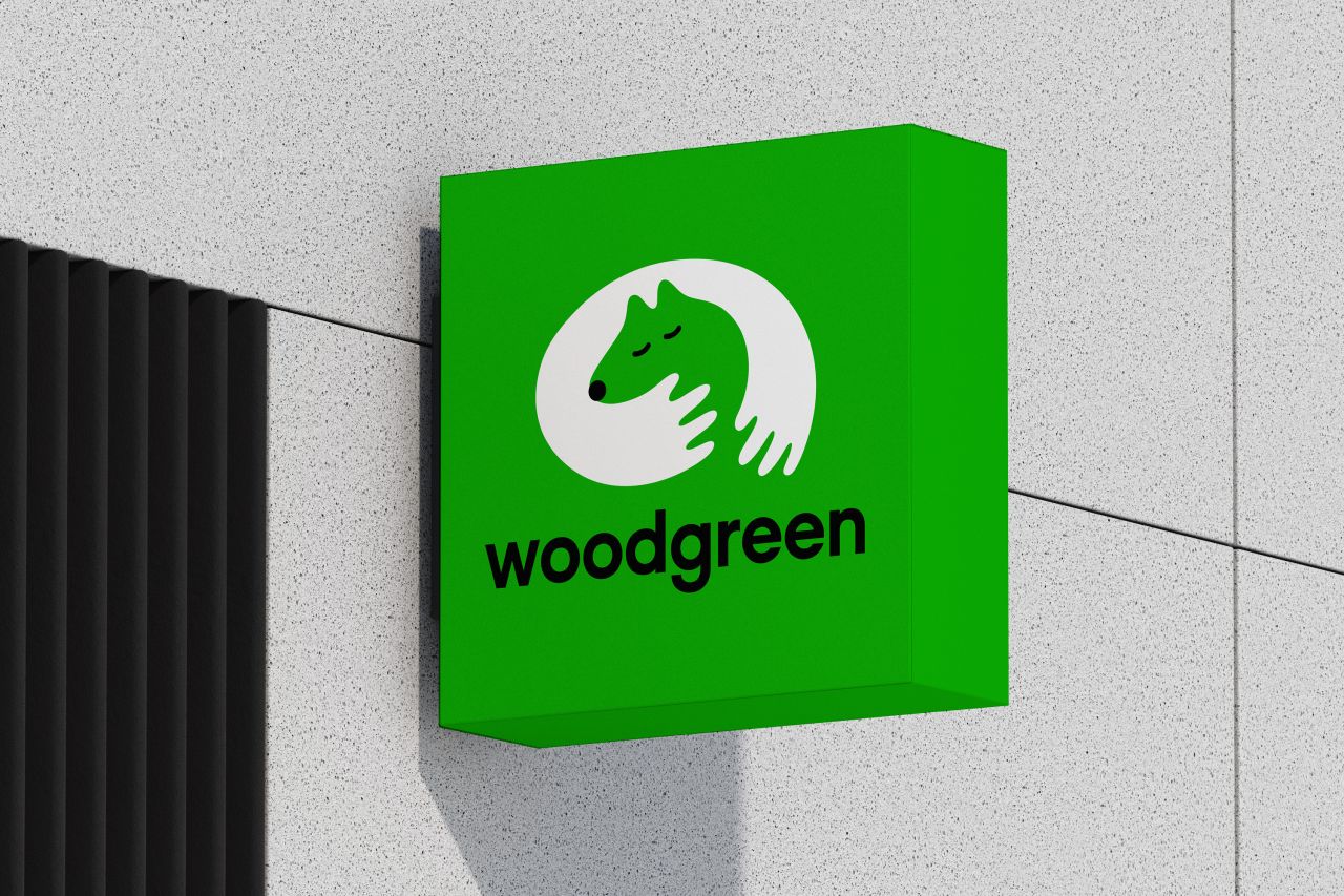
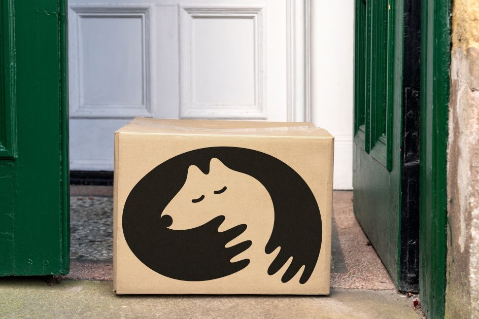
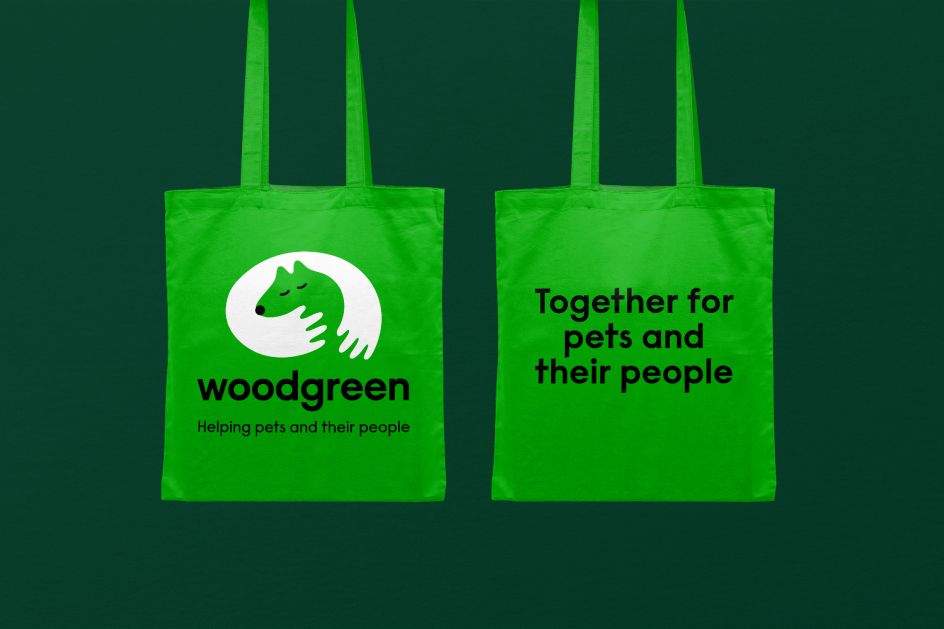
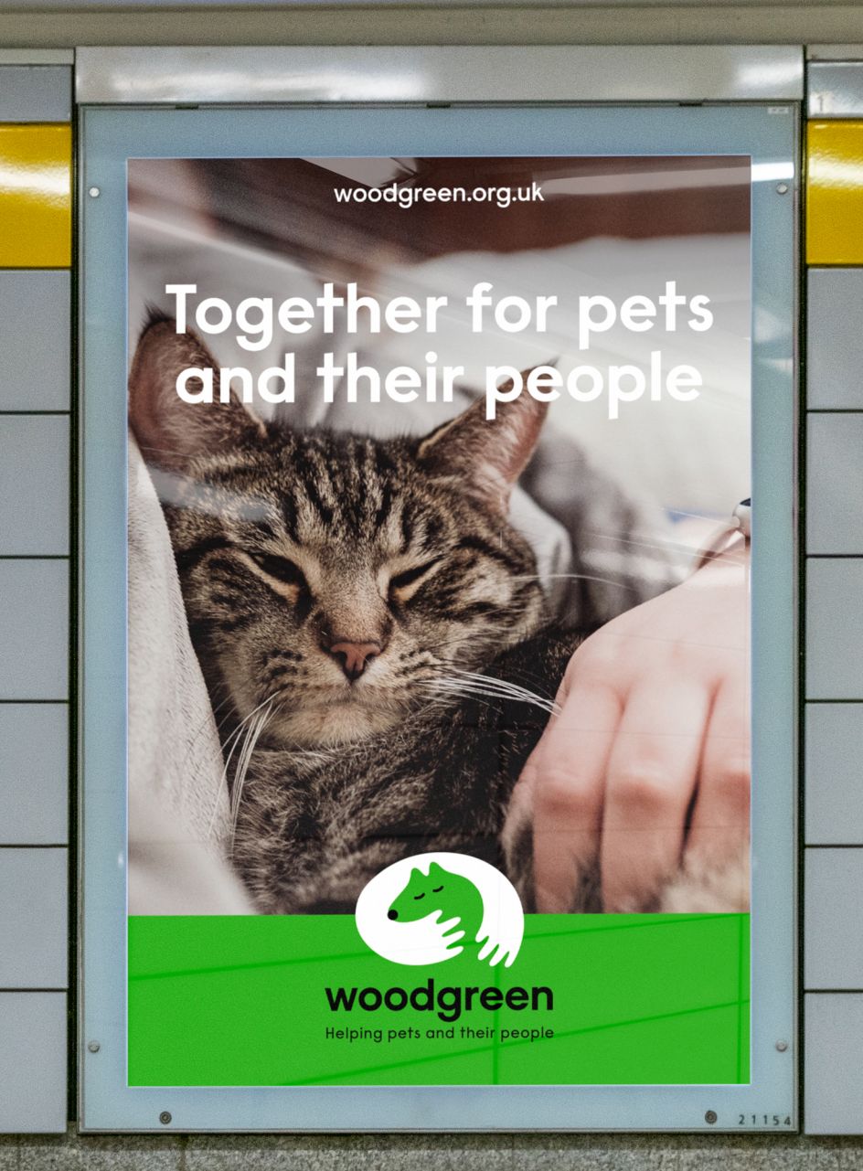
The identity developed by Marina and her team aims to fully reflect the breadth of these activities and powerfully state Woodgreen's special purpose. At its centre lies a heartwarming symbol that captures the unbreakable bond between animals and humans. Using positive and negative forms, the mark visually represents how pets and humans are dependent on one another. The words 'Helping pets and their people' appear under the logo, which summarises the idea that Woodgreen always sees the relationship from a pet's perspective.
In terms of the palette, Pentagram kept Woodgreen's primary colours of green and white but has complemented them with additional shades of green and a variety of warm tones which have been chosen to represent the natural environment.
The tone of voice, meanwhile, works in a direct and conversational manner, either expressing the emotional and compassionate aspect of Woodgreen's personality or being optimistic, caring and approachable. Words highlight the emotional benefits and joyful connections between pets and people. And there's a dash of humour, too, as the messaging is often directed to the pet. This is supported by simple yet practical messaging which is more direct, to help talk to pet owners and anyone looking to adopt a pet. "It provides information in a way that's straightforward, without formalities or judgement about how they can seek support, help and care," says Pentagram.
Imagery adds to the brand expression with photographs of pets taken at eye level to place the animals centre stage. This is supported by documentary-style imagery of professionals, the staff and volunteers that support Woodgreen, playing an integral part of the story, showing the behind the scenes aspects of the charity's work. Additionally, there are images featuring moments between animals and humans to highlight the bond between them and emphasise Woodgreen's mission.
Looking at typography, it aims to reflect a "tonality and personality which has to be kind as well as highly skilled and professional". Colophon foundry's Raisonne Pro (used in Bold, DemiBold and Book) is the primary typeface used throughout—contemporary and straightforward, it represents a voice that can be used across Woodgreen's different styles of communication.
"The new brand will help Woodgreen clearly communicate its key values, of compassion towards animals and their humans and the societal benefits that this special relationship can bring," adds Pentagram.
Editor's Picks


Trending


Editor's Picks
Further Reading