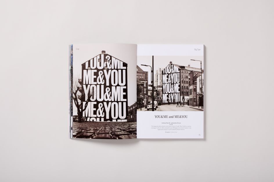
Big Type: Counter-Print's new book explores graphic design where type plays the leading role
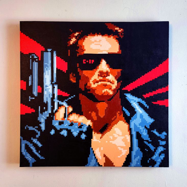
If you think about the typography trends of recent years, one, in particular, stands out. Big, bold type can be seen everywhere, from billboards to websites, motion design to motion pictures. So it's great to see a new book from Counter-Print devoted to this very subject.
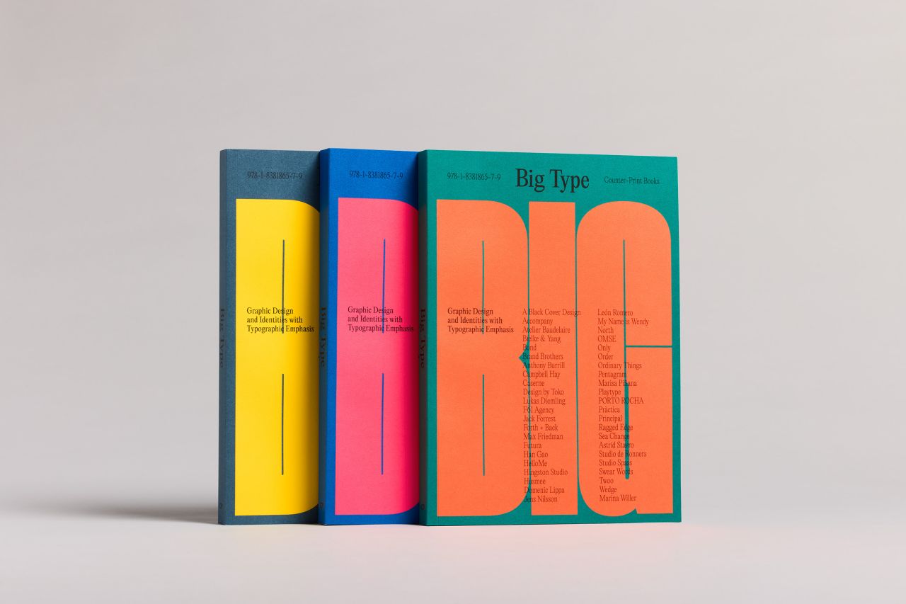
As you'd expect from its title, Big Type explores graphic design and identity work where the emphasis is on, well, big type. (Or should that be BIG TYPE?). And it's a timely release indeed.
The visual landscape in which creative work appears is becoming more cluttered, and the digital world is so vast that making your work visible is getting harder and harder. Large type is one tool in your arsenal, and while it should never be used unthinkingly, it can be a great way to get your design voice heard.
To see how it's done, just check out the work on show within this book. These are all brilliant examples of a fascinating direction in graphic design, one forged by a collision of technology, typography and trends, creating new and exciting results today.
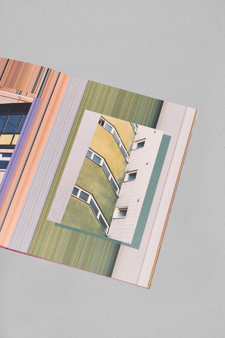
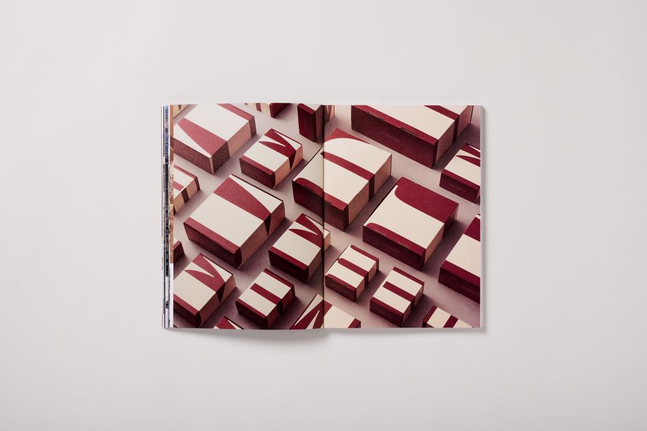
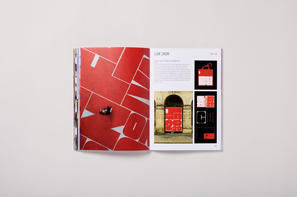
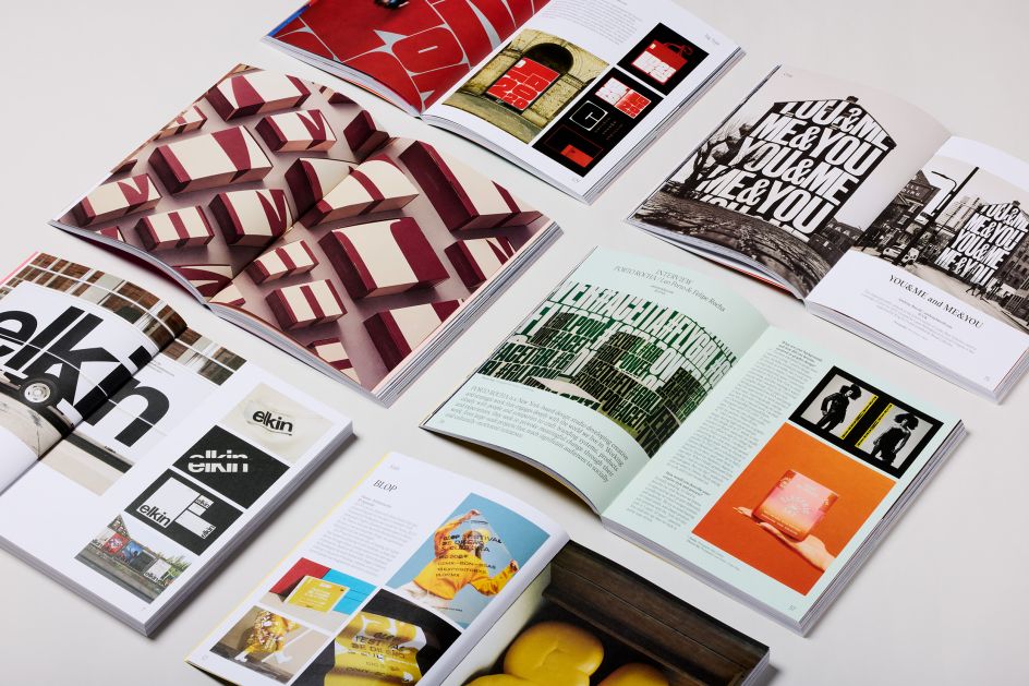
The book is divided into sections that look at scale, repetition, cropping, lettering, distortion and interaction. It's packed full of eye-popping imagery from some of the world's best graphic designers and contains agency interviews and enlightening project descriptions to add context to visuals.
There are three cover colour options to pick from, and you can buy your copy of Big Type here. In the meantime, we chatted to Jon Dowling, co-founder of Counter-Print, about what inspired the book, some favourite projects, and the increasing richness of modern visual identities.
What inspired the book?
The book started as a bit of a joke. [Counter-Print co-founder Céline Leterme] and I used to work in branding agencies in London before setting up our own studio and moving on to publishing later in our career. Whenever we'd work on identities, there'd often be a 'big type' option proposed to the client. I think 'big type' is a shorthand for a certain style of design, which designers can all immediately bring to mind.
Like many, I'm always drawn to projects such as these, as they are so eye-catching and celebrate the beauty of type. The initial reaction to the book, its title and the contents has been so warm – unlike anything we've experienced before. It seems to stir something in designers to create and view such work.
Looking at projects out there, graphic design is having a moment on the streets like never before. What do you think has changed?
I think the platforms through which a contemporary brand can express itself have widened with technology development. Tech has become central to all our lives. Whereas a few years ago, the activities of the graphic designer were mainly restricted to the creation of posters, advertisements, packaging, signs etc., the modern designer's work has now expanded to embrace virtually every field of representation and design.
On the street, specifically, paper has been replaced in part by digital screens, extending advertising space from static to animation. Meanwhile, fonts can now be customised and animated too. All of this has resulted, from a brand perspective, in visual identities that have transformed from static to dynamic, with much richer possibilities of communication than were previously afforded.
How did you pick the projects in the book, and what are some of your favourites?
All the projects in the book were chosen for their strength and conviction, which was intended to cut through the visual noise we encounter every day and communicate a message, elicit a response or represent a call to action.
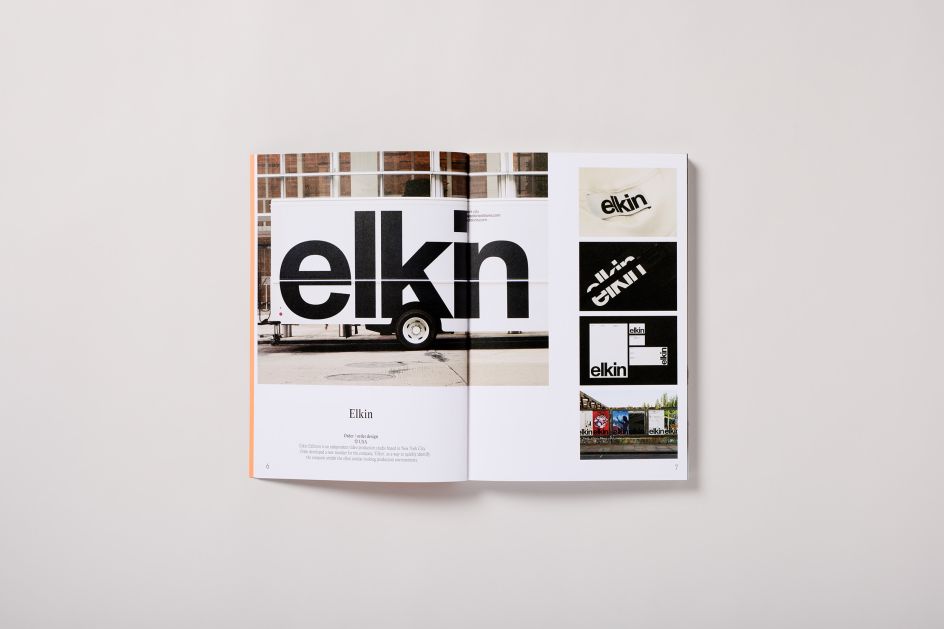
It would be hard to single out one or two projects, but there are always some personal favourites. I love the stark brutality of Order's logo and identity for Elkin, an independent video production studio. Order developed a new moniker for the company to quickly identify the brand amidst the often similar-looking production environments.
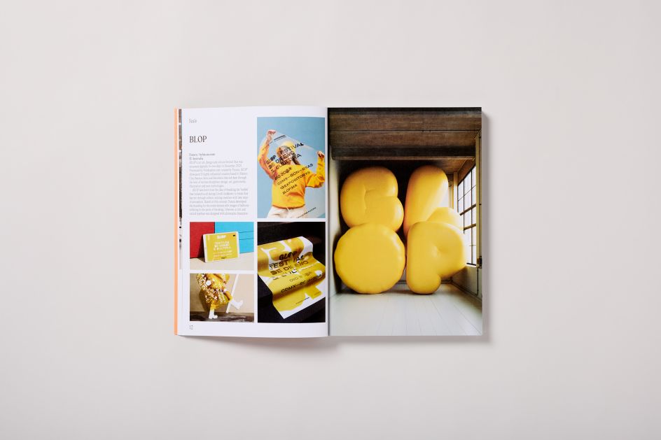
Futura's work for BLOP, an art, design and culture festival, is also a firm favourite. BLOP was born from the idea of breaking the 'bubble' that isolated us all during Covid's lockdown. Based on this concept, Futura developed the branding for the entire festival with images of balloons inflating to the point of breaking.
What do you hope people will get from this book?
I hope it inspires people to sometimes leave their inhibitions behind when designing and push themselves a little further than they are comfortable with. My hope, with all our books, is that people will see that design can be a creative, fun, passionate, intelligent and rewarding experience – both for the intended audience and the designer making the work.
Editor's Picks


Trending


](https://www.creativeboom.com/upload/articles/86/862919952c0ad18439004228895a431dc6e45ffc_732.jpg)
Podcasts


Editor's Picks
Further Reading