Changing the Game with Pepsi and Utrecht: This Week’s Featured Design Annual 2022 Entries

If there’s one thing to be said about our global society, it’s constantly growing and changing. Fortunately, one great thing about graphic design is the power to showcase these changes, and this week’s Design Annual 2022 competition entries are definitely switching up the game.

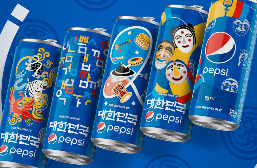
“Think globally. Act locally.” This is the mantra for the “Pepsi Culture Can Series” (above) designed by PepsiCo Design & Innovation. The limited-edition packaging initiative is set to create unique, hyperlocal designs that would sell in markets around the world. The series is located in over ten countries, with over forty designs. The design initiative is centered around celebrating what binds us together as people: our identity, pride, and sense of community with symbols, food, images, architecture, and music. From China to India, Saudi Arabia to Jordan, the Pepsi Culture Can tapped into the DNA of local markets.

Often working with local artists and designers, the team uncovered symbols of unity, hope, and joy wherever they went. They then took these influences and infused the traditional designs with the “youthful optimism” of the Pepsi brand. The end product was unmistakably Pepsi but also undoubtedly local. Can by can, the series spread across the globe, leaving love, joy, and refreshment in its wake. The Pepsi company was met with some pushback, being told that it wasn’t a good idea to change their packaging region by region. However, what makes the series special is that it is not a marketing initiative — it was all about putting smiles on people’s faces and bringing people together. In the team’s own words: “We did this for the love of hope. For the love of people. For the love of design.”
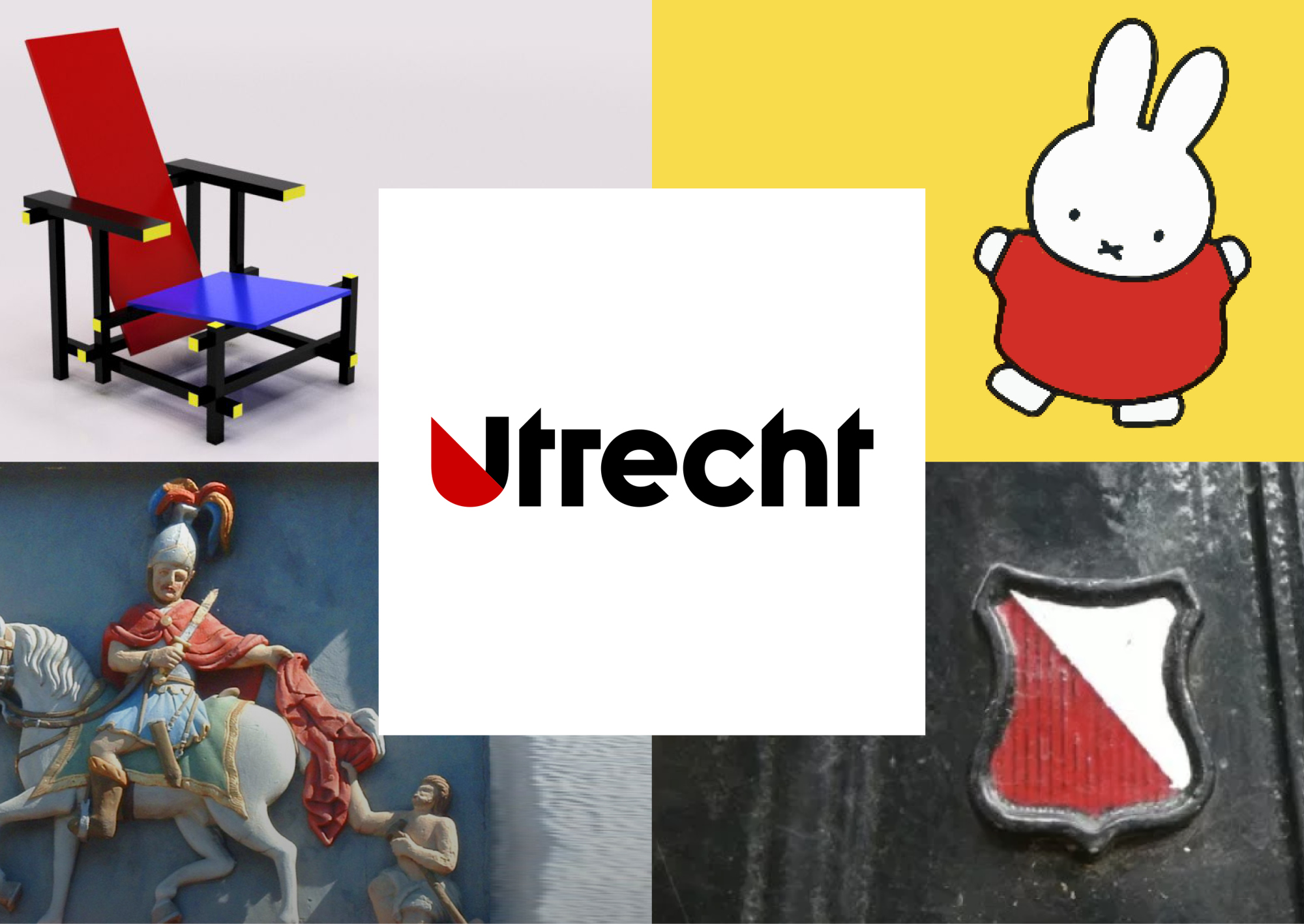
Faced with a playing field filled with increasingly international competitors, Netherlands-based marketing company Utrecht needed a new corporate identity, a further development of the style they’d already developed in 2009. The objective of Utrecht Marketing is to “stimulate economic growth and strengthen the substantive values of the city brand”; due to this, the new corporate identity is not only aimed at residents and visitors, but also at international companies. Enter the designers of Total Design: Tabi Aziri, Dimitri van Loenen, Ruud Nederpelt, and Rogier Bisschop. Total Design, also located in The Netherlands, specializes in helping brands develop and grow through various disciplines, including branding, content marketing, digital design, and campaigning.

For Utrecht Marketing’s transformation, the logo and corporate identity were based on the coat of arms of the city of Utrecht. The diagonal red area refers to the story of St. Martin, who cut his cloak in two to share with a beggar, symbolizing two important brand values for Utrecht: sharing and connecting. The U was already widely used in Utrecht, and since it has the shape of a shield, the idea of sharing and connecting was subsequently carried through consistently. The diagonal line on the coat of arms is the driving force of the design; it resembles a division sign, and as such symbolizes the value of sharing. The diagonal also has the freedom to divide up color fields or images in a multitude of ways. The redesign has been in effect since July 2020, and the simple rules ensure that all expressions are immediately recognizable from Utrecht. The result is not only recognizability, but also a constant visible engagement with the stories, customs, and attitudes that are quintessentially Utrecht.

For more of these and other designs, check out more entries from our Design Annual 2022 competition on our main website. The deadline for the competition has been extended to May 4th, so submit now!

Author: Graphis

Leave a Reply

Your email address will not be published. Required fields are marked *