You’ve been asked to design a profile screen for a mobile or web app. It will need to include an avatar, a name, a job title, and a location. You fire up Sketch or Figma. Maybe you pull out your drafting pencil or head straight to markup and CSS.
What’s your go-to fake name?#section2
Regardless of your choice in tools, you’re probably going to end up with some placeholder data. Are you the type that uses your own name, or do you conjure up your old friend, Mr. Lorem Ipsum? Maybe you have a go-to fake name, like Sophia J. Placeholder.

For me, it’s Nuno Bettencourt. Or Nuno Duarte Gil Mendes Bettencourt, more formally. Nuno played guitar in the subtly-named early 90s band Extreme. To the younger among you, he was a touring musician with Rihanna. None of that matters for our purposes here today, except that he has a fairly long name.
It may not seem like it matters what you put in for a placeholder name. It won’t end up in the final product—it’s just a variable. Well, it does matter. The text you start with will subtly influence your approach to layout and style. It may limit the scope of options you allow yourself to consider, or more dangerously, obscure actual limits that you’ll run into later.

A few obvious solutions may spring to mind: use a long placeholder name; use real data in your design. While these are a good start, it’s worth exploring more deeply how these and other practices can both improve your design process and help produce more durable products.
It’s more than just fake names#section3
This is about more than just fake names. It’s also fake addresses! Fake headlines! Fake photos! When we design around limited data, the limitations bleed into our designs.
The inability to deal with long strings of text is the most basic and maybe most common way components can fail when coming in contact with real data. You thought the tab would be labelled “Settings”? Well, now it’s called “Application Preferences.” Oh, and the product launches tomorrow.
Length is just one of many ways that real text and data can strain a weak design. You may also encounter unanticipated line-breaks or even text that’s too short. Beware of the following areas where we tend to cheat with easy placeholder data.
Account profile photos#section4
Don’t expect people to have a studio quality self-portrait with a solid white background (and be suspicious of those who do!). Many people may not be interested in uploading a photo for their account at all. Others may try to squeeze in their much-too-wide company logo into that little square or circular area. You can’t account for all possible data, but if you incorporate some of these less-than-visually-ideal cases early in your design process, your output will be that much more resilient.
Thumbnails for videos and photos#section5
Not all thumbnails will be in the aspect ratio you’ve anticipated. Some might include text or images that clash unexpectedly with the surrounding page. A common issue I’ve seen is a nicely designed home page with a company logo prominently displayed at the top. Then, the video arrives and the default poster image for the video also includes the company logo. Now your beautiful home page layout looks like a logo salad.

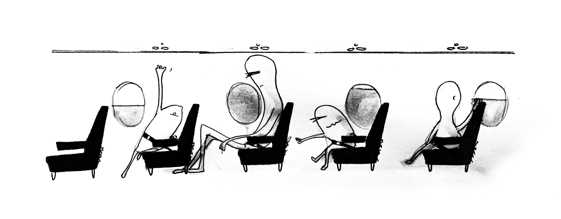
Wild variations in amounts#section6
Watch for elements containing lists where the amount of items in those lists may vary significantly. Imagine a layout with cards where each card includes a set of tags. One card may have three tags while another may have twenty-five. Tabular data can also suffer both aesthetically and in legibility when one particular cell varies wildly in length from the others.

Missing elements#section7
You may create a nice layout for your site header that scales beautifully from your phone to your 27” display. Then you discover it needs a Support menu item—but there’s no room! I often start a wireframe by compiling two lists. The first contains the goals a visitor to this screen needs to accomplish. The second has the elements that need to live on this screen. Be sure to include all of the elements—from the primary content to advertisements, and down to a privacy link in the footer. It’s particularly easy to spot a site that was designed without accounting for the advertisements it includes.

Viewport sizes#section8
Beyond placeholder data, we have a tendency to present our designs at the most flattering viewport sizes. Or rather, we design our layouts to look best at the sizes we choose for our mockups—particularly when we design with tools built around fixed frame sizes. In the neglected troughs of responsive design, we find two common pitfalls: the stretched mobile layout and the squished desktop design layout.


Flexible design can be more accessible design#section9
We can’t spend endless amounts of our time (and our clients’ money) on every edge case imaginable. We can be more mindful of the influence of the canvas on which we create, the tools we use, and the data we design around.
It’s necessary to focus attention and testing on the ways in which your site will most commonly be accessed. Things don’t have to be, and never will be, perfect at every screen size. Letting go of control and embracing this fluidity is part of designing for the web.
Designing with flexibility can also make your design more accessible. Those with vision impairments (which is most of us at some point in our lives) may browse with a customized minimum font size. Others may browse at a zoom level that triggers responsive layouts intended for mobile devices even on a large desktop browser.
Avoid the disappointing reveal#section10
There are enough factors that can already contribute to clients and stakeholders having unrealistic expectations and being disappointed by the eventual implementation. Don’t add to this potential mismatch of expectations by showing designs that look flawless, only to have the client review them in the harsh light of real data.
While you may need to convince people of the merits of your design, you’ll only set yourself up for failure if you choose to showcase an unrealistic design. Instead, indulge initially by showing the layout with ideal data Then show how durable and flexible the design is by showing variations with difficult data. This not only helps people understand your design but also the value of your process and expertise.
When I was a kid, I distinctly remember a door-to-door vacuum salesman jumping on a vacuum cleaner to demonstrate the durability of his product. We didn’t need a new vacuum (the immediate flaw in the whole door-to-door model), but the image stuck with me. Jump on your designs! Throw them against the wall! Fill them with garbage and show how well they hold up.
For example, when showing a design to a client, show them how it adapts to various viewport widths and default font sizes. Showing a client how their site responds to browser sizes can also help them let go of the need to polish designs solely for the particular device and size they happen to use. If you’ve got a robust way of dealing with long names on a profile page, show it off! This can help your client understand that there is a whole other dimension of work (and time, and money) beyond what’s visible in a static screenshot.
Garbage in, gold out?#section11
The old computer science adage reads, “garbage in, garbage out.” Instead, aim for “garbage in, hrm … not bad.” A better adage to lean on may be Postel’s law, also known as the robustness principle: “Be conservative in what you do, be liberal in what you accept from others.” If you imagine your evil twin trying to pick apart your design, how would they break it? Maybe squish the browser to a narrow size, and enter some unusually long headlines (garbage in). Your design should respond nicely to the narrow width, and gracefully reduce the font size of particularly long headlines (gold out).
With practice, you can internalize some of this process. You’ll come to know instinctively what pitfalls come with a given visual design. Much in the same way experts in accessibility or internationalization learn to quickly spot the common pitfalls that limit the universality of designs. While our intuition can help us, it can also trick us—be sure to test, and see how real people work with your product.
Even as you do hone your ability to anticipate and avoid common mistakes, your mind will constantly be pulling toward the path of least resistance. Like endurance athletes training at high altitudes, exercising with ankle weights, or the pro baseball player taking practice swings with a weighted bat, we must continue to artificially increase the strain on our work.
Real data isn’t good enough#section12
Much has been written on the benefits of designing with real data. My colleague Daniel Burka writes:
Try not to gloss over complexity. Design work in the real world is pretty hard. If you design a fake graph, put in realistic data. If you fake redesign a site, … don’t just magically remove an ad unit. If you create a sexy fake login screen, don’t forget to include a way to recover lost passwords or usernames. … Write real copy. Lorem ipsum is for amateurs.
Daniel is right—especially when it comes to interface elements where the meaning of the text is inextricable from the function. When it comes to design elements that may display widely variable contents (profile photos or names, for example), you can do better than using real data. Go beyond realistic data. Get difficult data.
If you are able to pull in real data, dig through it for the worst cases. If you can handle the worst, the common cases will be a breeze.
When redesigning an existing screen, take advantage of the current and historical data available. Dig into the extremes of the data, finding the longest and shortest titles. If you’re designing with thumbnails of photos or videos, grab a random set of real thumbnails and throw away those you know are easy to design around.
When you don’t have existing data, and even when you do, create difficult examples. Write headlines that push up to and beyond the limits of what the screen can accommodate. Create thumbnail images that have their own built-in border or shadow, and see how they clash with what you’ve got in place.
Sometimes difficult data can (and should) be fixed#section13
While your design should be as robust as possible, you may sometimes turn up edge cases that needn’t be so. In designing a list page with a client, we looked at their complete archive of data to see how the length of the item titles varied. The shortest title was 8 characters, and the longest was over 320, but only a handful were over 80.
We worked with the client to create a design that catered to the maximum 80-character titles. Some editorial surgery was then performed on those few outliers to get them in under the limit. They ended up being better titles as a result.
When dealing with content that is managed by your company, team, or client, it is also worth codifying the practices into a style guide. You needn’t spend all of your energy designing around difficult data that’s coming from down the hall.
Internationalization#section14
I’ve had the privilege of working with teams at Mozilla, where pages are translated into as many as eighty languages. With such broad localization efforts, we learned to build page layouts and designs that supported both non-Latin character sets and languages with right-to-left text direction.
Supporting both left-to-right and right-to-left languages requires more than just allowing text strings to reverse. The entire visual structure of your layout and design needs to be able to flip horizontally. Rather than being a frustrating limitation, you’ll find this and other similar constraints will help you develop design superpowers.
In anticipation of the longer text strings in languages like German, some designers developed a process where Latin text is generated at twice the length of the source text. The W3C has a handy article on common length ratios across languages.
Capitalization can also be problematic in some locales—especially when forced with CSS. If your design really relies on text-transform: uppercase or text-transform: lowercase, either revisit the design to be more flexible, or handle capitalization in the source text (rather than via CSS) so a localization team can maintain control over capitalization.
MDN is a great resource for more on designing for localization.
Beware of your own cultural blindness when it comes to placeholder data during the design process. Design cheating often affects those least like yourself.
Whenever possible, design with difficult data#section15
Much has been written (and should be read) about how our tools can help us design with real data. With modern design and prototyping tools, HTML/CSS/JS prototypes, and even static mockups, we only cheat ourselves if we aren’t pushing our designs to the breaking point.
There’s always a balance to strike between making something quick and over-building. As with all things in design and on the web, it depends. It depends on the data, the audience, the project, and the goals.
Schedule and budget are the common excuses for not delivering more robust design components. Especially on larger projects, though, learning to incorporate more difficult data into your early design process can save you time in the long run.
Like that long-distance runner who improves by training in the thin air of high altitudes, by building with difficult data from the very beginning, you’ll become a stronger designer. You’ll be more aware of where and how your design may break, and be better able to communicate your process and decisions.
Every designer should learn the complete data before dive into the design process. majority of designer start learning after they reach to a robust component of the process.
I didn’t know that using difficult data had a law name. Cool.
Thanks a lot for this.
True, Thanks for the insights. Check out the best online channels to watch Super bowl without cable.
I just found for website designing company in janakpuri . it is offering high-end designing services and also on time.