Henleys Sweets re-brand

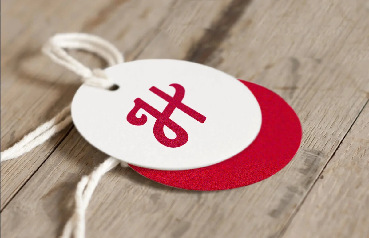
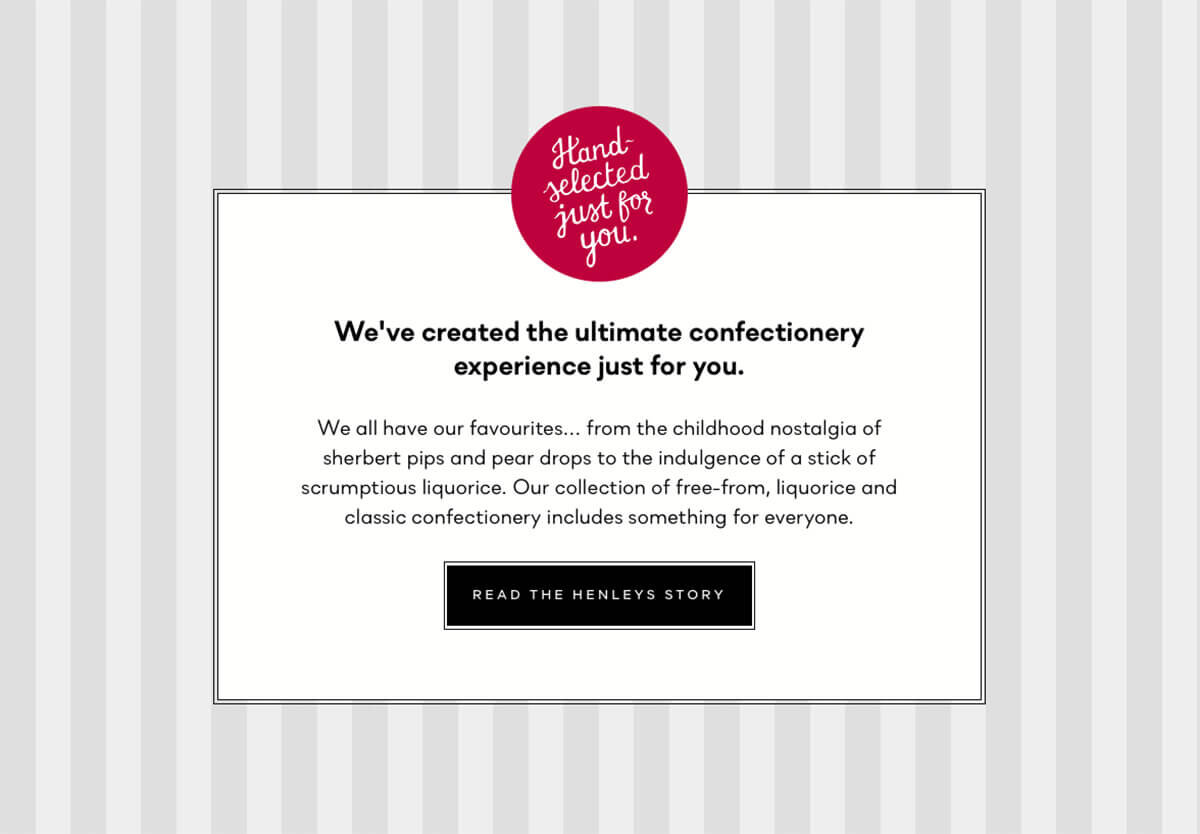
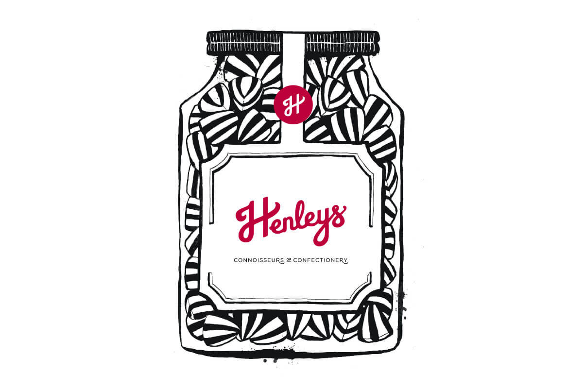
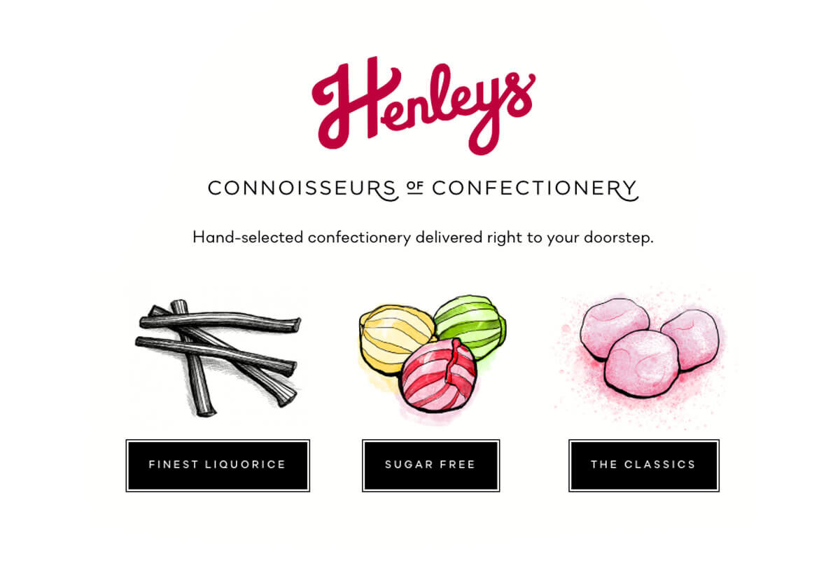
Henleys Sweets needed a re-brand to encourage more customer sales and engagement from their website. We wanted to convey the company’s unique selling points, portraying that they are extremely knowledgeable about confectionery but also approachable and friendly with excellent customer service. The logo was developed from a hand-lettered device in order to convey tradition and authenticity and a typographic device was created from the strap-line: ‘connoisseurs of confectionery’ which complemented the logo and could be used throughout the site. We developed further assets, such as stickers and stamps that would be relatively inexpensive to produce on packaging, giving brand continuity, and we incorporated illustrative elements which helped to add personality. Once the brand identity was developed we worked closely with Denken.studio and Wordperson to provide content, web development and SEO.
You can see the full web design at https://www.henleysweets.com
…………………………………
Collaborations:
Web Development: Oliver Brown, Denken Studio
Copywriting: Ellen Holcombe
Photography: James Thomas