Remove 2011 Remove Coding Remove Media Remove Networking
article thumbnail

17 Best Online Coding Courses (Free & Paid)

Just Creative

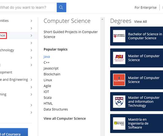
Coding is an invaluable skill that forms the bedrock of many leading companies. In this article, you will discover some of the best online resources that are currently available for learning to code, so you can expedite the learning process without having to waste any more time than is necessary. What Is the Best Online Coding Course?

Coding 253
article thumbnail

Must-See Marketing Movies to Inspire Success

Canny

For example, Moneyball (2011), starring Brad Pitt and Jonah Hill, will inspire you to find alternative ways to succeed despite having very little budget to do so. Released In: 2011. The Social Network. Do let us know via the social media platform of your choosing. How they inspire you will range from movie to movie.

Marketing 147
Insiders

Sign Up for our Newsletter

This site is protected by reCAPTCHA and the Google Privacy Policy and Terms of Service apply.

Trending Sources

article thumbnail

Design 4.0: leading design in the new industry

UX Collective

In 2011, the German government started using the term “Industry 4.0” In the past, designers were expected to both design and code front-end applications. Gone are those days with the rise of Figma and Webflow , as well as many other no-code platforms. One such upcoming new media designer is Refik Anadol.

article thumbnail

50 Best Design Blogs You Have To Read (2023 Update)

Shillington

Design Week Founded in 1986, Design Week was the UK’s leading design magazine until 2011, when it became online-only. Shillington Design Blog Shillington is a college network offering an innovative approach to design education based on short, intensive courses and practical, industry-focused learning.

article thumbnail

Why Your Website Needs a Mobile-First Design

Inkbot Design

It is the opposite of traditional design strategies, which begin with creating a desktop website and using coding techniques to make it respond to different screen sizes. Mobile behaviours include engaging with social media , checking emails, making appointments, and managing multiple aspects of our everyday lives.

article thumbnail

Responsive Web Design: Future-Proof Solutions

Inkbot Design

IBM reported that Christmas Day 2011 was the first-day mobile devices outsold PCs for online shopping. Marcotte called for fluid grid layouts, flexible images and CSS media queries. Media queries: This CSS3 feature enables styling rules based on screen size breakpoints and device capabilities. The web had outgrown the old ways.

article thumbnail

History of WordPress – a 20-Year Journey

Template Monster

How the History of WordPress Started The story of WordPress started in 2003 when the young American blogger Matt Mullenweg posted in his blog the article “The Blogging Software Dilemma”, where he submitted the idea to use b2/cafelog code to fork the software. It extended users' abilities to work with media content. Further version 3.5