
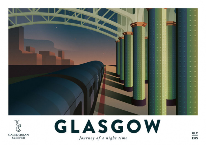
“Journey of a night time”: designing for the night train renaissance
Overnight trains are the sleeper hits of the transport industry – with both vintage and modern appeal. How do you design for that newfound appeal?
In January, the Brussels-Vienna overnight train service was revived; it was the first time the service ran between two continental cities since 2003. Trains may not seem the likeliest category for transport innovation but the Nightjet was the latest in a renaissance for sleeper trains in Europe. Reasons that have been given for that late-in-the-day popularity include the greener aspects of train travel and the comfort of a journey, especially over budget airline flights.
In the UK, there are three sleeper train services; the Caledonian Sleeper service which travels from London to Scotland, the Royal Scotsman (an update of the Orient Express) which travels through the Highlands, and the Night Riviera which joins London and Penzance, Cornwall. And while there is growing interest in this travel sector, how do designers present a centuries-old travel form to modern audiences?
The “romance of travel”
Moray Macdonald, managing director of Weber Shandwick, the consultancy behind the Caledonian Sleeper’s marketing says that the updated brand is built on the “romance of travel”. The identity was introduced in 2015, when the train service was bought by public services company Serco, and was rolled out over the next four years. When new trains were introduced in 2019 – Serco bought a £150 million fleet of 75 carriages with en-suite double rooms – it “really brought the brand to life”, Macdonald says.
The consultancy, which has its own in-house design studio, looked to the past for inspiration. Research revealed that the “romantic” name for the Caledonian Sleeper was the Deerstalker Express -so-called because it travels through the Highlands, taking in the scenery of Inverness and carrying Londoners who sought “hunting and shooting” in the countryside. The new logo is a white stag – in mythology, the animal represented the “beginning of extraordinary adventures” according to Macdonald – with five points on the antler which reflect the train’s five destinations; Aberdeen, Glasgow, Inverness, Fort William and Edinburgh.

While the revived trainline was initially plagued by criticism, from delays and badly-run service, things seem to be changing. Since the last campaign and the installation of the new trains, sales have increased 25% in the past year, Macdonald says. A few days before we speak, he says the service had its highest-ever one day sales figure.
“We wanted to link that bygone era with a sense of modernity”
Caledonian Sleeper unveiled its poster campaign, with the slogan ‘The Journey of a Night time’ last year. It only took 45 seconds for someone on Twitter to ask if they could purchase it, according to Dale Watkins, Weber Shandwick’s creative director. “It resonated with an audience,” Watkins says. The posters display sleepy scenes of train travel, showing carriages passing by evening scenery and billowing trees. For the basis of the imagery, the team looked at how train travel had been presented in the past – “there’s a real nostalgia for train travel,” Watkins says.

But there’s a balance to strike between looking back and creating a “new slant”, he adds. The team looked at “what a modern traveller needed” he says. “We wanted to link that bygone era with a hint of modernity.” Visually, this was achieved through the modern graphic style. While the scenes might be nostalgic, the bold applications of colour – shades of bright pink and fuchsia – help to give them a modern feeling.
The posters are slightly disingenuous in that they are not “deliberately correct” about all the landscape that the train visits; it was more about creating a “dream-like” impression of what it passes by. “It should be about a hint of experience – almost a voyeuristic perspective,” Watkins adds. Posters, postcards are going to be sold, and further merchandising – train washbags, for example – is being planned.
Designing for the Night Riviera “club”
One of the benefits of the Caledonian Sleeper, Macdonald says is that you can arrive in London, have a night’s sleep and arrive at a 9:30 meeting refreshed. “You can’t do that with flying,” he says. In a similar way, The Night Riviera provides a service for people working in London who return to Cornwall for the weekend.
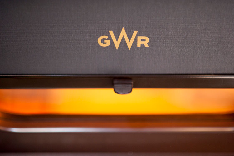
It’s been travelling from London’s Paddington to Cornwall’s Penzance since 1983, and is run by Great Western Railway (GWR), itself rebranded in 2015 by Pentagram’s John Rushworth. The exterior livery and insignia balance between heritage and modernity. The insignia, for example, is what it might have looked like if it hadn’t been bought by the Western Region of British Railways in 1948. (The middle, enlarged W is a nod to the railway’s connection with the west of England.) The primary colour of the brand was green – another nod to the brand’s heritage, as a shade called dark holly green was used on the first GWR locomotives.

While the visual identity is important in communicating ideas, what’s inside the carriages is vital too. Michael Rodber, who works in transportation design and consulted on the interior design of the Night Riviera during its refurbishment, says that it’s a “club”. “A lot of people use it,” he explains. “There’s a lot of allegiance for it.”
For a designer, the job was a “dream”, Rodber says. The interiors were “radically” changed: ladders were integrated, the beds were swapped around so that people’s heads weren’t by the door, the bottom bunks were configured so that they could become a sofa for people to sit on. And wardrobes were added, so that “you don’t have to look at your trousers as you sleep”, Rodber says.
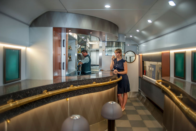
One of the biggest changes was outside of the cabin, though. The bar was stripped out and made into a more social area. The idea was to make more of a cocktail lounge-like space where people could socialise and enjoy the experience even before the train leaves the station. “It’s a hotel on wheels,” Rodber says.
“Essentially British”
The renaissance doesn’t seem to be uniform across Europe, however. There is a distinct difference between the UK sleeper services, which invoke this sense of heritage more strongly, as opposed to the continental services which can appear more utilitarian. The newly-revived Nightjet, for example, has a cleaner, less romantic look compared to the Caledonian Sleeper’s white stag with five antlers. The design details of UK trains may be tailored to a stronger tourist audience – Weber Shandwick’s Watkins says that a target audience was American and German – and a longer history of railway travel.

Rodber says that this extends to the interiors on the trains too. A few years ago, he was travelling in Italy on a high-speed train in business class – which he found a disappointing experience. “I went along to the bar, and it was white Formica, and it was quite nice, but it was white Formica,” he says.
“The good thing about building on heritage is that you can have something essentially British and it isn’t the obvious white Formica and blue cushions,” Rodber says. “We did something much richer.”
Read this next


Hello, I am the author of a research paper on exactly this topic: it is about new designs for night trains, to find a way to build a real travelling hotel. The work includes innovative interior design concepts, new on-board and off-board services, layouts of different carriages; there is also a basic business plan that verifies the possibility of realisation. If you are interested, it is published in the book ‘Hotel-Train’, isbn 978-88-31474-12-2. Thank you! Flavio Bassi