
Paula Scher exhibition looks at graphic design in the public sphere
As part of Design Manchester 2019, the revered graphic designer and Pentagram partner is hosting an exhibition of poster art that illustrates her love of public design
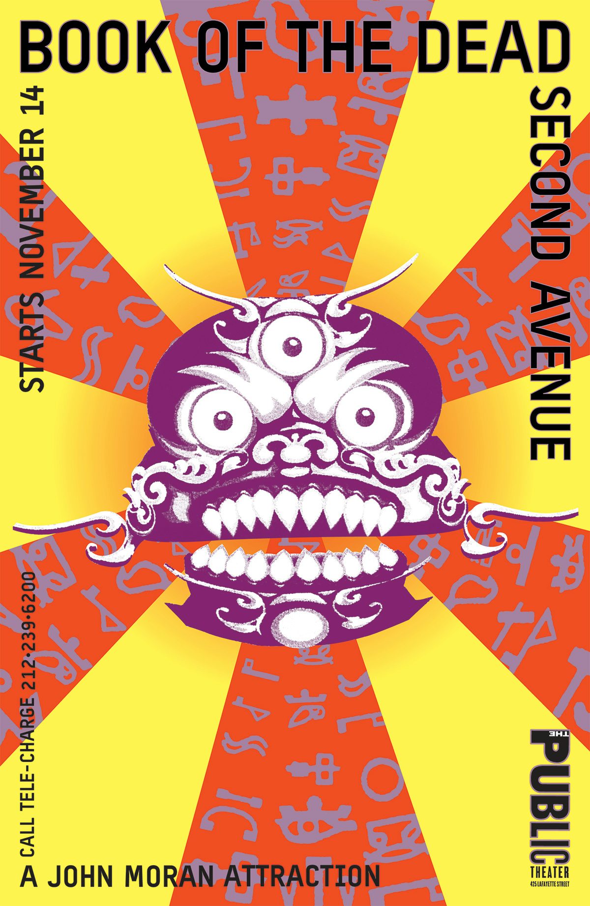
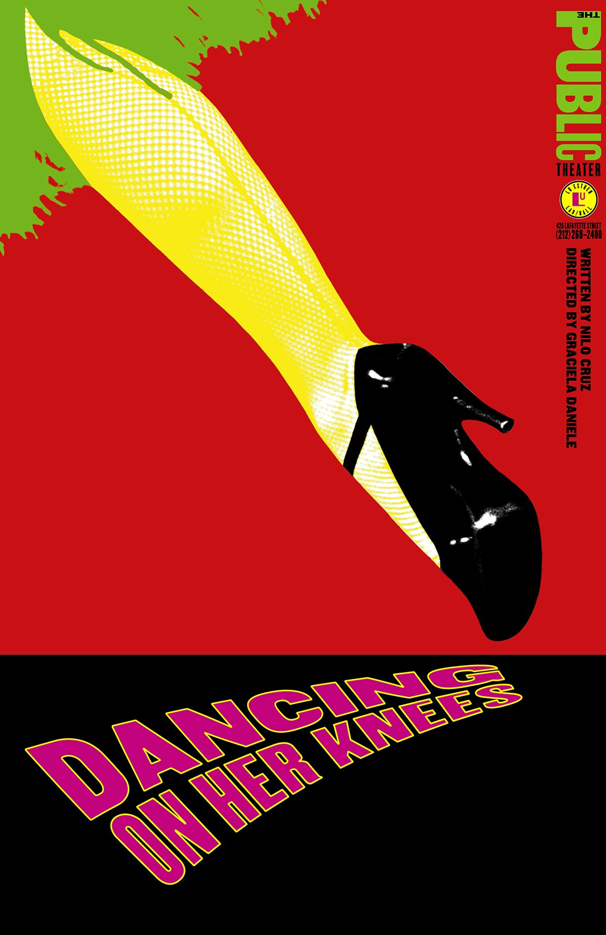
In 1994, Pentagram New York was brought on board to shape a new visual identity for arts organisation The Public Theater. With Paula Scher at the helm of the project, The Public Theater gained a fresh pool of designs that drew on everything from Pop Art and Constructivism to graffiti and hip-hop aesthetics.
Twenty-five years later, Scher’s poster designs are being celebrated in a free exhibition at the Manchester School of Art that draws its name from that pivotal collaboration. The show is being held as part of Design Manchester, where she was also keynote speaker at this year’s Smart conference, held last Friday.
Paula Scher: Public Theater runs until December 7, and gives the floor to the wealth of innovative poster designs created by Scher. The designs lay bare her compelling use of striking shapes, vibrant hues and bold typography, as seen across her poster designs for Public Theater and beyond. Scher’s inventive, ever-changing typographical choices were shaped by the influence her earlier Public Theater designs had on the competition, eventually realising “what I had to do was create some kind of language that only existed for a season … so nobody could copy it.”


Not only this, the show exemplifies her obvious and unwavering love of creating designs that live out in the open for the public to experience. “As long as I’ve been practicing design, I have been most obsessed with the connection between the work I create and its public. It began when I was a record cover designer in the 70s, working in an area of pop culture where audiences made a connection between graphic design and music,” says Scher.
“Later in my career, I was happiest working in the public realm where the work existed in the physical form: on the streets, in public spaces, on packaging, and later, through identity systems for cultural organisations, particularly theatres and art museums,” she added. “I love the scale of the poster. I love big things outside. I love working on environments and environmental graphics. And I love when other people engage with them”.

Paula Scher: Public Theater is on display at Manchester School of Art until December 7; designmcr.com. Revisit our series How Paula Scher Works here
Latest from CR


